Day 3 was meant to be one of the trip's highlights and did not disappoint. I scheduled a Pariscityvision tour of both Vaux le Vicomte and Fountainbleau - a little out of the city.
For the most part I can't recommend these bus tours highly enough; 'leave the driving to us' and enjoy your trip! Vaux le Vicomte is an amazing 17th century chateau which led Louis XIV to create the Versailles we have today (and imprisonment for its' owner who dared build a greater palace than the sun king!)
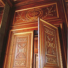
The interiors mostly have been brought back to this early creation but glimpses of the future styles to come still remain as well. We were lucky with the weather and the chateau was astounding.
On the way out of the chateau don't miss the large carriage museum and lunch at the cafe located in the stables; very charming.
Next on the trip was Fountainbleau, country home to French Kings and later emporers for more than 7 centuries.
Fountainbleau will take your breathe away by sheer size and the number of styles included. Really though it is an architectural 'hot mess' that is delightful and magnificent.
Napolean left the largest mark on the chateau perhaps because he was the last person to make significant changes. Above you see about 1/3 of a corridor showing his family portraits (big family!).
Napolean's camp bed has been set up within a tented room - so chic!
Napolean had a throne room set up within the apartments of king Louis XVI. cheeky.....
Which was set up next to Marie Antoinette's bedroom. I will never understand the flow of these 18th century palaces and their enfilades. How do you live here? bedroom attached to bathroom attached to throne room.
The tour ends at the Hotel Regina across from the Louvre and I suggest you end the day with a drink in their elegant bar as I did.
After dinner at L'Ilot Vache on the Ile St Louis (one of my favorite retaurants I find myself at time and again), I was thankful to climb the million steps up to my own Paris Pied a terre just across the street. Long but fabulous days!
Friday, May 17, 2013
Tuesday, May 14, 2013
Paris vacation - first days
Dear Reader, I again find myself blessfully and blissfully on vacation in Paris. The first two days have been spent organically, wandering around the city and reacquainting myself with different charming nooks.
I spent a fair part of the afternoon wandering around the Luxembourg gardens after a delicious lunch at one of my favorite restaurants that I come to again and again; Chez Fernand on the Rue Christine.
I particularly loved these stone urns planted with simple geraniums in the gardens. Also not to be missed is the Chagall exhibit at the nearby Musee Luxembourg.
A walk past the wonderful Invalides convinced me I need to visit inside sometime this trip!
No post on Paris is complete without the ubiquitous shot of the Eiffel Tower.
On the left above is the Hotel Crillon (the clean part of the building) which is sadly closed for renovations. We caught them loading the last of the contents into trucks(famously auctioned off last month at staggering prices).
Paris is full of beautiful doorways but the one above, in a very Parisian turquoise, boasts newly cleaned brass hardware. While I love the patina of age something is just so beautiful about frequently and lovingly maintained old hardware.
After a long day of wandering around the city nothing is better than returning to your own little apartment in the city seen above (rented of course) with copious amounts of stinky cheeses and a still-warm baguette from the local boulangerie. I am again staying in a cozy apartment on the well-located Ile St. Louis which I can't recommend more highly; just say no to hotels!
I spent a fair part of the afternoon wandering around the Luxembourg gardens after a delicious lunch at one of my favorite restaurants that I come to again and again; Chez Fernand on the Rue Christine.
I particularly loved these stone urns planted with simple geraniums in the gardens. Also not to be missed is the Chagall exhibit at the nearby Musee Luxembourg.
A walk past the wonderful Invalides convinced me I need to visit inside sometime this trip!
No post on Paris is complete without the ubiquitous shot of the Eiffel Tower.
On the left above is the Hotel Crillon (the clean part of the building) which is sadly closed for renovations. We caught them loading the last of the contents into trucks(famously auctioned off last month at staggering prices).
Paris is full of beautiful doorways but the one above, in a very Parisian turquoise, boasts newly cleaned brass hardware. While I love the patina of age something is just so beautiful about frequently and lovingly maintained old hardware.
After a long day of wandering around the city nothing is better than returning to your own little apartment in the city seen above (rented of course) with copious amounts of stinky cheeses and a still-warm baguette from the local boulangerie. I am again staying in a cozy apartment on the well-located Ile St. Louis which I can't recommend more highly; just say no to hotels!
Friday, May 10, 2013
An inspiring lecture: Gil Schafer
Earlier this week I had the pleasure of attending one of those lectures which snaps you right back to life career-wise in a "oh, thats why I'm doing this" kind of way! Award winning architect and president of the ICAA, Gil Schafer spoke in Georgetown about his life, his work, and his book, The Great American House: Tradition for the way we live now.
Many of you are probably familiar with his work through the many national publications in which it has been featured as he works with many top name designers such as Miles Redd and Bunny Williams. However, his work stands strong on its own and it was a pleasure to hear him speak of his childhood inspiration, his grandmother's country house in Georgia. Ever modest, Schafer is quick to speak on how a great house is 3 parts: Architecture, Decoration, and Landscape. He explained how these topics made his grandmother's house so special and in turn, he pays strict attention to them in each of his projects.
Schafer pointed out that he strives for dignity and comfort in his houses but not strict elegance (although one could argue they are also quite elegant just not in a 'fancy' way.) Hierarchy of spaces is important; so living and dining rooms will be detailed quite differently from family and breakfast rooms ( no bloated, oversized mcmansions here!). Like me, Schafer thinks of himself as an architect who thinks like a decorator. How will you live in a space? Is it comfortable, is there room for curtains, is it so contrived so that someone won't feel at home? Schafer believes decorators teach architects, if they listen, to loosen up.While he tries to give new houses a 'history' he warns one to be careful not to become too kitsch or slavish in its historical decoration: this is a modern time of course. Schafer also stressed the importance of landscape in a project from the get go and not 5 years later when the money is available. He advises someone building a new house to plan on a fully developed landscape with a SMALLER house at first and then later put on an addition as needed.
Schafer practices in the classical language but is not a purist; he believes it's important to live in the current moment in a modern, comfortable way; not a museum (here here!). His new houses are designed 1 or 2 rooms deep with traditional, proportionally sized rooms that aren't too big so that natural light is spread throughout the space. While his work contains much larger interior openings and windows than found in older houses he keeps the proportions the same so the buildings appear 'correct'. And most important to me during his poetic and inspiring lecture, he correctly used the words house and home; home was rarely uttered. Nails on a chalk board!
Images of Schafer's New York City apartment courtsey Gil Schafer.
Many of you are probably familiar with his work through the many national publications in which it has been featured as he works with many top name designers such as Miles Redd and Bunny Williams. However, his work stands strong on its own and it was a pleasure to hear him speak of his childhood inspiration, his grandmother's country house in Georgia. Ever modest, Schafer is quick to speak on how a great house is 3 parts: Architecture, Decoration, and Landscape. He explained how these topics made his grandmother's house so special and in turn, he pays strict attention to them in each of his projects.
Schafer pointed out that he strives for dignity and comfort in his houses but not strict elegance (although one could argue they are also quite elegant just not in a 'fancy' way.) Hierarchy of spaces is important; so living and dining rooms will be detailed quite differently from family and breakfast rooms ( no bloated, oversized mcmansions here!). Like me, Schafer thinks of himself as an architect who thinks like a decorator. How will you live in a space? Is it comfortable, is there room for curtains, is it so contrived so that someone won't feel at home? Schafer believes decorators teach architects, if they listen, to loosen up.While he tries to give new houses a 'history' he warns one to be careful not to become too kitsch or slavish in its historical decoration: this is a modern time of course. Schafer also stressed the importance of landscape in a project from the get go and not 5 years later when the money is available. He advises someone building a new house to plan on a fully developed landscape with a SMALLER house at first and then later put on an addition as needed.
Schafer practices in the classical language but is not a purist; he believes it's important to live in the current moment in a modern, comfortable way; not a museum (here here!). His new houses are designed 1 or 2 rooms deep with traditional, proportionally sized rooms that aren't too big so that natural light is spread throughout the space. While his work contains much larger interior openings and windows than found in older houses he keeps the proportions the same so the buildings appear 'correct'. And most important to me during his poetic and inspiring lecture, he correctly used the words house and home; home was rarely uttered. Nails on a chalk board!
Images of Schafer's New York City apartment courtsey Gil Schafer.
Thursday, May 9, 2013
An ingenious solution
While reading through the April 2013 issue of House & Garden I came across an intriguing little project that I just had to share! When designer Roger Hall had proposed an addition to his 17th century listed house and had it rejected by the planning authorities, he decided to build a garden folly which would give him and his family the extra space they needed as well as provide a focal point to his garden.
He calls the space his 'Posh Shed' and it certainly is closer to posh than shed. What shed do you know of contains a kitchen, bath and working fireplace? The pavilion houses guest quarters as well as a studio for his work in an 18'x18' square; talk about small living at 324 SF (the size of the smallest studios found in NYC).
The pavilion matches the style of the main house which you can just glimpse in the image below including the same beautiful stonework and slate roofing. Behind the fireplace above are a compact mini kitchen and full bathroom for guests. I think I would spend all of my time out here and never go into the main house!
Above you can see how from the garden the pavilion looks like one small albeit tall room but when seen from another perspective 2 floors are clearly visible. I vote this is a clever solution to a problem that makes the end result better as a whole than the original proposed addition - what do you think?
Photography via the article by photographer Sarah Hogan
He calls the space his 'Posh Shed' and it certainly is closer to posh than shed. What shed do you know of contains a kitchen, bath and working fireplace? The pavilion houses guest quarters as well as a studio for his work in an 18'x18' square; talk about small living at 324 SF (the size of the smallest studios found in NYC).
The pavilion matches the style of the main house which you can just glimpse in the image below including the same beautiful stonework and slate roofing. Behind the fireplace above are a compact mini kitchen and full bathroom for guests. I think I would spend all of my time out here and never go into the main house!
Above you can see how from the garden the pavilion looks like one small albeit tall room but when seen from another perspective 2 floors are clearly visible. I vote this is a clever solution to a problem that makes the end result better as a whole than the original proposed addition - what do you think?
Photography via the article by photographer Sarah Hogan
Labels:
Architect,
clever ideas,
designer,
Gardens,
House and Garden,
Interiors,
magazine
Wednesday, May 1, 2013
Do you MOO?
Not MOO cows - MOO cards! I recently received an order of lovely new blogger cards which I ordered from Moo after hearing about them from everyone (Habitually Chic and Slim Paley for example). The mini-MOOs are half the size of an ordinary business card and oddly enough are the same proportions of a blog header! I ordered them in the matte finish and they arrived within 2 days of placing the order online, couldn't have been easier! Save 10% off your order HERE. They also offer stickers, postcards and a wide variety of products and finishes. The cards are available with up to 100 images on the back side (although I ordered mine all the same blog header beautifully drawn by the talented PVE).
What have you ordered and been pleased with lately?
I received no compensation for this post, just happy to share a good product!
What have you ordered and been pleased with lately?
I received no compensation for this post, just happy to share a good product!
Saturday, April 27, 2013
A lovely stone house
It's been awhile since I shared a weekend picture and thought I'd share this adorable stone house I came across last weekend in the Arlington,Virginia suburb of DC. Houses such as this are always my favorite! I especially like the mature landscaping which provide dappled sunlight in our notoriously hot and humid summers but allow for full sun in our cool winters. My only comment would be the 'fake' shutters flanking the double windows on the ground floor - don't need them! What do you think of the house?
Labels:
Architect,
DC,
gardens.,
houses,
Washington
Thursday, April 25, 2013
Georgetown Housetour - this weekend!
Don't miss the Georgetown house tour THIS WEEKEND - April 28. This is the longest running house tour in the country and benefits the ministries of St John's Episcopal Church.
Nine beautiful houses of varying styles will be featured on the tour including these 4 pictured here.
Also included is a delightful tea at St John's Parish Hall. I'm most excited by seeing inside the Georgetown Stables below, long ago converted into a quirky residence. I saw them retouching some paint in preparation for the tour just a few weeks ago and it should prove to be very interesting!
Also upcoming as part of the Georgetown Housetour is a lecture given by architect Gil Schafer on May 9th. Information is at the housetour website. Hope to see you there (at both events)!!
Photos courtesy of the Georgetown Housetour.
Nine beautiful houses of varying styles will be featured on the tour including these 4 pictured here.
Also included is a delightful tea at St John's Parish Hall. I'm most excited by seeing inside the Georgetown Stables below, long ago converted into a quirky residence. I saw them retouching some paint in preparation for the tour just a few weeks ago and it should prove to be very interesting!
Also upcoming as part of the Georgetown Housetour is a lecture given by architect Gil Schafer on May 9th. Information is at the housetour website. Hope to see you there (at both events)!!
Photos courtesy of the Georgetown Housetour.
Labels:
blogging,
DC,
designers,
Gil Schafer,
houses,
housetours,
lectures,
Washington
Tuesday, April 23, 2013
Book Review: Michael G. Imber Ranches, Villas, and Houses.
I recently received a copy of the new book Ranches, Villas, and Houses on architect Michael G. Imber and his brand of vernacular, southern-styled classicism which was utterly fascinating to my north-eastern eye. These projects are so refreshing because they suit their numerous locations: no Cape Cods in the heart of the desert if you know what I mean. Recognize the rendering above from a project in Alys Beach?
The book is broken up into 3 sections covering the subjects at hand. The Butcher Ranch in Gonzales County, TX, seen below is probably his most well known project. Interestingly enough the project was funded by the client's sale of a Georgia O'Keeffe painting - a fair trade, don't you think?
While the styles vary throughout the book and project to project, the attention to detail and great little moments such as the round window or the curvelinear plasterwork remain constant.
I thought the fluted column fireplace in the living room below was a really playful adaptation of a common element which reminded me of a Scandinavian wood stove.
The beaux-arts style renderings which Michael does early on for each project are really beautiful and here he explores the materiality for each project.
This book is full of places you will want to visit like the courtyard pool below!
My favorite project featured in the book is a pair of exquisite Palladian Villas completed for a brother & sister in Roswell, NM. While this may seem a weird fit for New Mexico, the climate is ideal for such a style, the clients are Italian, and honestly, who can ever say no to Palladian anything? (not this architect!)
The floorplans of both reveals just how personal each house is.
The brother's house features this kitchen which is probably in my dream house.
Imber recently completed the Southern Living House for the eponymous magazine in 2011. I loved how the early sketches, seen below, reflect so accurately the finished project.
Don't miss out on this large-scaled gorgeous monograph - a must for any design library!!
All photos courtesy of Rizzoli.
The book is broken up into 3 sections covering the subjects at hand. The Butcher Ranch in Gonzales County, TX, seen below is probably his most well known project. Interestingly enough the project was funded by the client's sale of a Georgia O'Keeffe painting - a fair trade, don't you think?
While the styles vary throughout the book and project to project, the attention to detail and great little moments such as the round window or the curvelinear plasterwork remain constant.
I thought the fluted column fireplace in the living room below was a really playful adaptation of a common element which reminded me of a Scandinavian wood stove.
The beaux-arts style renderings which Michael does early on for each project are really beautiful and here he explores the materiality for each project.
This book is full of places you will want to visit like the courtyard pool below!
My favorite project featured in the book is a pair of exquisite Palladian Villas completed for a brother & sister in Roswell, NM. While this may seem a weird fit for New Mexico, the climate is ideal for such a style, the clients are Italian, and honestly, who can ever say no to Palladian anything? (not this architect!)
The floorplans of both reveals just how personal each house is.
The brother's house features this kitchen which is probably in my dream house.
Imber recently completed the Southern Living House for the eponymous magazine in 2011. I loved how the early sketches, seen below, reflect so accurately the finished project.
Don't miss out on this large-scaled gorgeous monograph - a must for any design library!!
All photos courtesy of Rizzoli.
Labels:
architects,
blogging.,
books,
design,
Interiors,
photography
Thursday, April 18, 2013
Book Review: The Welcoming House
I recently reviewed a beautiful copy of the book "The Welcoming House" by Circa Interiors owners Jane Schwab and Cindy Williams and couldn't have been more pleased. These talented designers write a charming and useful advice book about how to turn your house into a home with inspirational images of their own projects and homes.
Another clever detail found in the book was this powder room hidden behind a framed tapestry. While I'm not sure I would use this in such a public application, it could be useful in hiding a closet or utility space.
My favorite project was one completed in conjunction with their friend, noted architect Bobby McAlpine. This bathroom in particular was just amazing. I'm not a bath taker but would reconsider that for this setup!
Definitely check out this book to see a number of inspiring other projects. I definitely need to try to visit one of their 2 shops now!
All photos courtesy of Rizzoli
One of the few similarities found within their many projects illustrated in the book is spareness. Their key to a peaceful and welcoming home is an absence of clutter; I'm on board with that! I love how the tv was hidden in the paneling of the above family room. They also are firm believers in using what you have: fine china, silver, living and dining rooms, etc. Don't save it for special occasions, use it today and everyday!
The projects featured cover many different styles but are united through calm palettes and clean lines. I love their mantra of a few 'special' pieces in each room, such as an antique or interesting work of art, and choosing clean lined furniture to complete the space. I loved the master bathroom above treated as a real room; so comfortable!Another clever detail found in the book was this powder room hidden behind a framed tapestry. While I'm not sure I would use this in such a public application, it could be useful in hiding a closet or utility space.
My favorite project was one completed in conjunction with their friend, noted architect Bobby McAlpine. This bathroom in particular was just amazing. I'm not a bath taker but would reconsider that for this setup!
Definitely check out this book to see a number of inspiring other projects. I definitely need to try to visit one of their 2 shops now!
All photos courtesy of Rizzoli
Subscribe to:
Posts (Atom)