 I came across this image on yesterday's NYSD's home tour. Jonah Bushwick's dance studio front door has this really clever name plate- scrabble pieces! I really love this, how fun!


1898 Queen Anne in Lewiston, UT
11 hours ago
I came across this image on yesterday's NYSD's home tour. Jonah Bushwick's dance studio front door has this really clever name plate- scrabble pieces! I really love this, how fun!
 Yes, this is the outside face of a landfill. Puente Hills
 The inside face of Puente Hills after a day's work has been covered with 12" of dirt
 the 5 steps of trash
 Here is 'Big Mike' -one of the characters interviewed in the article. A day's worth of trash at this ONE site is so enormous, you can't even imagine. Waste, Waste, Waste!
 The LOSER from the competition was Jerry - a really really pompous designer who really was the most annoying person I've seen on tv in a long time. I was so happy he was kicked off! You gotta have the goods to backup your talk, Jerry. Like they said on the show -it looks like a psycho killer's outfit.
 This was the winner's outfit by Kelli. Hard to tell from the photo, but the details were beautiful. However, the coffee filters make a flat chested model look even MORE flat chested. bad move.....
 I secretly loved this dress by Kenley. Isn't this a fun party dress? This was probably the prettiest model, too! Turquoise and red -my favorite color combo!!
 This was the runner-up (for being the loser) -the designer, Stella -was REALLY whiney. Like - work with it lady - she kept complaining but didn't work at all! No wonder the dress turned out awfully. I think maybe the bones of this piece were ok, but it was cut very unattractively. It looked like the garbage bags it was. And I'm sorry, but those shoes are SOOOOO ugly!!
 This had poor ratings on the bravo website, but I loved this piece as well by Emily. I see great things coming from her hopefully. The dress itself was cute and the little sweatery neck thing is colorful, fun and pretty!
 This dress by Korto was probably the most fabulous. The dress itself was magnificent - great workmanship. Then she was the only designer to up the ante of the challenge -she used fresh produce! While that's sort of icky -it was the challenge!! This kimino style dress in yellow with the green and red accent (done beautifully for being garnish, literally) is really really probably the most couture piece in my book.
 Props to Daniel for this beautifully done dress. While not produce, it's an unusual material ( plastic solo cups) and meets the requirements in a sophisticated manner. He seems like his workmanship will be impecable.
 Can't wait for the rest of the season!
 BAMO -fun name huh? It's an inventive architecture and interior design firm in San Francisco. I recently came across an intriging pavilion they did for a client in Marin County via desire to inspire and was so intrigued I looked it up. Their portfolio reads:
 Um, wow....I have so many feelings about this amazing place -I would love to attend a party here! I love those wall panels backed with mirror, the huge french doors, the whimsical lizards crawling up the exterior and their use as handles on the beautiful forged iron doors(It's all in the details).
  This reminds me of the post Cote de Texas did on conservatories, orangeries and poolhouses; I think this falls under the label - expansive windows and a seperate pavilion if not entirely glass as her examples show. This especially reminds me of the famous garden pavilion she wrote about from the sound of music in Austria (if a little more exotic)!
 Recently I started getting HOME magazine (it was only $5 for a years subscription) and was rather disappointed with last month's issue; basically it felt like the 'home' part of 'better homes and gardens'. However, this past issue was pretty fantastic. As I live in a studio, I'm always fascinated by articles about small-space living and the August issue of HOME had this great apt. of Chris Menrad from NYC.
  I think the issue with studios is making them feel like a home and a great place for guests without it feeling like a bedroom or college dorm room. I think Chris has dealt with this very successfully. Here is another angle of the living room so you can get an idea of the main space (14'x19'). There is room for a bed area, dining area, office area and main seating area. Now who needs a whole house when it all fits so nicely here! It helps that he doesn't seem to have a lot of 'stuff'.
 The bed is probably the most interesting feature to me. While it is a murphy bed (which I detest) I love that he put it sideways (queen sized mattress). The storage above is a good idea as well. I think with the cushions along the back wall it almost looks like a daybed. I would have not done the murphy mechanism and put storage under the bed as it is shown here. Every square inch is used, as shown here by the cubbies alongside the bed below. (hey, you need someplace for your china collection!)
 The kitchen has been stylishly but modestly laid out. There is only an under-counter fridge and the stove is efficiency width. Shelving instead of cabinets were used to make the kitchen feel larger.
 The bathroom has been completely redone but keeps the vintage styling. I love that sink! Pedestals make a bathroom feel larger and more spacious than a vanity. Interesting shower curtain too. I love a white bathroom with black accents!
 This past weekend I headed down to the National Mall to see a new exhibit about Jim Henson and his creations (muppets, fraggle rock, seasame street, etc). Photography wasn't allowed in the exhibit but I thought I would share a few of my other photos as it was a beautiful day!
 exotic palms surrounding an urn near the smithsonian castle.
 these roses were so fragrant you could smell them from 20 feet away!
 one of the castle's towers (rear entrance)

 an exhibit in the castle of some of their random 'treasures'.
 entrance to the exhibit in the international galleries underground beside the castle
 a great quote from Jim Henson that summed up the exhibit - it reads
 entrance to the exhibit
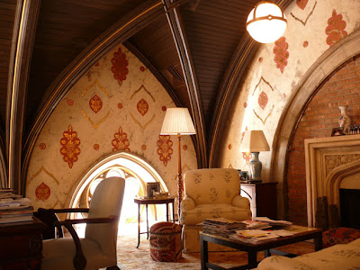
 After posting about converted spaces -I came across the apartment of Cynthia Lufkin in NY in the old New York Cancer Hospital. Her living and dining room and also her den are in the old chapel - AMAZING space! Check out more of the apartment at New York Social Diary. Creative living at its finest.

 I've always been fascinated by people who live in converted spaces. I'm not talking about the boring 'indstrial loft' fad either. Old stores, churches, banks, libraries, schools; Something a little more gracious than a factory with exposed ugliness (admit it, thats what it is). I think it started as a child with the BF Jones library that I mentioned in an earlier post HERE. I imagined the purpose of each room and how I would decorate them. Where would YOU like to live?
 interior from domino - looks like a converted schoolroom to me
 the possibilities of an amazing space.....like here at the ringling museum of art entrance
 it's lofty -but not INDUSTRIAL
  an old store perhaps?
 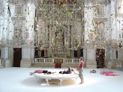 just make yourself at home!


.JPG)


