 In last week's post on the Pan American Building by Paul Cret, I forgot to post one of the most important pictures! This model shows a cross section through the main space -showing the Beaux Arts diagram of progression of spaces perfectly that I had tried to describe. To the left is the entry hall, you can see the glass canopy over the courtyard next with the stairs beyond. Next at the top of the stairs is the Hall of Heros and last is the piece de resistance, the ballroom with the tallest ceiling (with the library below it). You can tell this is the most important space in the building just from this section and all of the others lead up to it; Sometimes a picture IS worth a thousand words! Have a great weekend!
Saturday, September 11, 2010
One last thing
 In last week's post on the Pan American Building by Paul Cret, I forgot to post one of the most important pictures! This model shows a cross section through the main space -showing the Beaux Arts diagram of progression of spaces perfectly that I had tried to describe. To the left is the entry hall, you can see the glass canopy over the courtyard next with the stairs beyond. Next at the top of the stairs is the Hall of Heros and last is the piece de resistance, the ballroom with the tallest ceiling (with the library below it). You can tell this is the most important space in the building just from this section and all of the others lead up to it; Sometimes a picture IS worth a thousand words! Have a great weekend!
Wednesday, September 8, 2010
Remembering La Ronda
 Hard to believe, but it's been nearly a year since La Ronda, the Mizner designed Mansion outside of Philadelphia, met with the wrecking ball. The day it was torn down proved that although the historic preservation movement has come so far in the past 20 years, we still have a long way to go. Obviously a lot of people in this country still don't value the importance of our heritage.
 The great start of historic preservation in the US may have been the destruction of Penn Station in 1963, which even Jackie Kennedy couldn't save. Many organizations (and bloggers!) brought much needed attention to the fate of La Ronda but it was sadly too late. However, the bright spot is that it again brought our architectural heritage into the media spotlight and I hope none of us loose this passion we had for this place. As La Ronda had fallen into obscurity, hopefully other great works will come to light before it is too late.
 A great article summing up the whole debacle is in the October 2010 issue of Architectural Digest, written by Jay Pridmore with fantastic photographs by Craig Kuhner. Hopefully this fantastic issue (the best I've seen in years) heralds the direction of the magazine under its' new editor. I'll leave you with the strong closing statement from the article, a quote from Lori Salganicoff:
"People have to think past their personal ownership of resources because there are some things that ought to outlive them"
Ditto, Lori.
Monday, September 6, 2010
Paul Cret's Pan American Building
 The Pan American Building was completed in 1910 with a very prominent start; Paid for by Andrew Carnegie, opened by President Taft and with President Theodore Roosevelt as the biggest advocate of the organization. While the building kick-started Paul Cret's burgeoning career as his first major commission, it has fallen into relative obscurity.
 According to the historian Marjorie Ingle, the design of this building jump started the Mayan Revival which was popular shortly after 1910 until the early 1930s. How many buildings can boast of starting a fad or entire style? (Gehry's Guggenheim in Bilbao comes to mind)
 Cret studied at the Ecole des Beaux Arts in Paris and you can clearly see the influence in the Pan American Building. While the white marble form is clearly Beaux-Arts style, the details are something that was quite new and maybe a bit odd. They are inspired by the different traditional styles from South America such as Mayan and Aztec (although seen through a French man's eyes).
 However, much of the other detailing is neoclassical and very traditional, expected for the style, such as the figures seen below in the cornice and pilaster capitals. This mix is what makes the building so utterly fabulous in my opinion.
 The rear of the building faces a garden with a central pool. A library was located on the main level (prescribed by Carnegie of course) which opened out onto the garden with the grand ballroom seen above it through large arched windows.
 In Beaux-Arts tradition, the floorplan is the starting point of the design and really is the focal point. Architecture schools today, at least here in the US, still teach based on this beaux-arts method with a diagram which ultimately becomes the (modified) floorplan.
  Here in the Pan American building, there is a central entry point, the foyer seen above, with a long grand procession up stairs flanking an open courtyard, culminating at the main space, the ballroom.
  The essential purpose of this building was entertaining. Therefore, the floorplan follows this diagram precisely with all of the other functions such as offices and the library being worked in around this core. The building was designed around guests arriving for a party or lecture in the ballroom.
As I mentioned Saturday, all of the 'stonework' in the entry is faux - molded plaster. It had many of us fooled! Imagine all of the work that went into the walls being shaped into stone 'blocks', not to mention the garlands of leaves, pilasters, brackets, cornices and all of the other details. The columns at either end of the foyer are marble with bronze capital and bases. Here we have one of the grand stairs (the other is identical) which lead one from the foyer to the ballroom on the Piano Nobile above. Notice the wood beamed ceiling above the staircase and those beautiful bronze sconces.
 Even the smallest details were custom designed by Cret and his staff, such as these access ropes at the foot of the staircase. Rather than a plain hook, there is a Mayan figure to hold the rope back! You can see the faux plasterwork a little better here. Even the rope is gorgeous!
 The courtyard is the focal point of the building's circulation area. It has a retractable glass ceiling(no longer operating) and is open to the foyer and all of the stairs and hallways in the building. The materials are more durable in this space, such as the terracotta freize which runs underneath the wood cornice and brackets of the roof overhang.
 The tree on the left was actually planted by President Taft at the opening of the building: grafting together two species of trees, one from South and the other from North America.
 The fabulous central marble fountain was sculpted by Gertrude Vanderbilt Whitney and features Aztec figures with eyes which light up!
 More of the beautiful glazed terracotta work below depicting maps of the Americas and doves of peace: Peace being the organization's mission.
 Below you can see the glass roof over the terracotta tiles.
 The polychrome wood brackets are really stunning and add a lot of color to the terracotta and beige plaster.
 I thought this tiled water fountain, located behind the courtyard was really fantastic!
 Here we are at the top of the stairs looking down at the foyer. The building opens up even further on the 2nd floor, with office suites opening off the corridors you see running alongside the staircase.
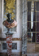
  The main hall upstairs is known as the 'Hall of Heros' and is lined with 50 busts which were given by countries in the organization. George Washington was chosen by the US and is located prominently in the center.
 Flags of the members also line the hall.
  The main ballroom, or 'Hall of the Americas', opens off the 'Hall of Heros' through 5 large doorways, mirrored 65feet across by the arched windows to the garden below and is lit by 3 enormous crystal chandeliers. A meeting was in session during our tour.
 Here we have one of the grand stairs (the other is identical) which lead one from the foyer to the ballroom on the Piano Nobile above. Notice the wood beamed ceiling above the staircase and those beautiful bronze sconces.
 Even the smallest details were custom designed by Cret and his staff, such as these access ropes at the foot of the staircase. Rather than a plain hook, there is a Mayan figure to hold the rope back! You can see the faux plasterwork a little better here. Even the rope is gorgeous!
 The courtyard is the focal point of the building's circulation area. It has a retractable glass ceiling(no longer operating) and is open to the foyer and all of the stairs and hallways in the building. The materials are more durable in this space, such as the terracotta freize which runs underneath the wood cornice and brackets of the roof overhang.
 The tree on the left was actually planted by President Taft at the opening of the building: grafting together two species of trees, one from South and the other from North America.
 The fabulous central marble fountain was sculpted by Gertrude Vanderbilt Whitney and features Aztec figures with eyes which light up!
 More of the beautiful glazed terracotta work below depicting maps of the Americas and doves of peace: Peace being the organization's mission.
 Below you can see the glass roof over the terracotta tiles.
 The polychrome wood brackets are really stunning and add a lot of color to the terracotta and beige plaster.
 I thought this tiled water fountain, located behind the courtyard was really fantastic!
 Here we are at the top of the stairs looking down at the foyer. The building opens up even further on the 2nd floor, with office suites opening off the corridors you see running alongside the staircase.
  The main hall upstairs is known as the 'Hall of Heros' and is lined with 50 busts which were given by countries in the organization. George Washington was chosen by the US and is located prominently in the center.
 Flags of the members also line the hall.
  The main ballroom, or 'Hall of the Americas', opens off the 'Hall of Heros' through 5 large doorways, mirrored 65feet across by the arched windows to the garden below and is lit by 3 enormous crystal chandeliers. A meeting was in session during our tour.
Labels:
Architect,
DC,
history,
Interiors,
Washington
Subscribe to:
Posts (Atom)


.JPG)


