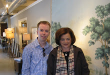
 I hope everyone enjoys their first weekend of spring, perfect time for walks outside! Photo from a walk earlier this week in Lafayette Park in front of the White House.
Saturday, March 21, 2009
spring time walking
 I hope everyone enjoys their first weekend of spring, perfect time for walks outside! Photo from a walk earlier this week in Lafayette Park in front of the White House.
Friday, March 20, 2009
Adlon Party
 Last night I went to the party celebrating Adlon's opening with B&B Italia & MaxAlto and took some pictures to share the beautiful showroom with you!
This....um.....interesting chair greets you at the front door. Brainchild of the 60s -it has an umbilical cord connecting the 'mother' (see the anatomy) to the 'child'. Convienently it kept the ottoman from rolling out the front door! Weird but I'm sure it's probably very comfy. 

The party was in full swing when I arrived! 

Great vignettes had been set up all over the store, I love this shelving system! 

The showroom is housed in an old industrial building with thick stone walls along the canal in Georgetown. I love these old steel windows (Hopes perhaps?) and the rough walls compared with the painted highly polished concrete floor.
 The showroom is set up into individual 'stores' for each brand that they carry. I loved this chair in MaxAlto, one of the guests of honor - creamy buttery leather!
 The showroom is set up into individual 'stores' for each brand that they carry. I loved this chair in MaxAlto, one of the guests of honor - creamy buttery leather!
Juxtoposition is everything in this store! The modern with the 'victorian', the polished with the rough.....so interesting!
 Another great vignette. Notice the shadows -this store has exquisite lighting! See the 'vase' form cut out of cardboard and then a black edge done with a sharpie (?maybe?) creating the form. Thats a fun idea!
 I can't get enough of those walls (I hate these chairs though....it looks a bit like 'star trek' -see I don't love EVERYTHING always).
 This lamp with the purple'ish shade adds some great color to the primarily B&W space.
 Another great vignette. Notice the shadows -this store has exquisite lighting! See the 'vase' form cut out of cardboard and then a black edge done with a sharpie (?maybe?) creating the form. Thats a fun idea!
 I can't get enough of those walls (I hate these chairs though....it looks a bit like 'star trek' -see I don't love EVERYTHING always).
 This lamp with the purple'ish shade adds some great color to the primarily B&W space.
I love these low couches and sections - perfect for a party (obviously!) This was the most popular spot in the showroom!
 The wardrobes had 'clothes' cut out of vellum and backlit: I wonder what intern had the job of making these? Another cute touch in the showroom!
 I loved this little seating nook - check out that gold vase and white screen!
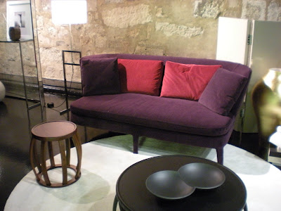 So cute - yeah for color!! Love the stool too! I guess the white rug and bright lighting kept people from sitting here?
 The other guest of honor - B&B Italia - love these ! Also love the red dress, she really stood out in the crowd of black clothed guests!
 Pretty tulips near the giftbags -a reminder that spring starts today!
 The wardrobes had 'clothes' cut out of vellum and backlit: I wonder what intern had the job of making these? Another cute touch in the showroom!
 I loved this little seating nook - check out that gold vase and white screen!
 So cute - yeah for color!! Love the stool too! I guess the white rug and bright lighting kept people from sitting here?
 The other guest of honor - B&B Italia - love these ! Also love the red dress, she really stood out in the crowd of black clothed guests!
 Pretty tulips near the giftbags -a reminder that spring starts today!
I hope you all enjoyed coming along to the party with me! You can visit their website HERE.
 You can visit their website HERE.
Labels:
DC,
flowers,
parties,
Washington
Tuesday, March 17, 2009
Happy Birthday, PVE!
 Everyone join with me on this St. Patricks day to say Happy Birthday to my friend PVE! She has a special relationship with all things green and shamrocky due to the shared holiday! She does such a great job of bringing thought and meaning to everyone who reads her blog through her wonderful drawings. I hope you can all stop by her blog today to wish her a Happy Birthday and a Happy St Patricks Day!
Photo from Nimble2 on flickr.com - he has quite the collection of 4 leaf clovers! Check them out HERE
Monday, March 16, 2009
Try this one...
 Last week I posted some photographs of a new modern condo building here in DC that had just gone up and it wasn't everyone's cup of tea. A few blocks away is a more traditional condo building that you might appreciate: 2501 Pennsylvania Ave.
 Originally an abandoned building ( the corner building seen above ) - 2 adjacent structures were built attached in different styles which helps the entire building seem smaller. I like this approach to city scale. No more city-block sized monster buildings!
Facing Pennsylvania Avenue is the more luxurious, neoclassic part of the building seen in the first picture. I love the limestone faced facade - very grand and beautiful. The penthouse units seem to have terraces, which is a great idea -you can see a close up above.

The original portion was fully restored and the entrance used for the entire newer building. The added tower helps to make the entrance more prominent. I wonder whats inside the tower room?
 The 3rd part of the building faces a smaller side street and houses the entrance to the garage and is a lot simpler, but still very traditional; quietly grand.
 I like how they kept the stone base and used brick above. I think the architect did a great job making these buildings look like the evolution of the city, don't you agree? I think this units are super upscale and way out of my price range, but hopefully there will be a general open house and I can check them out! I'll be sure to share with you if I get to go inside!
The development has a website HERE with great pictures and floor plans. Check it out!
Subscribe to:
Posts (Atom)


.JPG)


