 And don't forget -go to the SATC movie!
Friday, May 30, 2008
S.A.T.C. movie!
 If you are a fan -you know what that stands for! Just a short blog posting today as I'm WORN out from seeing a midnight showing of 'sex and the city' movie last night with friends and about 5,000 other screaming fans in heels (no, not me!).
 Definitely go see the movie! While it has its problems, who cares!! It's a 2 1/4 hour long SATC episode! It is definitely a crowd please - 4 out of 5 stars!
 The fashions are incredible, the apartment Carrie nearly moves into is FANTASTIC and there is even a redecoration of her former apartment (I hope that doesn't give too much away). ENJOY!! Go see the movie so they keep making more!!
Thursday, May 29, 2008
Modern House porn
 Recently while doing some research for a project at work for modern glass canopy's I ran across this BLOG. While I have an affinity towards a more classical approach to architecture (even stuff as modern as this, symmetry and balance are king) this house really struck me and not just for the beautiful photography!
 Designed by Shubin & Donaldson in Santa Barbara, the house showcases the views and sunlight the clients were seeking. The wife (who is an interior designer who studied under Rose Tarlow) sought a smaller sized house which I always appreciate - at a roomy 3,200 SF with 1,400 SF of additional storage in the basement ( you can never have enough storage when you're a collector like me!). The house is also very green and aims at sustainability.
  view from the back deck
 the ground floor plan - that 2nd powder room off the dining room that looks like a sunroom worries me......bad placement!
 the 2nd floor
 yet more views from the living room - that fireplace with built-in wood storage is amazing!
 views from the master bedroom corner window! Thank you for draperies in a modern house!
  Is that a powder room in the middle of hte photo through glass doors off the dining room? That must be a labeling mistake in the floor plan!
 What a magnificent sunset this room must look out over!
Wednesday, May 28, 2008
Paul Cadmus
 Recently I read an article online about Paul Cadmus. I recognized one of his most famous paintings as one I bought as a child on a bookmark at the smithsonian! 'Bar Italia' was painted in Italy while he lived there in the mid 50's and satorizes the tourist in Italy. I think you can see a few similarities between his style of figure painting and John Currin's whom I blogged about earlier. While even more cartooney, it's the same modern but realism style of sketching figures and capturing their essence.
Paul had a very controversal career -I think you can see why and how that went in this painting. In this closeup, he included himself -he is in between the gigilo and the fat guy, his face leaning on his hand. I love learning little things like that about artists - it's sort of like Hitchcock doing cameos in his own films!
Tuesday, May 27, 2008
Nacional Museu d'Art de Catalunya
 While in Barcelona a few months ago, I visited the Nacional Museu d'Art de Catalunya which was near the Barcelona Pavilion and was built for the same world's fair as the head building. It has some of the best views over all of Barcelona and also a fantastic restaurant on the mezzanine level overlooking the city surrounded by a BEAUTIFUL fresco'd ceiling (which is why I went to see it).
 The rest of the museum is amazing though -housing works of art by masters of art from the medieval period to current times including a large portion of the Thyssen Bornemisza collection. Included are some of MY highlights from the museum :-) If you get to Barcelona it's a must-see!


 the back of this ancient church door was so modern looking, I loved it (even had my picture taken beside it!) while the front was more what would be expected -but the colors still so VIVID


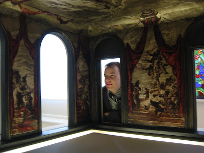
 this was the coolest little model of a room! We had a lot of fun looking into this!

 these 2 portraits were so spanish and SO beautiful! I love the colors


Monday, May 26, 2008
Noah Sofa
 I am so in love with the Noah Sofa from OLY. This is what I wanted my daybed to look like in my apartment, a real couch -but this is so much better! When I was looking for a beautiful daybed I kept finding wonderful examples like this that I loved but wouldn't fit a real twin sized mattress. If you want to make your fortune and want to know what is lacking in the industry-MAKE BEAUTIFUL DAYBEDS that aren't meant for little girls and look like couches!
Subscribe to:
Comments (Atom)


.JPG)


