A few weeks ago, I had the pleasure of touring the
Organization of American States original headquarters with the
ICA. Now, I've had a love affair with this building since early college when I had a (45 page!) term paper I wrote on the building, designed by Paul Cret and finished in 1910; so you can imagine how excited I was to actually take a tour (I had never been inside).

Rather than jump in with the main building, however, I'll start small with an auxiliary building I had never noticed behind the main structure that started life as the house for the director of the organization.

Located behind the main building at 18th and Virginia Avenues, NW, it's hard to imagine anyone living here in noisy tourist central (other than at
1600 Pennsylvania Avenue across the street of course!). Remember though, when it was built, the national mall and the monuments mostly did not exist. Instead, a canal, warehouses, random farmhouses and marshland were its' neighbors. It really was the edge of town.

What struck me first about the house were the small porportions. Look at the guard in the front doorway -that is SHORT! This is a
private space. Immediately inside is the staircase: graceful but purely residential.

The house was turned into an art museum for the organization a number of years ago. The exterior loggia on the rear of the house, which faces the Pan American building creating a courtyard, was enclosed to provide security and also extra display and entertaining space.

Imagine this space being open to the lovely courtyard and pool; This is a LOVELY room.

Much like the adjacent Pan American building, Cret and his staff designed all of the tile work and ornament found throughout. In Beaux arts design, the most detail is found in the most important space and the spaces leading up to it become more ornate as you progress. Therefore, the exterior of the house remains very plain out of heirarchy to the main building.

However, within the house itself, this exterior room was treated as a special space: a destination. It makes sense, who wouldn't want to spend time here; breakfast, lunch and dinner!

I love the contrast between the natural terracotta and the turquoise glazing. All of the figures in the decoration reflect the union of North and South American design.

I love the grillwork on the doors back into the house. These details are where Beaux Arts style thrives in my opinion.

The tilework doesn't stop at the loggia, the guardrail down to the pool off the rear terrace also features some amazing detail.

Even the bronze benches designed for the space reflect the Mayan motif's found throughout. Everything is part of an integrated design, no detail was forgotten.

I will be showing more of my pictures from the main building next week, stay tuned; it will blow your socks off!
 As promised, Monday I will post on the Pan American Building by Paul Cret. As a teaser, check out the entry way ceiling - this is all plaster, detailed to look like stone, which somehow makes it so much more interesting to me.
  Also included is a grand ballroom, the climax of the Beaux-arts diagram, but more on that later -for now, enjoy your weekend!


 The hotel in general has a very French flavor, which may hark to the time Thomas Jefferson spent in that country or maybe it just fit the space.
 The entry has beautiful black and white marble floors, white woodwork and dramatic deep colored walls which show off their extensive DC history collection perfectly.
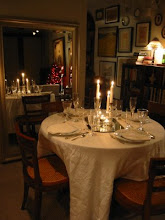
 In the rear of the first floor are a series of business spaces with beautiful wood paneling and really stylish furniture - I could work here, couldn't you, or at least curl up with a good book?
 It definitely has a distinct quietly residential feeling; just what you want in a luxury hotel.


 Rather than jump in with the main building, however, I'll start small with an auxiliary building I had never noticed behind the main structure that started life as the house for the director of the organization.
 What struck me first about the house were the small porportions. Look at the guard in the front doorway -that is SHORT! This is a private space. Immediately inside is the staircase: graceful but purely residential.
  The house was turned into an art museum for the organization a number of years ago. The exterior loggia on the rear of the house, which faces the Pan American building creating a courtyard, was enclosed to provide security and also extra display and entertaining space.
 Imagine this space being open to the lovely courtyard and pool; This is a LOVELY room.
  Much like the adjacent Pan American building, Cret and his staff designed all of the tile work and ornament found throughout. In Beaux arts design, the most detail is found in the most important space and the spaces leading up to it become more ornate as you progress. Therefore, the exterior of the house remains very plain out of heirarchy to the main building.


 Even the bronze benches designed for the space reflect the Mayan motif's found throughout. Everything is part of an integrated design, no detail was forgotten.


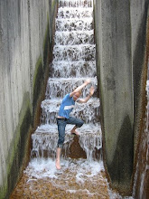
 I have always loved the fountain in the parterre but never thought much of the pattern which runs along the base. Even on a (rare) cloudy day in DC, the water would sparkle as it hit the points of the pattern; ingenius detailing.
 I have to remember to get out and explore the city even when I don't have the excuse of a guest in town. Hope you had a great weekend as well!


.JPG)


