Booth brought on renowned Finnish architect Eliel Saarinen to help him not only develop the campus architecturally but the mission of the multi-faceted academy with a seemingly endless budget. See my previous tour of Saarinen's house on campus HERE.
Sculptures by Carl Milles dot the lush gardens and many water features. Milles had moved from Sweden in 1931 to be sculptor-in-residence at Cranbrook and remained until returning to Sweden in 1951.
The campus came at an intriguing time in architectural history. It started as rather arts and crafts in the 1920s, played with Art Deco in the 30s, and the later buildings from the 40s and 50s are a precursor of the International movement.Artists are still in residence in the Saarinen properties.
Fragments of antique sculpture are embedded into the brickwork on the older buildings.
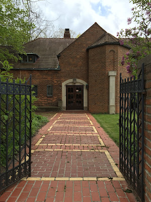
The different areas of the campus each have defined portals or gateways like this arch into the boys and girls schools (a middle school run by Episcopal diocese). The inscription wisely reads "A life without beauty is only half lived".
No 2 details are alike. Have you seen such interesting Ionic capitals before; the art-deco influence at work.
Notice that each bracketed capital is completely different!
I loved this cloistered garden off the infirmary.
The ironwork found throughout the campus on multiple gates and fences are incredible.
While there are many disparate styles and ages to the buildings they all work together.
Around each corner is a surprise: a sculpture or fountain.
The Boys and Girl's campus have this lovely stone pergola. Imagine it with roses or wisteria!
As you can see in my snapshots we had unusual weather ranging between hail, flurries, and sunshine.
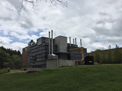
The tower seen above was really intriguing and could be seen throughout the campus but I don't know what purpose it served.
The building on the right which looks like a chapel had these intriguing paneled stone entries.
Another beautiful sculpture and water feature.
Many of the buildings are connected with covered walkways. This one was intriguing with little domes inserted into the poured concrete surface.
More amazing ironwork. Everything was done on site by artisans living on campus.
These doors led to what appeared to be a chapel but is actually the dining hall. Check out those lamp posts!
Place of worship of food.
This shot above sort of connects all of the previous pictures of the kid's campus area so you can get a sense of how they relate to one another.
Another 'entrance' from what was originally intended to be the public entrance (but was never used) is this lovely telescoping arched breezeway which leads to the arts academy.
The telescoping of the breezeway makes it look much deeper than it actually is by forcing the perspective. The brickwork is really lovely, a sort of herringbone ceiling pattern.
And like I said the details are everywhere. A pair of centaurs led down to somewhat forgotten water garden.
These were intended to be the main gates at the public entrance leading to the museums but proved too difficult to monitor people coming and going off campus.
This 2nd century roman capital lies in a courtyard where Ray and Charles Eames had their workshop designing much of their famous furniture we all enjoy today.
The art museum was hosting a graduate exhibit with some really interesting projects. I was all eyes for the architecture however and loved these travertine stairs -notice the integrated handrail detail.
I did love this student project. The tent was painted with scenes of the forest and a speaker played sounds of crickets.
Another project by an architecture student was an outdoor pavilion with intriguing plays of light and color through a skylight playing on sheer curtains.
Another great detail in the basement of the art museum was this curved metal barn door; not from Saarinen I don't believe but a modern addition.
Antique stained glass in the lobby had wonderful views of the garden.
The site is constantly changing. It's a living, breathing arts campus and not stuck in time. Buildings have modern but sympathetic additions and modern sculpture dots the landscape along with the original artwork.
This addition behind the museum was particularly successful I thought in being of today but melding nicely with the old.
And not to fear, the modern buildings also have thoughtful details like this rainchain instead of a downspout. Notice the lovely patinated copper gutter.
If you're ever in the Detroit area I highly recommend a visit to the Cranbrook Academy of Art, you won't regret it!






.JPG)


