While on the topic of LA, I also visited the Getty Center. This is probably one of the most beautiful places I've ever visited! Besides having a fantastic collection of European decorative arts from the 17th thru 20th centuries, the compound has incredible views over all of the LA area as it is perched on a big hill (the Santa Monica Mountains). Above is the compound from the approach.

The collection of buildings are placed in a collection of gardens and public spaces.

This staircase really caught my eye: I love the zigzag it creates on the exterior.
 View of downtown LA.
 Design began by Richard Meier in 1984, construction began in 1989 and the center finally opened in 1997 -it cost upwards of 1.3 BILLION dollars!!! The exteriors are clad in Meier's trademark 30" square aluminum panels and travertine marble. As there was basically an unlimited budget, Meier was able to create a perfect place architecturally. His 30 inch grid that he works off of is felt here very strongly, both on wall planes and the floor.

The gardens are beautiful. Here this trellis is painted lavendar, the color of shadows on the white walls.

As the building is on a hill, it's built down deep -here you can see just how big parts of the building are!

The outdoor spaces really are the most important here -the outdoor/indoor California lifestyle at work in architecture!

I loved the play of levels on the hilly site.

Beautiful views everywhere!
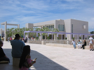
Another closer view of that lavendar trellis!


You could walk down that exterior bridge to get a closer look at the view -I love the keyhole in that wall for the path!

What CAN'T you see from here?

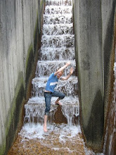
Lots of benches and places to absorb the view and the sun. People always tend to gather near water elements!
 A pattern I have fond memories of is Harebell by Coalport. My mother has a large teaservice set in this pattern that was her great-grandmothers. She would use when I was a little kid when entertaining her friends. Of course now it's in a box somewhere in their basement!


 A Harebell is another name for a bluebell that you may be familiar with. This is a flower found in Great Britain and all over northern Europe that grows in the late summer / early fall. The flower is a pale blue, but in this china pattern is painted as a vibrant turqouise which is brilliant against the white background. While the teacup shape is a bit old ladyish for me (but aren't all teacups in general?) this is really a beautiful pattern!

 Images taken from ebay
 Since it was a lovely day, I decided to take a short little walk and show you more of Georgetown, DC's most charming neighborhood. We'll start here at the 'heart' of Georgetown - the gold dome in the distance (my bank!) is at the major intersection of M street (the commercial and tourist street) and Wisconsin Ave (the street you see here with smaller stores and more local traffic).


 Another pretty side street with smaller houses. Trees make every street more welcoming, don't they?
 A welcoming front stoop, I love geraniums!

 This is a new 'loft' condo building facing the canal. I wish I could live here!!
 It's huge!! One of the penthouses is currently selling for $10 million, a bit out of my price range (rolls eyes). Some of the units have views of the potomac river while others face the canal here.
 This is the opposite side and view from the condos. Beautiful! That is Cady's alley on the right which houses a lot of designer showrooms.
 I love this little building -it houses an architectural firm. It's built right into that wall!


 While on the topic of LA, I also visited the Getty Center. This is probably one of the most beautiful places I've ever visited! Besides having a fantastic collection of European decorative arts from the 17th thru 20th centuries, the compound has incredible views over all of the LA area as it is perched on a big hill (the Santa Monica Mountains). Above is the compound from the approach.


 the original
 the ladies at Saks
 and AGAIN at Saks....see a pattern?

 yes, Meg Ryan, I'm as confused as you are! why is this movie so bad after 14 yrs in the making?


.JPG)


