Tuesday, April 8, 2014

Those trashy Greeks.....

No the title is not meant to be derogatory but hopefully it caught your attention!  Rather, how fabulous is this trash can in the "Greek style" from the 1967 movie Playtime. I watched this movie last night at the recommendation of professor Michael Djordjevitch from the NYC Beaux Arts Atelier. If you get a chance the Atelier is a wonderful organization which gives intensive courses in classical architecture and drawing ranging from 1 week intensive courses to 1 year programs (I've been meaning to take the 1 week course myself). The movie is notable for its intricate and daring sets which are a riff on modern architecture and urban planning -they make this funny movie all the better (thro.out greek style)! Be sure to add Playtime to your netflix queue, you won't regret it.

Friday, April 4, 2014

Accents of color

The spring/summer 2014 issue of New Old House magazine features a new house by architect Rafe Churchill  that is traditional in its detailing, spartan even, but modern in its outlook. Most striking to me was the use of color throughout the house.
Today the norm is white or cream painted trim in every room right? Any color in this generally seems strange or odd. Not quite that long ago colored trim was commonplace and it's a device interior design is missing today. Even in my 1930s apartment I discovered all of my trim had originally been a bright turquoise while doing some work!
 I especially loved this screened porch -my favorite 'room' in the house.
 The cheerful apple green paneling in the family room is cozy, charming, and eye catching.
 The dining room features mustard yellow trim with white walls that tie into the kitchen.
Upstairs paint is taken to another level with glossy white painted floors in this bedroom. Interestingly while the trim is also painted a soft green, the door is left the natural wood.
Even this unusual 'country mancave' as I refer to it features dark painted trim, albeit with exposed stud walls. I'm not sure I'm brave enough to risk this much color in such a way in my own home but would you, could you?  Maybe we should all take a clue from the not so distant past and skip the white trim for awhile.
All images by John Gruen

Monday, March 31, 2014

Let there be light

One of the most underrated light fixtures in my humble opinion is the sconce. Mounted at eye level sconces create flattering light unlike the shadow lines created on ones' face from overhead lighting. Also, they don't take up precious table space like lamps or clutter a room like floorlamps.
This weekend I helped a friend install some antique sconces we had picked out at Artisan Lamp (my favorite lighting source here in DC) onto some existing built-in bookshelves in his den. The effect is magical particularly in this small room without any existing lighting!
Not only are they the jewels of the room, the warm light cast by them is ultimately flattering and practical. Don't forget sconces in your next project!

Friday, March 28, 2014

Chapin Residence floorplan

One of my favorite books that I've mentioned before is the monograph of H.T. Lindeberg's residential work. Many of his smaller projects are shown including just these 3 intriguing photographs of a rather odd house in Lake Forest, Illinois in 1926 for Lowell C. Chapin, Esq.
If you study the plan you'll notice that the house consists of a rather small entry vestibule and an enormous living room. Thats all for public space! A warren of servants quarters fill the remainder of the first floor while the 2nd floor holds 4 bedrooms. Strange but ultimately practical.
And as you can see the 'simple' house packs a lot of punch with that steep French roofline.  Rather a quirky house and it leads me to wonder how it has changed over the past 90 years or is even still extant.

Wednesday, March 26, 2014

Frank Lloyd Wright's Taliesin West

A few weeks ago while in Arizona I visited Taliesin West, arguably the most well known site in the area. Frank Lloyd Wright started the 'camp' in 1937 when his doctor suggested spending the winters in the southwest for his health. He would winter here until his death in 1959.
Frank Lloyd Wright fell in love with the desert landscape overlooking Paradise Valley just north of Scottsdale. It's easy to see why; still stunning.
Unlike many modernist architects Wright loved art and decoration and dotted his campus with items from his collection of Asian art as well as these Native American carvings above found on site.
At the time Wright was operating an architecture school and used his students as indentured servants of sorts. The students did the construction: collecting the stones on site and building the formwork to erect the structures on 'campus'. This might have been seen as slightly unfair but was a marvelous education for these young architects ( win win? ).  Above you see a corner of his office; the glass was a later addition (originally canvas was used in place of glass for the 'windows'.
Say what you will about Frank Lloyd Wright (most over-rated architect ever?) but the man was inventive. Forms and buildings like these were straight out of his imagination and unlike anything else at the time and have stood the test of time.
While on the topic, architects and designers love to roll their eyes at the name of Wright partly because he has become such an (overblown) icon. He is the only architect that the average person could probably name!  I think we need to give credit where it is due.  Wright may not be the ONLY great architect but he certainly was one of the most important designers of the 20th century.  The cult-like status awarded to him is bizarre but I can at least see the reasoning.
The campus faces the valley stretched out before it with a small lawn and pool - an oasis in the desert.
Above to the left you see the architecture studio (still in use by students )with his own house / quarters to the right. His office we saw earlier in the post is to the far left.
Another piece of Asian art incorporated into the landscape above.
And here we see Wright's favorite view in the world of Paradise Valley down to Scottsdale (until the power lines were installed!).  Wright lobbied to have them removed but nothing could be done.
The foundation still has an on-site sculptor (former student of Wrights) and her work dots the campus.
I love the way the buildings work with the surrounding landscape.  Above another fountain stands between Wrights private quarters and the screening room.
You heard that correctly, screening room! Wright was a huge movie buff; his son was a Hollywood agent and his granddaughter was Anne Baxter!  And as a precursor to current design the 'tv' ( or projector screen rather) was above the fireplace. The room also boasts this intriguing ceiling and coved lights.
This breezeway between Wrights quarters and the architecture school beautifully frames the view.
Above to the left is the screening room with Wright's quarters on the right.
This intriguing bell tower announced meal times.
I just fell in love with the desert landscape and can see the draw for Wright.
Fountains and water create little oasis pockets throughout the garden.
The lines of the buildings echo the lines of the desert floor - harking back to Wright's Prairie style.
Art works are to be found throughout the garden.
I loved this quote from Chinese philosopher Laotse  on the walls of the theater / gathering space: "The reality of the building does not consist in roof and walls but in the space within to be lived in";  A statement that's easy to forget in the planning and design of a building.
All of the fountains attracted bees and other desert wildlife -always a surprise!
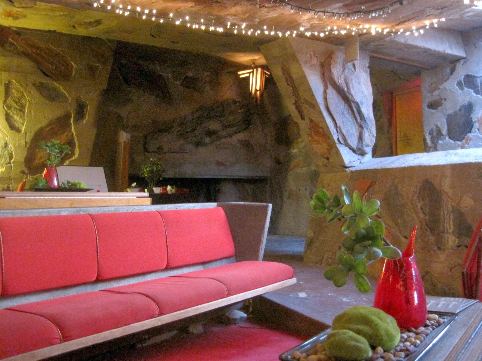
The most interesting building on campus was the cabaret - still in frequent use.  Wright designed it in the shape of a hexagon to have perfect acoustics and to my untrained ear they were pretty amazing.
Mrs. Wright strung the uncharacteristic Christmas lights along the ceiling but they are a nice touch. I'm sure Wright would be appalled! All of the other fixtures and furniture in the room were custom designed by him.
I hope you enjoyed this brief look at Taliesin West through my eyes. For more pictures (special privileges much?) check out the blog of Martha Stewart who was allowed to take photos in areas that we weren't right around the same time I visited!  If you find yourself in the Phoenix / Scottsdale area make sure to check out Taliesin West!

Wednesday, March 19, 2014

Nesting in my apartment

I've had a lot of changes in my apartment recently which is strange because aren't we meant to nest in preparation for winter and not spring? Regardless I thought I'd share some of these upgrades as they're really quite exciting for me!
A few months ago I purchased this antique armchair from an estate sale which had last been upholstered in the early 1960s.  While the fabric was nice in its own way (an embroidered silk) it was not quite to my taste and rather dirty.
Upon the recommendation of my friend Michele from the blog My Notting Hill I checked out Haute Fabrics in Ballston, Virginia (a DC suburb). There I found this lovely hand printed linen with a subtle paisley fabric that I just loved. I also found Urban Castle Interior Solutions who proved to be an excellent upholsterer after my last one had sadly retired. I worried it would perhaps be a little bland but I have such a random assortment of things that I love in this room that I thought the neutral tones would tie everything together.
At the same time I purchased this lovely Safavieh rug which really anchors the space. This is my living room in a 1 bedroom apartment so I really LIVE in here!
Now I have a comfy chair in which to read and relax which anchors this corner of the room- just what I always wanted! Now I just have to start looking for the perfect sofa to replace my underscaled loveseat (so no comments about that!).
I received no compensation for this post -just sharing some excellent resources! Picture quality is lacking because these were taken with my phone.

Wednesday, March 12, 2014

Exciting News: Kips Bay 2014

Exciting news has just been released about the 2014 Kips Bay showhouse. Not only will it be held within one of the 1884 Villard Houses by the famed architectural firm of McKim, Meade, and White but the list of designers selected is stellar!  Much of the rest of the building is the New York Palace hotel which looks stunning (in case you need someplace to stay while visiting the showhouse!)
The list of talented designers with links to their websites are as follows:
Carrier & Company Interiors Ltd.
Christopher Peacock
Cullman & Kravis Inc.
Darryl Carter, Inc.
Edward Lobrano Interior Design, Inc.
Ingrao Inc.
John Douglas Eason Interiors
Juan Montoya Design
Kirsten Kelli, LLC
Mark Hampton LLC
Markham Roberts Inc.
Martyn Lawrence Bullard
Matthew Quinn
Mendelson Group, Inc.
Meyer Davis Studio, Inc
ODADA (Orlando Diaz-Azcuy Design Associates)
Robin Sacks Decorative Painting
SPAN Architecture
Vincente Wolf Associates
Villalobos Desio
William T. Georgis Architect
Young Huh, LLC

Stay tuned for more details and a history of the structure. The house will be open to the public May 1 until May 29th - I'll see you there!

Wednesday, March 5, 2014

David Mayernik lecture in Georgetown

Join the Washington Mid-Atlantic chapter of the ICAA in welcoming David Mayernik, architecture professor at Notre Dame, author, urban planner, artist, and architect,  to Georgetown to discuss his latest book The Challenge of Emulation in Art and Architecture. I've been told by his former students that he is a charismatic and inspirational speaker!
Emulation in the classical tradition was a challenging middle ground between imitating and inventing.  The disappearance of emulation fissured artistic production in the later 18th century into either copying the past or continually seeking novelty, approaches confirmed in the 19th century and mostly taken for granted today. Mayernik will show instead how emulation operated for artists and architects of the Renaissance and Baroque, and will describe his own process of emulation as an argument for its recovery today.
Find details on the event scheduled for Thursday March 13, 2014 on the website HERE. Hope to see you there!

Tuesday, March 4, 2014

Classic style doesn't date

 As you well know I'm a firm believer that classic style doesn't date.  An example of this is a room by talented designers Tom Fox and Joe Nahem from the 1980s when they decorated the dining room of the Castles on the Sound showhouse (featured in the book Interior Visions).
Working with the great bones of the space, mahogany paneling and a stone fireplace surround, they re-envisioned the formal dining room for everyday use TODAY (or at least 1980s today). Beautiful classic furniture, art, and objects create a space that anyone would be happy using in 1980 or 2014. How many times have you redecorated your own living or dining room since 1980 and at what cost? Do we need any more reason to shun the overtly trendy and revel in classic style