Thursday, May 9, 2013

An ingenious solution

While reading through the April 2013 issue of House & Garden I came across an intriguing little project that I just had to share! When designer Roger Hall had proposed an addition to his 17th century listed house and had it rejected by the planning authorities, he decided to build a garden folly which would give him and his family the extra space they needed as well as provide a focal point to his garden.
He calls the space his 'Posh Shed' and it certainly is closer to posh than shed. What shed do you know of contains a kitchen, bath and working fireplace? The pavilion houses guest quarters as well as a studio for his work in an 18'x18' square; talk about small living at 324 SF (the size of the smallest studios found in NYC).
The pavilion matches the style of the main house which you can just glimpse in the image below including the same beautiful stonework and slate roofing. Behind the fireplace above are a compact mini kitchen and full bathroom for guests. I think I would spend all of my time out here and never go into the main house!
Above you can see how from the garden the pavilion looks like one small albeit tall room but when seen from another perspective 2 floors are clearly visible. I vote this is a clever solution to a problem that makes the end result better as a whole than the original proposed addition - what do you think?
Photography via the article by photographer Sarah Hogan

Wednesday, May 1, 2013

Do you MOO?

Not MOO cows - MOO cards!  I recently received an order of lovely new blogger cards which I ordered from Moo after hearing about them from everyone (Habitually Chic and Slim Paley for example). The mini-MOOs are half the size of an ordinary business card and oddly enough are the same proportions of a blog header! I ordered them in the matte finish and they arrived within 2 days of placing the order online, couldn't have been easier!  Save 10% off your order HERE.  They also offer stickers, postcards and a wide variety of products and finishes. The cards are available with up to 100 images on the back side (although I ordered mine all the same blog header beautifully drawn by the talented PVE).
What have you ordered and been pleased with lately?
I received no compensation for this post, just happy to share a good product!

Saturday, April 27, 2013

A lovely stone house

It's been awhile since I shared a weekend picture and thought I'd share this adorable stone house I came across last weekend in the Arlington,Virginia suburb of DC.  Houses such as this are always my favorite! I especially like the mature landscaping which provide dappled sunlight in our notoriously hot and humid summers but allow for full sun in our cool winters.  My only comment would be the 'fake' shutters flanking the double windows on the ground floor - don't need them!  What do you think of the house?

Thursday, April 25, 2013

Georgetown Housetour - this weekend!

Don't miss the Georgetown house tour THIS WEEKEND - April 28. This is the longest running house tour in the country and benefits the ministries of St John's Episcopal Church.
 Nine beautiful houses of varying styles will be featured on the tour including these 4 pictured here.
Also included is a delightful tea at St John's Parish Hall. I'm most excited by seeing inside the Georgetown Stables below, long ago converted into a quirky residence. I saw them retouching some paint in preparation for the tour just a few weeks ago and it should prove to be very interesting!
Also upcoming as part of the Georgetown Housetour is a lecture given by architect Gil Schafer on May 9th. Information is at the housetour website. Hope to see you there (at both events)!!
Photos courtesy of the Georgetown Housetour.

Tuesday, April 23, 2013

Book Review: Michael G. Imber Ranches, Villas, and Houses.

I recently received a copy of the new book Ranches, Villas, and Houses on architect Michael G. Imber and his brand of vernacular, southern-styled classicism which was utterly fascinating to my north-eastern eye.  These projects are so refreshing because they suit their numerous locations: no Cape Cods in the heart of the desert if you know what I mean. Recognize the rendering above from a project in Alys Beach?
The book is broken up into 3 sections covering the subjects at hand. The Butcher Ranch in Gonzales County, TX, seen below is probably his most well known project. Interestingly enough the project was funded by the client's sale of a Georgia O'Keeffe painting - a fair trade, don't you think?
While the styles vary throughout the book and project to project, the attention to detail and great little moments such as the round window or the curvelinear plasterwork remain constant.
I thought the fluted column fireplace in the living room below was a really playful adaptation of a common element which reminded me of a Scandinavian wood stove.
The beaux-arts style renderings which Michael does early on for each project are really beautiful and here he explores the materiality for each project.
This book is full of places you will want to visit like the courtyard pool below!
My favorite project featured in the book is a pair of exquisite Palladian Villas completed for a brother & sister in Roswell, NM. While this may seem a weird fit for New Mexico, the climate is ideal for such a style, the clients are Italian, and honestly, who can ever say no to Palladian anything? (not this architect!)
 The floorplans of both reveals just how personal each house is.
 The brother's house features this kitchen which is probably in my dream house.
Imber recently completed the Southern Living House for the eponymous magazine in 2011. I loved how the early sketches, seen below, reflect so accurately the finished project.
 Don't miss out on this large-scaled gorgeous monograph - a must for any design library!!
All photos courtesy of Rizzoli.

Thursday, April 18, 2013

Book Review: The Welcoming House

I recently reviewed a beautiful copy of the book "The Welcoming House" by Circa Interiors owners Jane Schwab and Cindy Williams and couldn't have been more pleased.  These talented designers write a charming and useful advice book about how to turn your house into a home with inspirational images of their own projects and homes.
One of the few similarities found within their many projects illustrated in the book is spareness. Their key to a peaceful and welcoming home is an absence of clutter; I'm on board with that! I love how the tv was hidden in the paneling of the above family room. They also are firm believers in using what you have: fine china, silver, living and dining rooms, etc.  Don't save it for special occasions, use it today and everyday!
The projects featured cover many different styles but are united through calm palettes and clean lines. I love their mantra of a few 'special' pieces in each room, such as an antique or interesting work of art, and choosing clean lined furniture to complete the space. I loved the master bathroom above treated as a real room; so comfortable!
Another clever detail found in the book was this powder room hidden behind a framed tapestry.  While I'm not sure I would use this in such a public application, it could be useful in hiding a closet or utility space.
 My favorite project was one completed  in conjunction with their friend, noted architect Bobby McAlpine. This bathroom in particular was just amazing. I'm not a bath taker but would reconsider that for this setup!
Definitely check out this book to see a number of inspiring other projects. I definitely need to try to visit one of their 2 shops now!
All photos courtesy of Rizzoli

Tuesday, April 16, 2013

2013 DC Design House

As I mentioned in my teaser yesterday, last week I attended the preview of the DC Design House open now through May 12th. The showhouse raises money for Children's National Medical Center, a very worthy cause. The bar, located on the first floor, was one of the few built-in spaces (kitchens, baths) which was totally changed. Andrea Houck changed out the builder grade bar countertop for luxurious onyx and filled it with fun, vintage barware. I love that she subtly lit the glass shelf edges with LED lights causing them to glow and also added a beautiful glass lamp for ambiance.
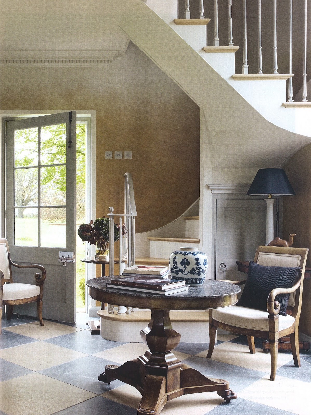
Victoria Neale completed the cozy family room, centrally located off the main hall. I love the curtains which really complete the room and the linen and bleached oaks tones are very trendy right now.
At the very top of the house, Savant Interior Design included a built-in fish tank into their media room; an underused element in such fun spaces I think!
Yes; family room, media room, library, living room - this house is BIG, huge in fact. You certainly get your money's worth on the tour this year!
David Mitchell decorated the wood paneled library with views out to surrounding trees; a very cozy space which almost feels like a treehouse. Mitchell believes in comfortable rooms where all the furniture can be used and enjoyed. This room certainly fits the bill!
 I loved this mission style chair with the wool plaid fabric.
 The mix of warm elements makes this one of the coziest rooms in the house.
As I mentioned the house contains many sort of 'extra' rooms - such as a lower level dining room (in addition to the formal dining room and the breakfast room off the kitchen!).
This dining room was beautifully decorated by Scott Cooke in a very traditional vein which you know I love. The room is very large and even contains a sort of library nook looking out onto the backyard.
Cooke took a cue from the elaborate tray ceiling and placed a round table in the center of the room. Round dining tables are my favorite and I love the comfortable upholstered chairs he choose, perfect for lingering over long dinner parties.
Beautiful antiques fill the room such as these candle sconces. Dining by candle light is a beautiful thing, I'm so glad he included them (wicks correctly pre burnt I might add )!
Another corner of the room featured this beautiful vase atop a gilded pedestal, artfully lit. I love the wood floor detailing.
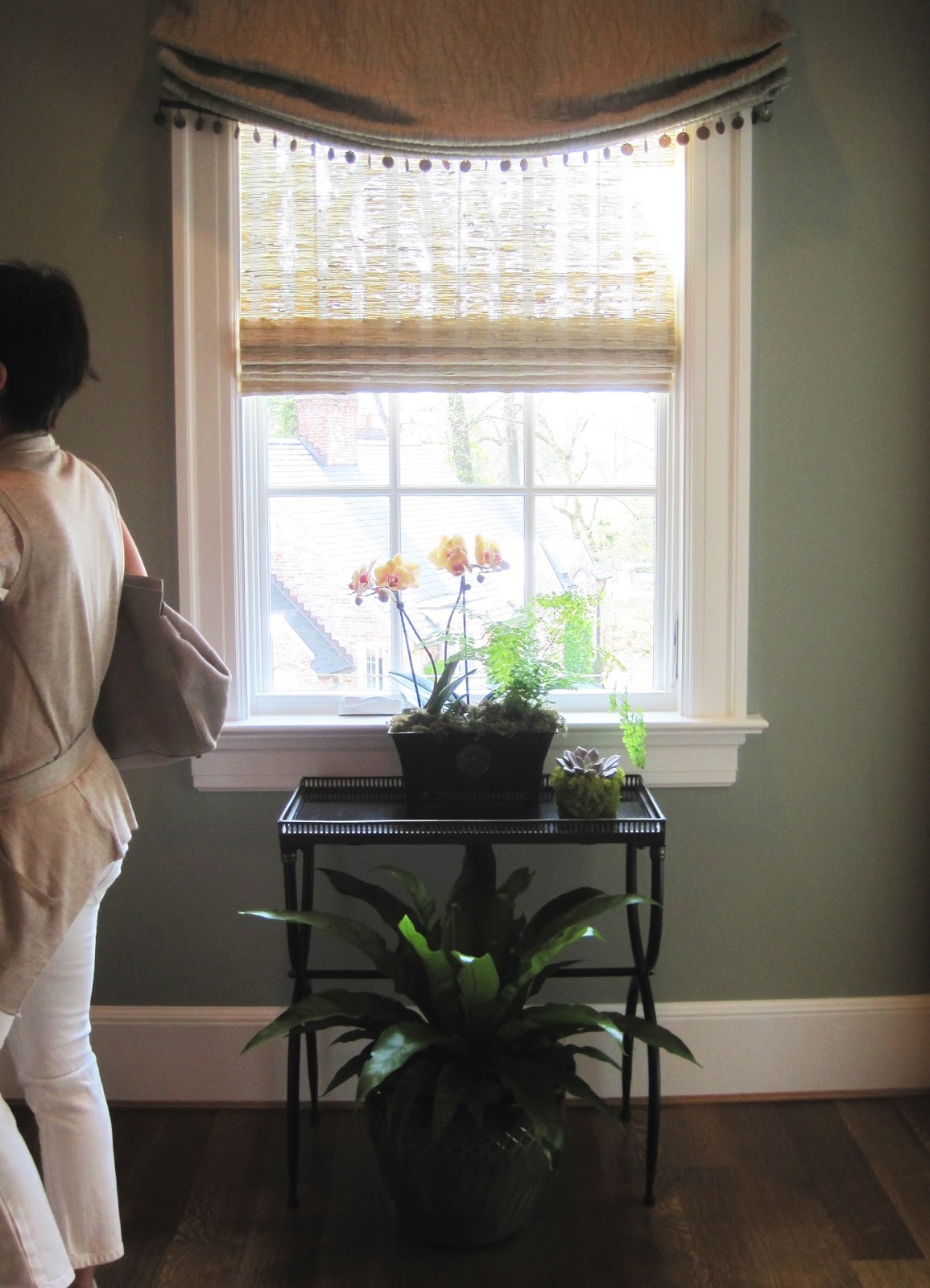
The large hall on the 2nd floor outside of the master suite was decorated by Claire Schwab out of Alexandria. Schwab choose beautiful moss tones with hints of orange to create a cozy landing out of what otherwise would be a banal hallway.
 I mean this as the highest compliment when I say it felt very 'Martha Stewart', particularly the plants in front of the window.
One of the most talked about spaces was the morning room decorated by Iantha Carley. The cheerful, sunny room was fitted out with a variety of beautiful textures and patterns but what I most appreciated was the attention to small details, such as the orange colored dog bed in the corner!
Saving the best for last, by far the most successful space in the house is the Master Sitting room on the 2nd floor designed by Michael Hampton.  Hampton based the room on the beautiful flame-stitched carpet from Patterson Flynn he had always wanted to use on a project; showhouses are great for such experimenting!
The room is a luxurious retreat with soft, warm neutrals comforting the user. While the house this year feels harmonious with the rooms flowing nicely together for the most part (unusual for a showhouse), this was still a soothing room to enter. Recognize the side table from Bunny Williams's Beeline Home collection?
Much loved were the towering Circa light fixtures on either side of the bookcase. Notice the faux bois wallpaper which has been cut into squares and alternated to create movement on the walls? Great details!
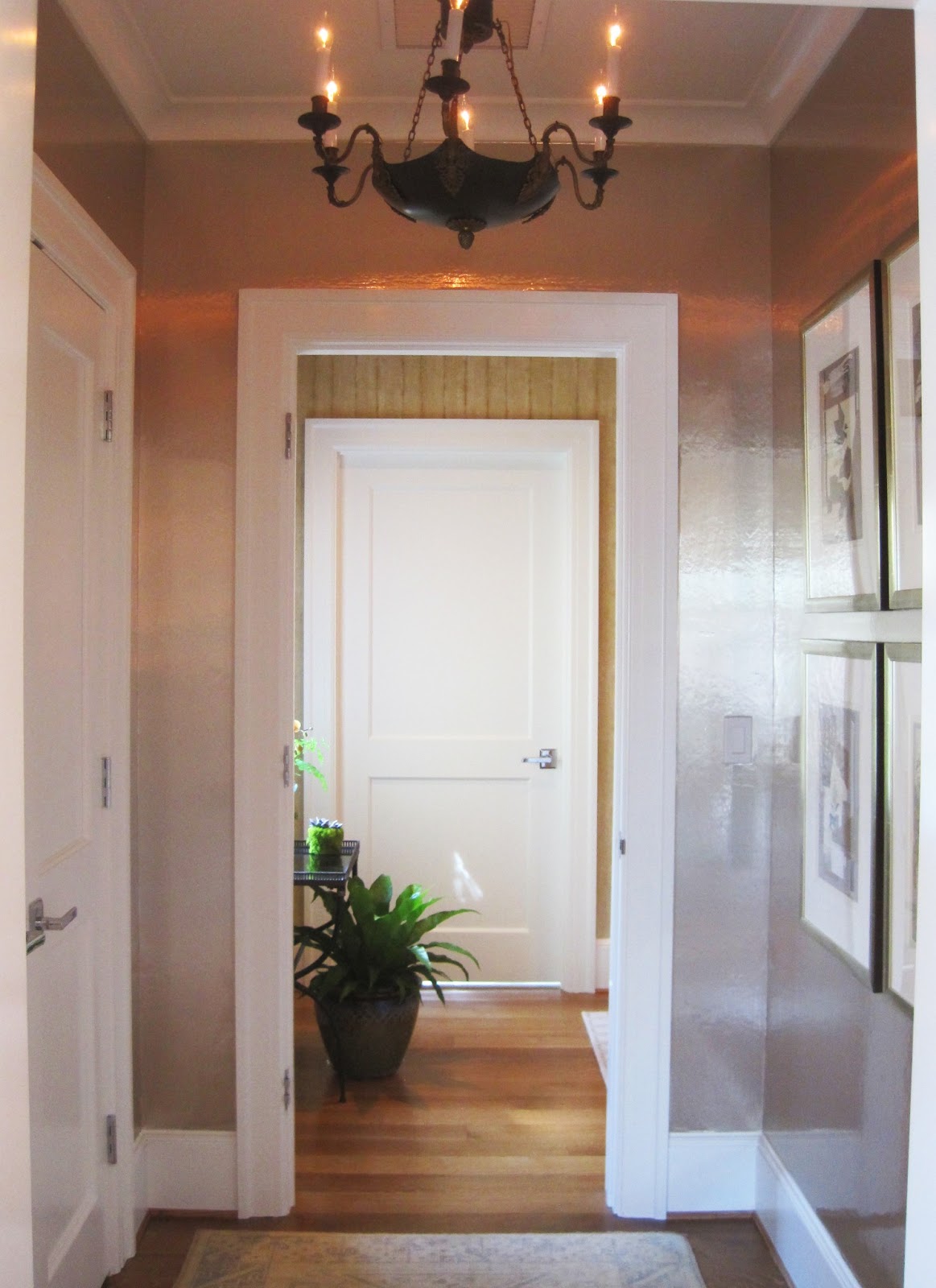
The vestibule is papered in a fantastic luxe lacquered wallpaper which adds glamour to the tiny space. I loved the neoclassical light fixture which Hampton says he got off ebay for only $200 years ago (I love finds like that)!
The room is anchored on a comfy daybed in the center of the room ideal for lounging or even extra sleeping. Great light fixtures throughout the room provide a nice layer of detail and finish.
Be sure to visit the showhouse this year located in Wesley Heights along Foxhall Road, you won't regret it!
Read more coverage by other local bloggers here:  Design du Monde, DC by Design, and My Notting Hill

Monday, April 15, 2013

DC Design House teaser

Last week I attended a preview of the DC Design House which is located on Foxhall Road. Before I bring you my favorite rooms, I thought I would bring you some fun ideas from Designer Regan Billingsley.
Generally bathrooms in design houses are either filled with loud wallpaper, passed over, or simply left with the door closed.  However, Billingsley made it a prominent feature of her Teenage Boys Room.  The black painted doors were highlighted with the sides painted a bright red. That pop of color with the door open was amazing!  I also loved the message she put on the wall backwards only legible in the mirror "Don't grow up, it's a trap".  Wise words from a clever designer! More tomorrow......