Victoria Neale completed the cozy family room, centrally located off the main hall. I love the curtains which really complete the room and the linen and bleached oaks tones are very trendy right now.
At the very top of the house, Savant Interior Design included a built-in fish tank into their media room; an underused element in such fun spaces I think!
Yes; family room, media room, library, living room - this house is BIG, huge in fact. You certainly get your money's worth on the tour this year!
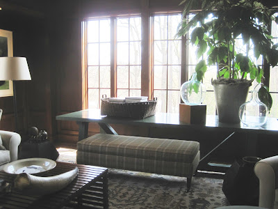
David Mitchell decorated the wood paneled library with views out to surrounding trees; a very cozy space which almost feels like a treehouse. Mitchell believes in comfortable rooms where all the furniture can be used and enjoyed. This room certainly fits the bill!I loved this mission style chair with the wool plaid fabric.
The mix of warm elements makes this one of the coziest rooms in the house.
As I mentioned the house contains many sort of 'extra' rooms - such as a lower level dining room (in addition to the formal dining room and the breakfast room off the kitchen!).
This dining room was beautifully decorated by Scott Cooke in a very traditional vein which you know I love. The room is very large and even contains a sort of library nook looking out onto the backyard.
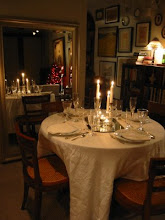
Cooke took a cue from the elaborate tray ceiling and placed a round table in the center of the room. Round dining tables are my favorite and I love the comfortable upholstered chairs he choose, perfect for lingering over long dinner parties.
Beautiful antiques fill the room such as these candle sconces. Dining by candle light is a beautiful thing, I'm so glad he included them (wicks correctly pre burnt I might add )!
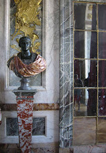
Another corner of the room featured this beautiful vase atop a gilded pedestal, artfully lit. I love the wood floor detailing.
The large hall on the 2nd floor outside of the master suite was decorated by Claire Schwab out of Alexandria. Schwab choose beautiful moss tones with hints of orange to create a cozy landing out of what otherwise would be a banal hallway.
I mean this as the highest compliment when I say it felt very 'Martha Stewart', particularly the plants in front of the window.
One of the most talked about spaces was the morning room decorated by Iantha Carley. The cheerful, sunny room was fitted out with a variety of beautiful textures and patterns but what I most appreciated was the attention to small details, such as the orange colored dog bed in the corner!
Saving the best for last, by far the most successful space in the house is the Master Sitting room on the 2nd floor designed by Michael Hampton. Hampton based the room on the beautiful flame-stitched carpet from Patterson Flynn he had always wanted to use on a project; showhouses are great for such experimenting!
The room is a luxurious retreat with soft, warm neutrals comforting the user. While the house this year feels harmonious with the rooms flowing nicely together for the most part (unusual for a showhouse), this was still a soothing room to enter. Recognize the side table from Bunny Williams's Beeline Home collection?
Much loved were the towering Circa light fixtures on either side of the bookcase. Notice the faux bois wallpaper which has been cut into squares and alternated to create movement on the walls? Great details!
The vestibule is papered in a fantastic luxe lacquered wallpaper which adds glamour to the tiny space. I loved the neoclassical light fixture which Hampton says he got off ebay for only $200 years ago (I love finds like that)!
The room is anchored on a comfy daybed in the center of the room ideal for lounging or even extra sleeping. Great light fixtures throughout the room provide a nice layer of detail and finish.
Be sure to visit the showhouse this year located in Wesley Heights along Foxhall Road, you won't regret it!
Read more coverage by other local bloggers here: Design du Monde, DC by Design, and My Notting Hill




.JPG)






14 comments:
My goodness! You weren't kidding when you said this house was big! I hope you brought breadcrumbs with you to find your way out...and a sack lunch!
The wool plaid fabric looks like the fabric on the chairs in your apartment! Is it the same?
I love everything about this house, Stefan! I am looking around my home right now, thinking about scrapping the entire deal and starting over!
xo
Andie
I am crazy about that lacquered wall paper!! lovely lovely
Divine, The house is really huge, you practically do need bread crumbs! haha Especially in the sub basement! The fabric was not the same no -mine is orange and from Ralph Lauren - not sure where this is from but it's all shades of brown and taupe.
Pura Vida - LOVE that paper too!
It is a great design house, there is so much harmony it is hard to believe so many different designers did the house. Usually there is a contrast every time you cross the threshold. Must be a treat to be there personally.
Take care
I honestly thought of you when I saw that clock on the desk in Michael Hampton's room!!!
Thanks for the mention too. :)
Stefan I love this home and for a Designers Showhouse it really seems to flow. Adore the mixture of textures, design, details, gloss.
xoxo
Karena
Art by Karena
Stefan - thanks for the tour. I so love your taste so interesting to see your favorites. I really wish now I was coming to DC tomorrow with David. I must plan a trip to coincide with the show house some year!!
Xo Terri
Stefan- Thanks for featuring my room on your blog post! I had a such a great time designing the room and have been thrilled to have participated with the many other talented designers.
Best,
Michael
Awesome tour! Gah, I love the room by Michael Hampton. Michael, we need to be friends so your good eBay mojo will rub off on me!
Thanks for the tour. I cannot wait to see all these fabulous rooms in person! So many talented designers here!!
Burnt wicks? In our family we were always taught to trim the wick before displaying. If a candle showed signs of having been used they were taken out and fresh ones displayed in case someone thought there was an event the day before in which they were not invited. The used ones were for "family only" informal dinners.
That vase looks precariously placed on top of that beautiful pedestal!
Thank you for the tour, I thoroughly enjoyed it!
I have the Beeline table in my master bedroom and it is one of my favorite furniture pieces, it's great to see how Hampton styled it - love the lamp, which might be by Baker? I would like to know!
Holly
Holly -yes -it's Baker as are a number of pieces in the room. Love the table! Bunny's line is so great.
Post a Comment