Tomorrow, Saturday October 19, 2013 is the first ever Palisades Village house tour that has been making the rounds of all the DC publications. The Palisades is a quirky neighborhood overlooking the Potomac River that despite the growing of the city has remained quite separate from the city. The neighborhood retains a charming small town atmosphere despite being less than a mile from the heart of Georgetown.
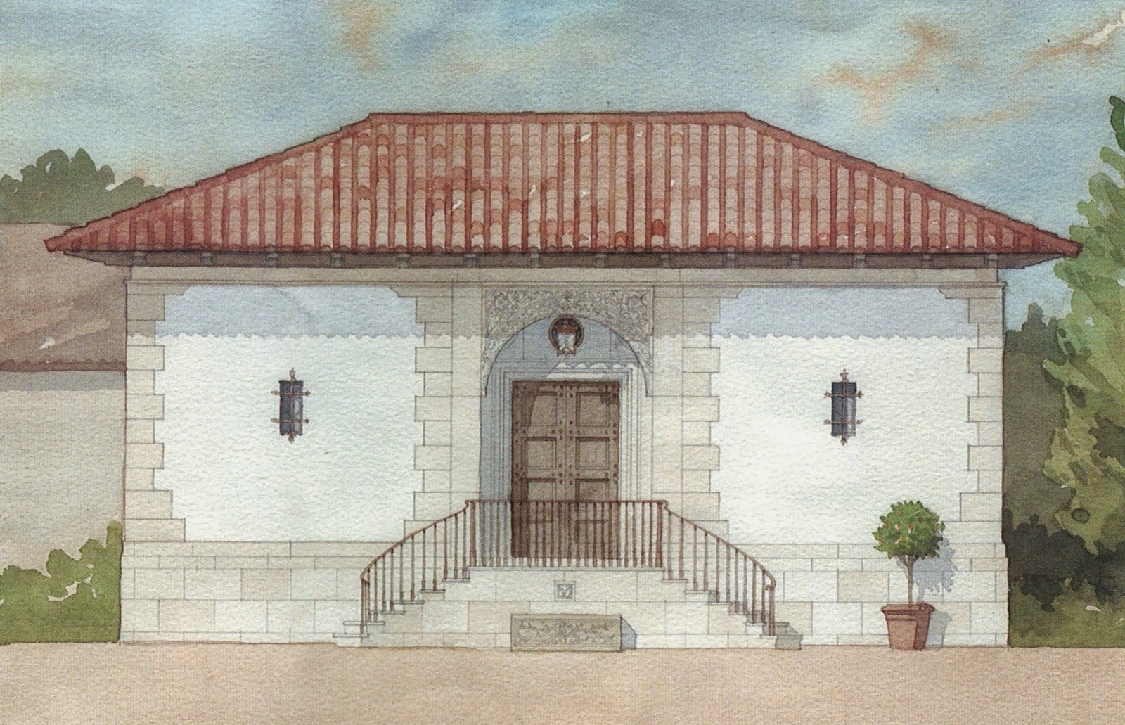
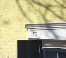
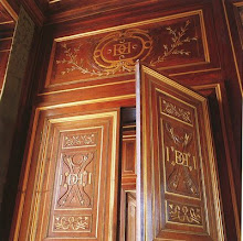
One of the houses on the tour was completed by BarnesVanze architects and is probably the house I'm most excited to see on the tour (seen here in these images). The house was designed to replicate the feeling of the local 19th century houses found on the river that had been added onto over time. I think given these pictures one would never guess this house wasn't 150 years old, do you?
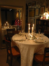
The dramatic dining room was built to look as if it had been an enclosed porch and features diamond paned windows.
The homeowners entertain frequently and this kitchen is any chef's dream so as to remain part of the party. 21st century living in a charming 'old' house.
The best feature of the house though has got to be the bright and airy attic family room which features dramatic views down to the river. Don't miss the tour and this fantastic house!
All photographs by Anice Hoachlander of Hoachlander Davis Photography.
Friday, October 18, 2013
Wednesday, October 9, 2013
Broadleys by Voysey
While at an estate sale this past weekend I came across an interesting little boxed set of 1/2 sheets of paper showcasing highlights of Western Architectural history. A sort of 1960s version of pinterest (do you follow me on pinterest?). One of these sheets was a vintage photograph and plan of house Broadleys by the architect Voysey, the sheet seen below. You may remember I blogged about another Voysey house, Upmeads, last year which was actually pretty similar in that it had an efficient, tight floorplan and was loacted out in the country.
This charming postcard caught my eye as well not only because of the beautiful rendering but it also included the 2nd floor plan. And so one falls down the rabbit hole of the internet.... Whats caught your eye lately?
Get 10% sitewide when you shop at Access Hydroponic. Valid until November 2013!
As I did with a number of the projects I wasn't familiar with (mainly cathedrals and palaces) I looked Broadleys up online. Not only is the house still extant but it is open to the public as a short-term rental or bed and breakfast! I came across a website listing a number of similar British Arts & Crafts houses that were also operating as bed and breakfasts HERE. What an incredible opportunity to not only go to house museums while you travel but to stay in one as well! The internet is full of dangerous ways to spend money.
A number of other interesting drawings popped up of Broadleys as well such as this cartouche in the collection of the V&A.This charming postcard caught my eye as well not only because of the beautiful rendering but it also included the 2nd floor plan. And so one falls down the rabbit hole of the internet.... Whats caught your eye lately?
Labels:
Architect,
design,
estate sales,
floorplans,
history,
houses,
Voysey
Monday, October 7, 2013
Estate sale mystery find
This past weekend I attended a few interesting estate sales and picked up a lot of 'treasure'! One pair of items though remains somewhat of a mystery to me and thought maybe someone would have some background. This unusual pair of macabre tree trunk vases appear to be quite old , perhaps Victorian period? Google searches turned up nothing other than a few Belleek vases but they did not have the unusual root 'legs'. Has anyone seen a vase like this before?
This extremely faint mark was hard to read and photograph - appears to be a serial number?I also picked up this rather worn mahogany sidechair with tired damask upholstery. The wood has beautiful detailing but needs some conditioning.
Stay tuned for the reupholstered after in the coming weeks!
Labels:
Architect,
China of the week,
DC,
designers,
estate sales,
Interiors,
my apartment,
shopping,
Washington
Friday, October 4, 2013
Recent work: Dramatic before and after
Reading and writing blog posts everyday I can sometimes forget to mention I'm more than a blogger: I also work in the design industry! I thought I would share the design process with you on a recent project, a renovated master suite (above is a finished teaser of the bath).
Lets get the ugly stuff out of the way first. My friend had a vintage 1920s house in the lovely Cleveland Park neighborhood of DC (you may remember a built-in I completed for him in the family room HERE). Old houses are great, I think we can all agree there, but old bathrooms are NOT so great - just look at it above!
Above the partial floorplan shows the original layout of the area I worked on which had great potential but didn't work for the client. A small, worn hall bath serviced the master bedroom as well as a small bedroom which my friend used as a dressing room as closet space was inadequate. The front half of the plan not shown on the left had the formerly renovated master suite which had been turned into another hall bathroom, separate laundry room, and a large bedroom facing the street.
Previously one came up the staircase and was confronted with the L shaped hallway seen here (remember, this is the BEFORE!).
Lots of square footage was wasted on the hallway in the tight plan and I had to come up with a way to best utilize the space.
The criteria was for a gracious master bedroom suite complete with en-suite bathroom, separate generous dressing room with loads of storage, and a separate sitting room.
The bones were all there but how best to reconfigure the space while respecting the vintage charm of the house? Another piece of the puzzle was leaving the exterior of the house untouched as it lies within a historic district where exterior changes are hard to get approved.
I decided to claim the 2nd hall closet and a fair amount of the hallway itself to enlarge the bathroom and provide all of the amenities one expects today in a house of this caliber. Above you see the 'demo' plan and how I was going to accomplish this.
The plan worked out nicely. Instead of coming up into a vast L shaped hallway, a more compact hall was created with a flush wall great for art at the head of the stairway. The master suite is now entered through a private vestibule which separates the bedroom from a dressing room. The opening between the dressing room and sunny sitting room was filled in to allow for more storage in the closet and a built-in bookcase in the sitting room.
The bathroom walls were completely removed to both insulate the exterior walls as well as reclaim any space we could find which previously housed ductwork and pipes which could easily be moved out of the way. Our contractor was a great help here! I decided to panel the walls with wide beadboard which added a vintage charm to the bath of the 1920s time period while also providing a 'warm' environment.
A separate soaking tub and large shower were added as well as an additional sink thanks to the space gained from the hallway. Now lets see how it turned out!
The hallway is still a generous size and makes sense for the house. Two bedrooms are left on this floor with a 3rd on the floor above. In the photo above you are looking into the new vestibule (painted the same purple as the bedroom) lit by an antique sconce found at my favorite lighting source just down the street in Cleveland Park, Artisan lighting.
Another antique frosted glass ceiling fixture was found at Artisan Lamp for the bedroom, on a dimmer switch for ambiance of course! You can see through the former closet door into the newly enlarged master bathroom.
Looking the other direction one can see into the sunroom sitting area. The natural linen curtains lining the wall hide an off-center window as well as provide a focal point for the bed.
The small bedroom became a proper dressing room with ample storage. Double hanging rods fill one entire wall while a large dresser sits opposite. The antique lamp on the dresser is also from Artisan - you can tell I love to shop there! The closet of this former bedroom was lined with cedar to become storage for sweaters and other off-season items.
The sitting room received a fresh coat of sage green paint as well as a major clean-up. An odd closet was ripped out of the corner as well as an unnecessary non-working but extremely HEAVY radiator.
However the piece de resistance is surely the newly created master bathroom. Wide 6" painted wood paneling was installed rather than drywall or tile as it created a warm, vintage feeling environment. Foam insulation was blown into all of the walls for sound isolation as well as temperature control. The window received a cafe height plantation shutter for privacy and a new marble sill perfect for additional storage. Antique neoclassical sconces were found at Artisan which really become the jewelry of the space.
As the brass and black enameled sconces are really focal points I didn't feel the other finishes needed to match and they were all spec'd in a polished nickel finish sourced from the Waterworks studio line ( a wonderful lower priced line which still has the great quality and heft of other Waterworks fixtures). The tile also came from Waterworks. I used a large format dark stone-like porcelain tile for the floor and the coordinating 2x2 tile for the shower floor. The shower walls were lined with a miniature subway tile and a long niche was created for soaps and shampoo. I love the industrial exposed surface-mounted shower fixtures from Waterworks! In-floor radiant heating was installed which can be controlled with the thermostat by the door for warm feet in the cold winter.
You can renovate your own bathroom into your DREAM space - be bold! Use Plumbtile to make all of your selections online and for easy ordering. From traditional to modern they have all of your bathroom needs as well as kitchen and lighting!
The same Italian Crema marble from the Restoration Hardware Gramercy vanity was used for the window sill, shower curb & surround, as well as to line the shower niche. I know you're wondering why I selected an open vanity as opposed to one with storage but I was worried the bathroom would feel tight when it lost that visual space below the sinks. Large medicine cabinets provide tons of storage. The freestanding bathtub from Victoria & Albert was clean lined while still having the appearance of an old Victorian soaker tub (seen best in my drawing earlier in this post). I'm very pleased with the entire renovation and more importantly so was my friend! What do you think?
Special thanks to my fantastic photographer friend Bill Bramble who provided the before and after pictures!
Lets get the ugly stuff out of the way first. My friend had a vintage 1920s house in the lovely Cleveland Park neighborhood of DC (you may remember a built-in I completed for him in the family room HERE). Old houses are great, I think we can all agree there, but old bathrooms are NOT so great - just look at it above!
Above the partial floorplan shows the original layout of the area I worked on which had great potential but didn't work for the client. A small, worn hall bath serviced the master bedroom as well as a small bedroom which my friend used as a dressing room as closet space was inadequate. The front half of the plan not shown on the left had the formerly renovated master suite which had been turned into another hall bathroom, separate laundry room, and a large bedroom facing the street.
Previously one came up the staircase and was confronted with the L shaped hallway seen here (remember, this is the BEFORE!).
Lots of square footage was wasted on the hallway in the tight plan and I had to come up with a way to best utilize the space.
The criteria was for a gracious master bedroom suite complete with en-suite bathroom, separate generous dressing room with loads of storage, and a separate sitting room.
The bones were all there but how best to reconfigure the space while respecting the vintage charm of the house? Another piece of the puzzle was leaving the exterior of the house untouched as it lies within a historic district where exterior changes are hard to get approved.
I decided to claim the 2nd hall closet and a fair amount of the hallway itself to enlarge the bathroom and provide all of the amenities one expects today in a house of this caliber. Above you see the 'demo' plan and how I was going to accomplish this.
The plan worked out nicely. Instead of coming up into a vast L shaped hallway, a more compact hall was created with a flush wall great for art at the head of the stairway. The master suite is now entered through a private vestibule which separates the bedroom from a dressing room. The opening between the dressing room and sunny sitting room was filled in to allow for more storage in the closet and a built-in bookcase in the sitting room.
The bathroom walls were completely removed to both insulate the exterior walls as well as reclaim any space we could find which previously housed ductwork and pipes which could easily be moved out of the way. Our contractor was a great help here! I decided to panel the walls with wide beadboard which added a vintage charm to the bath of the 1920s time period while also providing a 'warm' environment.
A separate soaking tub and large shower were added as well as an additional sink thanks to the space gained from the hallway. Now lets see how it turned out!
The hallway is still a generous size and makes sense for the house. Two bedrooms are left on this floor with a 3rd on the floor above. In the photo above you are looking into the new vestibule (painted the same purple as the bedroom) lit by an antique sconce found at my favorite lighting source just down the street in Cleveland Park, Artisan lighting.
Another antique frosted glass ceiling fixture was found at Artisan Lamp for the bedroom, on a dimmer switch for ambiance of course! You can see through the former closet door into the newly enlarged master bathroom.
Looking the other direction one can see into the sunroom sitting area. The natural linen curtains lining the wall hide an off-center window as well as provide a focal point for the bed.
The small bedroom became a proper dressing room with ample storage. Double hanging rods fill one entire wall while a large dresser sits opposite. The antique lamp on the dresser is also from Artisan - you can tell I love to shop there! The closet of this former bedroom was lined with cedar to become storage for sweaters and other off-season items.
The sitting room received a fresh coat of sage green paint as well as a major clean-up. An odd closet was ripped out of the corner as well as an unnecessary non-working but extremely HEAVY radiator.
However the piece de resistance is surely the newly created master bathroom. Wide 6" painted wood paneling was installed rather than drywall or tile as it created a warm, vintage feeling environment. Foam insulation was blown into all of the walls for sound isolation as well as temperature control. The window received a cafe height plantation shutter for privacy and a new marble sill perfect for additional storage. Antique neoclassical sconces were found at Artisan which really become the jewelry of the space.
As the brass and black enameled sconces are really focal points I didn't feel the other finishes needed to match and they were all spec'd in a polished nickel finish sourced from the Waterworks studio line ( a wonderful lower priced line which still has the great quality and heft of other Waterworks fixtures). The tile also came from Waterworks. I used a large format dark stone-like porcelain tile for the floor and the coordinating 2x2 tile for the shower floor. The shower walls were lined with a miniature subway tile and a long niche was created for soaps and shampoo. I love the industrial exposed surface-mounted shower fixtures from Waterworks! In-floor radiant heating was installed which can be controlled with the thermostat by the door for warm feet in the cold winter.
You can renovate your own bathroom into your DREAM space - be bold! Use Plumbtile to make all of your selections online and for easy ordering. From traditional to modern they have all of your bathroom needs as well as kitchen and lighting!
The same Italian Crema marble from the Restoration Hardware Gramercy vanity was used for the window sill, shower curb & surround, as well as to line the shower niche. I know you're wondering why I selected an open vanity as opposed to one with storage but I was worried the bathroom would feel tight when it lost that visual space below the sinks. Large medicine cabinets provide tons of storage. The freestanding bathtub from Victoria & Albert was clean lined while still having the appearance of an old Victorian soaker tub (seen best in my drawing earlier in this post). I'm very pleased with the entire renovation and more importantly so was my friend! What do you think?
Special thanks to my fantastic photographer friend Bill Bramble who provided the before and after pictures!
Labels:
Architect,
architectdesign,
architects,
bathrooms,
DC,
design,
designer,
designers at work,
details,
history,
houses,
how to,
Interiors,
lighting,
my work,
showhouses,
Washington
Tuesday, October 1, 2013
Michael Imber in DC: lecture
Join the Mid-Atlantic chapter of the ICAA for a lecture by architect Michael Imber, whose book I recently reviewed HERE, on October 17th 2013. Michael will be discussing his book as well as the influences that shape his work and its relationship to their environment.

The lecture will be held at St. John's Church in Georgetown: information for tickets HERE. Hope to see you there!
Labels:
Architect,
books,
DC,
design,
ICAA,
Interiors,
lectures,
opportunities,
Washington
Friday, September 27, 2013
A visit to Quebec City
I recently spent 5 days in Quebec City, Canada, and wanted to share with you some of that amazing little town. I call it a town for a reason; it's a quaint and charming 'ye olde towne' despite being the capital of Quebec.
Everyone has seen pictures of the famous Hotel, Le Chateau Frontenac, perched high on a cliff overlooking the St Lawrence river. Currently undergoing a massive restoration only half of the hotel is in operation but it remains a great home-base in the city; most evenings were finished in their round bar overlooking the river.
The oldest parts of Quebec City are actually down on the riverfront far below the Frontenac. This area dates to the 17th century and the exteriors have been faithfully maintained (if not the interiors which hold a warren of gimmicky tourist shops).
The city is surrounded by an enormous wall, separating the old town from the modern city. While once it defended the French and British troops, these fortifications are now freely crossed by hoards of tourists.
Definitely take a walk along the top most part of the wall for stunning views of the city.
The terrain is of course challenging, resulting in some cliff-like streets such as Cote de la Montagne see above.
The main street of Rue St Jean is a charming lane full of shops and restaurants.
I stayed at the luxurious Auberge St Antoine, a Relais & Chateaux property located in the heart of the Old Port district. Centrally located, comfortable, and accommodating, I can't recommend this hotel enough!
Much time was spent in the lounge / bar / restaurant relaxing, reading, and snacking.
What is there to do in Quebec City you may ask? Well......
...the answer is probably not much. If you are looking for a completely charming and beautiful location to relax, Quebec City may be the vacation destination for you!
Other than a handful of beautiful historic churches there isn't much to tour or visit other than walking the streets of the town.
I know because we saw each and every one. Each church was friendly and happy to have visitors tour their beautiful buildings.
I did find one minuscule shop that was definitely worth a visit, the Boutique a la Capucine near my hotel on the Rue St Pierre opposite the Museum of Civilization.
The weather in mid September was comfortable but rather damp with tremendous fog each evening and morning.
Much of the city was viewed through a romantic mist.
The train station is a beautiful Beaux Arts building down near the river that is definitely worth a visit near the entertaining food market.
Quebec is, as you probably already know, a French bastion of culture in Canada. Amazing French restaurants abound and I highly recommend both the Continental for old school HIGH French food, and the Saint Amour for nouvelle French cuisine. The Cafe du Monde down on the river has fantastic views and a wonderful brunch.
Walking around the city is a pleasure, despite any negative feedback you are sensing here. Surprises lurk around every corner, such as this tiny Victorian rowhouse squeezed between 2 much larger buildings.
The perfect length of time to spend in Quebec City is a weekend. This is generally what travelers have as it's a common stop for cruise ships which constantly hover over the lower part of town.
Lastly I have to commend the city for keeping the town immaculately clean with beautiful plantings and street art to be found through the city. Go for the food, go for the views, but just GO!
Subscribe to:
Posts (Atom)