This past weekend was the annual Embassy open house (Passport DC) and I headed straight for the Embassy of Brazil. Not because I love Caipirinhas but because the mansion was designed by master Architect John Russell Pope for Robert McCormick in 1911.
Here is the house as it appeared in 1911 after completion back when this area of 'embassy row' was nothing but farmland outside of the city. The house has a unique siting on a triangular lot which creates a very grand entry sequence from Massachusetts Avenue. I think that is what has always intrigued me about this Italian High Renaissance styled Villa, so I was excited to finally get a chance to get in (along with 1,000s of other curious Washingtonians!).
The vintage photograph and these floorplans come from one of my favorite books which I've mentioned before: Mastering Tradition, the Residential Architecture of John Russell Pope by James B. Garrison. As with all Italian Villas the house has a piano nobile plan, ideal for the city with cars whizzing by on Massachusetts Avenue (on the right hand side of the plans).
The rooms are spacious but the plan is more of a house than a large mansion. Notice how the public spaces are kept very separate from the private spaces. In order to access the upper levels where the bedrooms and family quarters are, one has to go up a tiny side stair which at first glance of the plan appears to be for servants. This is why houses like this become great embassies! Ambassadorial duties can be performed downstairs with the family housed in their own private apartment out of the way.
True to any Pope designed structure the limestone facade is a very cleaned up form of Classicism. This simple classicism inspired some of the best works of the early 20th century.
Every detail is carefully planned and thought out. Notice how the watertable which runs around the entire building (the limestone ledge) runs past the basement window well, not disturbing the line.
The house appears exactly the same as it did in 1911, down to the shutters on the bedroom level.
These marble bowls of fruit were found throughout the gardens, dozens and dozens of them. A sign of hospitality perhaps?
The details are incredible -all done in limestone.
I love the ball detail where the metal bars intersect.
The planting has become full and lush lending privacy to the house which is on a very exposed site.
This side porch off the library is where Mr. McCormick planned on smoking his cigars. Unfortunately he didn't live long in the house before passing but his wife remained until 1932. After her death it was sold to the Government of Brazil, including all of the contents, so that it retains a lot of the original furnishings.
Brazil has been an excellent caretaker for this beautiful house!
Now shall we go inside for a peak of the public spaces?
The interiors are eclectic and range from a number of periods, typical of many houses of the time.
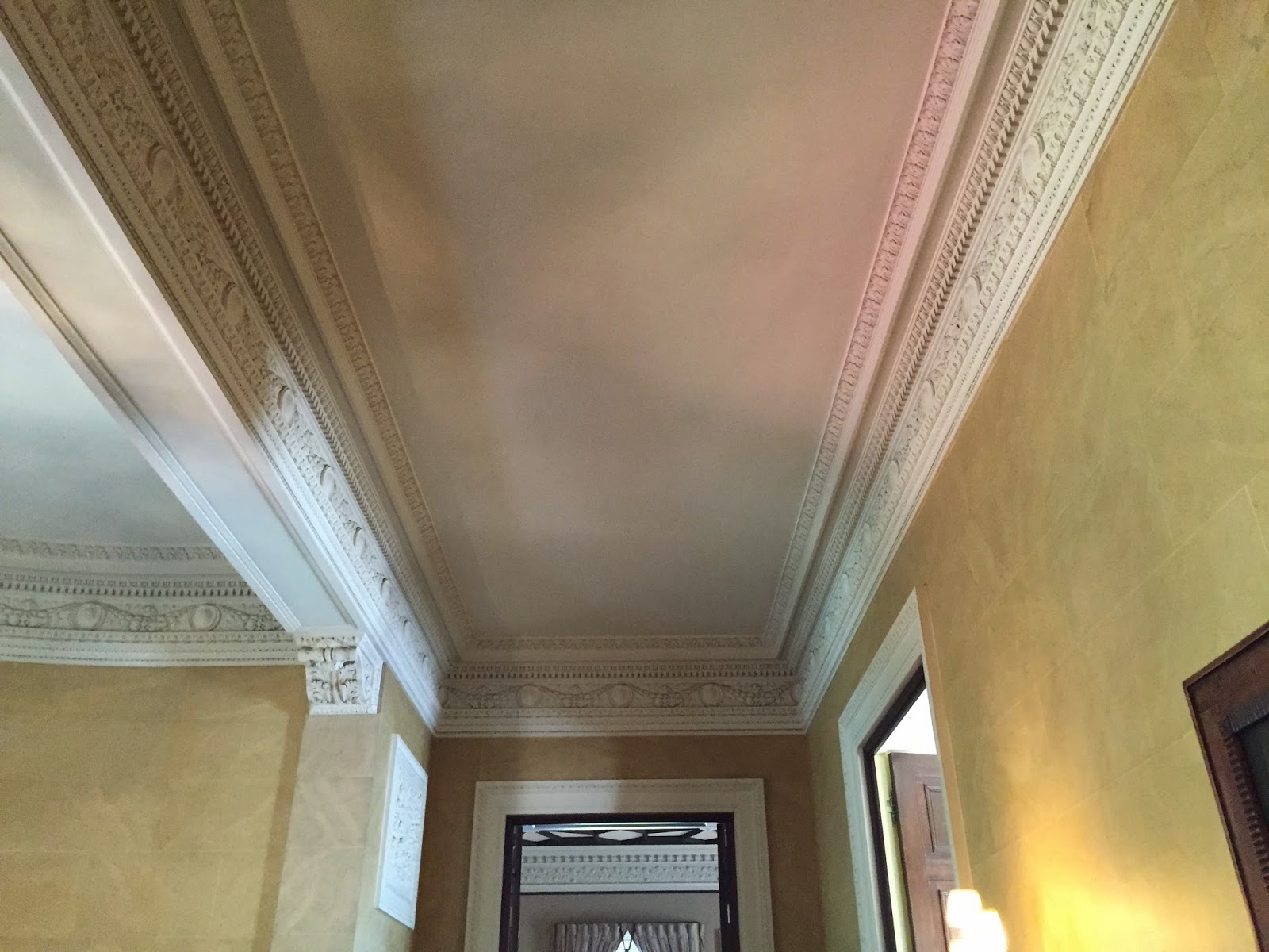
The beautiful plasterwork in the entry and the faux painted walls continue up the grand marble staircase to the public rooms.
Even the stair niche has niches! I wonder if they ever held anything? The vase is probably 6'-0" tall.
Here you can see how the stair-rail dies into the wall -a rather odd detail but it works and is executed very neatly.
The elevator door features this charming little porthole. I had never seen something like that before other than on a service door.
The ornamental plasterwork continues on this level.
Everything clean and tidy -amazing for a house that is over 100 years old and in public service.
A close up of the faux painted plaster walls -painted to resemble stone blocks.
These lovely sconces light the stair landing.
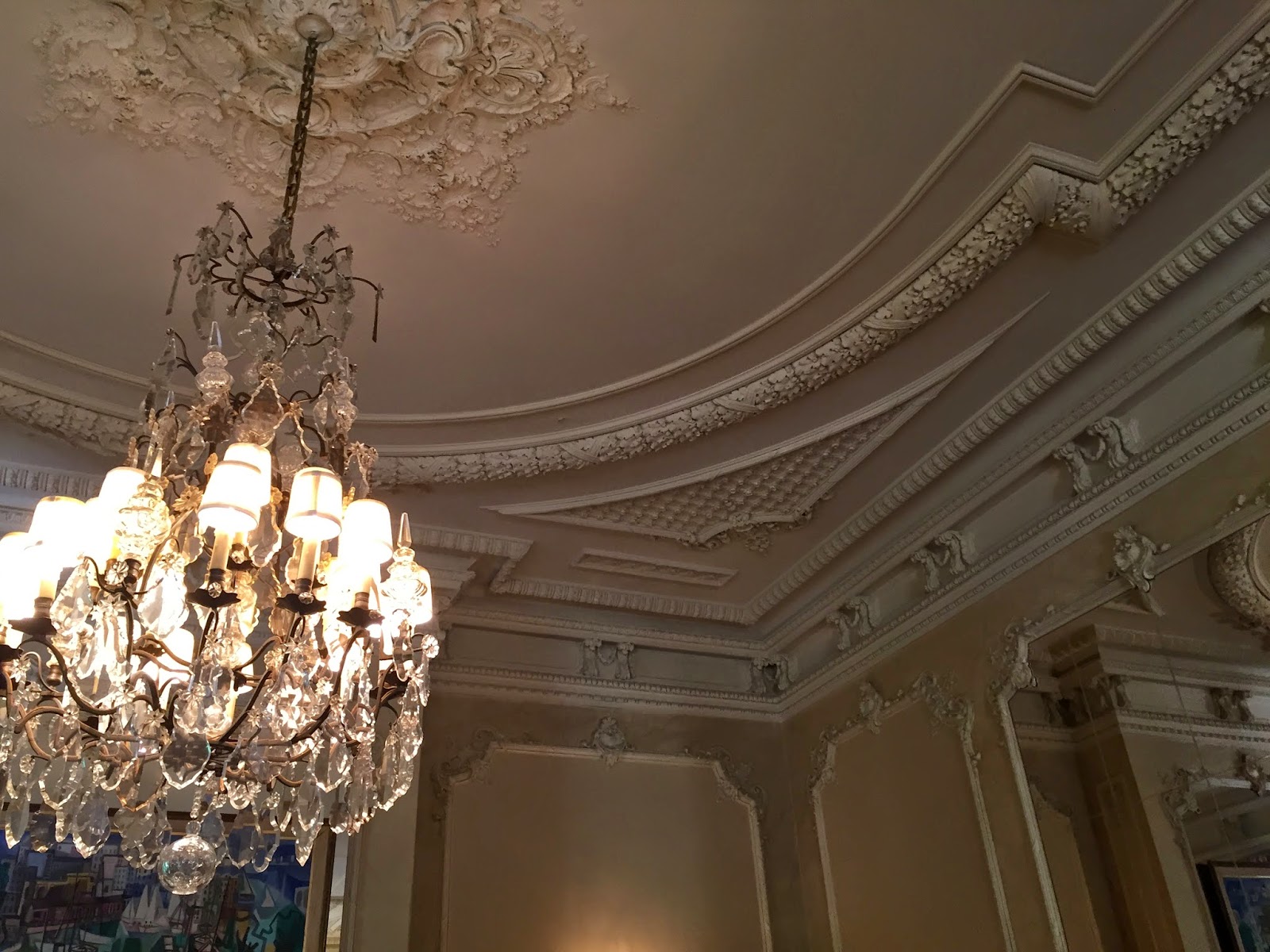
The main salon measures 60' long and 25' across -an amazing room for entertaining!
Check out those amazing chandeliers and again all of the crisp ornamental plasterwork.
As Mitch Owens commented on my Instagram feed, the curtains are somewhat skimpy -but I like the color they add to the spaces, keeping them from being too cold.
Chandeliers with little shades like this may be one of my favorite things -not sure why. I have them in my own dining room on a much less grand scale!
The small salon operates as a more private and intimate space and features a dining table, probably used by the family as a family room.
Each room naturally features a fireplace or two!
The dining room features an unusual Tudor plasterwork ceiling. I've never seen one with the design picked out in a dark paint but it really is a nice detail.
The original bronze hardware throughout the house is gorgeous.
The table was elegantly laid for a meal. Oddly though the dining room doesn't have a chandelier but is rather lit by lamps on all of the sideboard surrounding the room; Dining by candlelight.
Notice the scale of these rooms - that is a standard 7'-0" door. Also notice the decorative tape surrounding the grasscloth wallpaper.
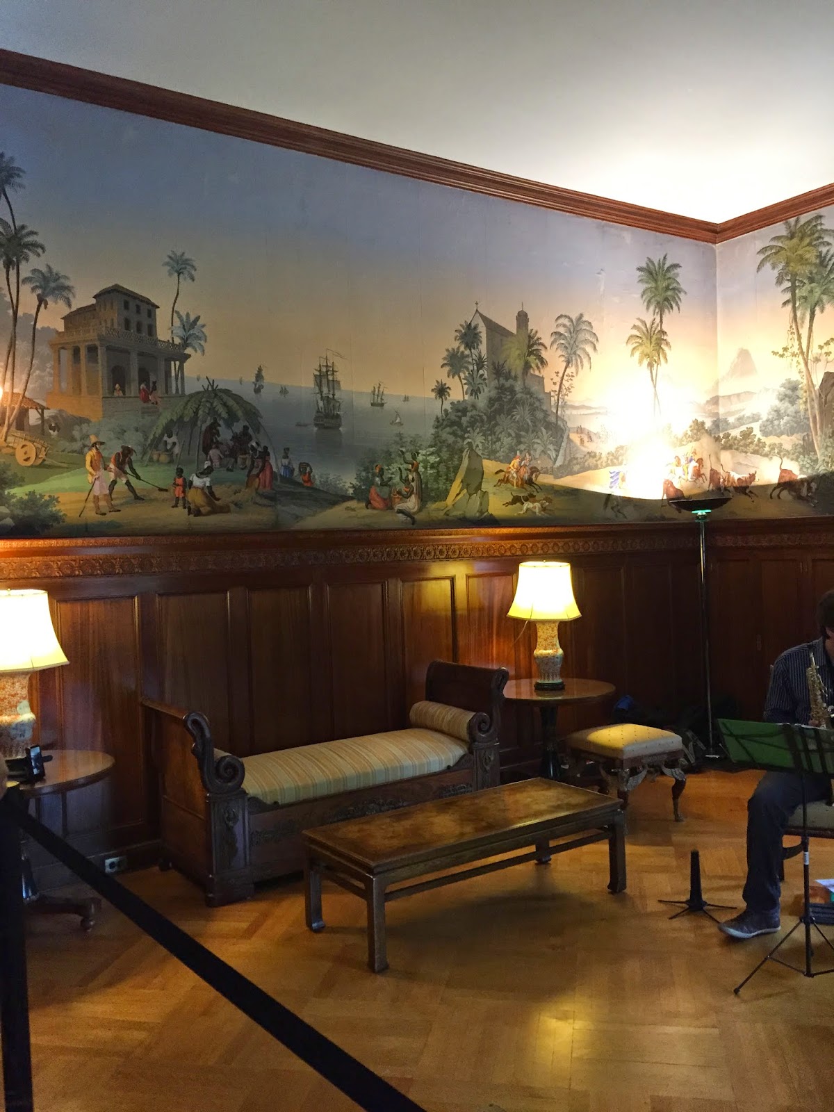
The library on the ground level features a scenic wallpaper (Zuber?) and beautiful 2nd empire furnishings.
I loved the Egyptian influence in all of the furniture.
We were serenaded by an excellent jazz band.
I can't get enough of this wallpaper! I've said it before and I'll say it again, sconces are the best lighting source for a room. They add beautiful detail and the quality of light is the most flattering.
I know this last picture isn't the best but I loved this clock and had to share it. I hope you enjoyed this little tour of John Russell Pope's Brazilian Embassy with my snapshots, it really made my weekend!
Tuesday, May 5, 2015
Friday, May 1, 2015
Michael Hampton and the DC Design House 2015
This year's DC Design House (2015) may not be located in DC but is still a very sophisticated and Washingtonian home.
Designed by Harrison Design architects, the house resembles a typical Virginian farmhouse which has been added onto over the generations. The multiple volumes help to mask the large size of the structure.
I loved the logical and light-filled floorplan. Who doesn't love a floorplan?
The only criticism I could have are perhaps the lack of program in the basement. Large open rooms bleed endlessly into each other with no real purpose. We had the idea of replacing the garage bump out on the first floor into the basement (which works with the grading) in the series of vague rooms on the left hand side of the plan below. This would also have the benefit of drawing more light into the back stairhall. But I digress......
Above you can see the room as Michael first found it; see his blog post HERE on the development of the space. Michael designed a beautiful oak paneling to line the library, incorporating a built-in window seat and bookshelves.
The large chinoiserie painting above the sofa from John Rosselli was the basis of the room; soft greens with red accents.
The crazy beautiful sofa is also from John Rosselli and features a delightful faux bois fabric by Jed Johnson.
There are other rooms in the house worth noting, unusual as some showhouses feature one gaudy room after another - this showhouse is a comparative model of restraint!
I loved the master bedroom by Christopher Patrick. Christopher has a real talent for mixing the best of modern design and antiques to make a room stylish and lived in. These are the types of rooms in which people want to spend time! The Benjamin Moore wallcolor was especially great and I plan on copying it soon in my own bedroom. Notice too that much of the artwork are architectural watercolors by Michael Hampton!
Lastly, the kitchen was a beautiful space which brought to mind a Virginia farmhouse with a sophisticated twist designed by Lobkovich kitchen design. Notice the leg details on the island -beautiful! I think they'll be getting a lot of calls from people for work on their own kitchens.
There is still time to visit the DC Design House, open until May 10, 2015 in McLean Virginia. Don't miss seeing it all for yourself!
All photos unless noted by Angie Seckinger.
Designed by Harrison Design architects, the house resembles a typical Virginian farmhouse which has been added onto over the generations. The multiple volumes help to mask the large size of the structure.
I loved the logical and light-filled floorplan. Who doesn't love a floorplan?
The only criticism I could have are perhaps the lack of program in the basement. Large open rooms bleed endlessly into each other with no real purpose. We had the idea of replacing the garage bump out on the first floor into the basement (which works with the grading) in the series of vague rooms on the left hand side of the plan below. This would also have the benefit of drawing more light into the back stairhall. But I digress......
The best room in the house is done by my friend, designer Michael Hampton. Don't just take my biased word for it, Architectural Digest prominently included it in their line up and most media coverage has featured the below image by photographer Angie Seckinger as their lead photo.
Michael was able to work with the builder of the house (Artisan Builds of Mclean) and develop many of the details of the house which may be one of the reasons the fit-out and detailing found in the house is so well done. Any talented professional designer (unlike decorator, which is a very different thing but not a negative connotation ) will add this level of finesse to any project.Above you can see the room as Michael first found it; see his blog post HERE on the development of the space. Michael designed a beautiful oak paneling to line the library, incorporating a built-in window seat and bookshelves.
The large chinoiserie painting above the sofa from John Rosselli was the basis of the room; soft greens with red accents.
The crazy beautiful sofa is also from John Rosselli and features a delightful faux bois fabric by Jed Johnson.
There are other rooms in the house worth noting, unusual as some showhouses feature one gaudy room after another - this showhouse is a comparative model of restraint!
I loved the master bedroom by Christopher Patrick. Christopher has a real talent for mixing the best of modern design and antiques to make a room stylish and lived in. These are the types of rooms in which people want to spend time! The Benjamin Moore wallcolor was especially great and I plan on copying it soon in my own bedroom. Notice too that much of the artwork are architectural watercolors by Michael Hampton!
Lastly, the kitchen was a beautiful space which brought to mind a Virginia farmhouse with a sophisticated twist designed by Lobkovich kitchen design. Notice the leg details on the island -beautiful! I think they'll be getting a lot of calls from people for work on their own kitchens.
There is still time to visit the DC Design House, open until May 10, 2015 in McLean Virginia. Don't miss seeing it all for yourself!
All photos unless noted by Angie Seckinger.
Wednesday, April 29, 2015
Why Beauty Matters: Roger Scruton
Why Beauty Matters ∇ Roger Scruton BBC from Vue Fine Art & Design on Vimeo.
"Beauty is the remedy for the chaos and suffering in human life...The beautiful work of art brings consolation in sorrow and affirmation in joy" - Roger Scruton
Last night I watched this video by Roger Scruton from 2009 on his philosophical view of beauty and why it can make or break our lives. The past decades have moved culture away from the centuries old 'cult of beauty' and Roger (and I) believe this only hurts our lives. Beauty has the power to restore our senses and bring meaning to our existence.
Scruton's view of beauty may be rather narrow and classical, which I can appreciate, but the fact remains that one can find beauty everywhere in their life in small moments (something I celebrate on this blog and in instagram) and perhaps even in modern style (sorry Roger!). I would argue that there are many beautiful moments to be found in modern architecture as well, such as the work of Renzo Piano or Richard Meier. Who would not agree that the Getty Museum in Los Angeles is not stunningly beautiful (seen HERE)?
If you haven't seen the video before I highly encourage you all to watch it tonight, it may just change your life view.
Labels:
be the change,
beauty,
roger scruton,
videos,
why beauty matters
Tuesday, April 28, 2015
See Charlotte Moss in DC, May 6 2015

Join the Mid-Atlantic chapter of the ICAA in welcoming Charlotte Moss to historic Dumbarton House on May 6, 2015.
Following a reception, Charlotte will speak about her latest book, Garden Inspirations. Afterwards she will sign copies of her books. It should be yet another great event sponsored by the ICAA here in DC!Hope to see you all there; be ready to be inspired by this fabulous taste-maker and don't forget to bring a copy of your book to be signed!
Tickets are available on the website HERE.
Images via Veranda Magazine and Charlotte Moss.
Labels:
Charlotte Moss,
Dumbarton House,
flowers,
Garden Inspirations,
Gardens,
ICAA,
lectures,
opportunities
Tuesday, April 21, 2015
English country house living in Australia
Located in Bathurst, Australia (about a 3 hour drive west of Sydney) is Abercrombie House. This charming English country house style structure was built in the 1870s for William Stewart, the Lieutenant Governor General, or 2nd in command. Since 1969 it has been in the hands of the Morgan family who have restored the house and have it open to the public to help with funding for further care of the house.
Don't let "open to the public" fool you; this is a real family home which is probably the most interesting reason to visit the mansion. Staid house museums can sometimes be a tad boring (even I'll admit that) and seeing an active family in residence and how they live in period style is the main attraction here.
This Victorian house mixes elements from many genres but Gothic Revival might be an appropriate moniker if one must be chosen.
The furnishings are casual and old; nothing fussy. One might believe they have accumulated over generations of Stewarts.
The double parlor is of course very Victorian. Lovely plasterwork and colorful wallpaper lend the period aire.
The original marble mantel pieces really steal the show. Notice the Gothic door paneling to the left below. Piles of books and a fireplace..... heavenly.
The grand dining room looks right out of a period drama.
Much of the wallpaper is in fact original, including this William Morris wallpaper.
The William Morris wallpaper in detail has lovely shades of brown, ivory, and gilding.
The grand oak stair is lined with old family photographs.....
which continue up to the landing. Notice the much narrower stair to the 3rd level.
It's lovely to see these old rooms LIVED in. One of the sons is interested in anthropology which is evident in his taxidermy filled bedroom.
Notice the modern lamps mixed in amongst the antiques.
Their other son occupies another cool and shady bedroom -also full of antiques.
The very clean fireplace sadly doesn't look as if it has been used in years.
The gardens, which occupy 50 acres, are frequent hosts to weddings and events.
Notice the old green house at the rear of the house above along with utilitarian farm vehicles.
Further out back are vintage Austin Princesses in 'storage'.
Lovely old wrought iron surrounds the immediate gardens.
It's somehow reassuring in this age to see such houses really lived-in and in such time worn style! Thanks to Neal for supplying us with his gorgeous inspirational photos!
Don't let "open to the public" fool you; this is a real family home which is probably the most interesting reason to visit the mansion. Staid house museums can sometimes be a tad boring (even I'll admit that) and seeing an active family in residence and how they live in period style is the main attraction here.
This Victorian house mixes elements from many genres but Gothic Revival might be an appropriate moniker if one must be chosen.
Reminders of the Stewarts' native Scotland are abundant. If it weren't for the sunny Australian weather one might imagine oneself in the heart of the moors.
This tiled loggia looks like a lovely spot for afternoon tea. Notice the modern light fixtures lining the ceiling - I love seeing how the house has moved with the times.
Period details such as Gothic plaster arches and stained glass though proclaim the age of the house.The furnishings are casual and old; nothing fussy. One might believe they have accumulated over generations of Stewarts.
The double parlor is of course very Victorian. Lovely plasterwork and colorful wallpaper lend the period aire.
The original marble mantel pieces really steal the show. Notice the Gothic door paneling to the left below. Piles of books and a fireplace..... heavenly.
The grand dining room looks right out of a period drama.
Much of the wallpaper is in fact original, including this William Morris wallpaper.
The William Morris wallpaper in detail has lovely shades of brown, ivory, and gilding.
The grand oak stair is lined with old family photographs.....
which continue up to the landing. Notice the much narrower stair to the 3rd level.
It's lovely to see these old rooms LIVED in. One of the sons is interested in anthropology which is evident in his taxidermy filled bedroom.
Notice the modern lamps mixed in amongst the antiques.
Their other son occupies another cool and shady bedroom -also full of antiques.
The very clean fireplace sadly doesn't look as if it has been used in years.
The gardens, which occupy 50 acres, are frequent hosts to weddings and events.
Notice the old green house at the rear of the house above along with utilitarian farm vehicles.
Further out back are vintage Austin Princesses in 'storage'.
Lovely old wrought iron surrounds the immediate gardens.
It's somehow reassuring in this age to see such houses really lived-in and in such time worn style! Thanks to Neal for supplying us with his gorgeous inspirational photos!
Subscribe to:
Posts (Atom)