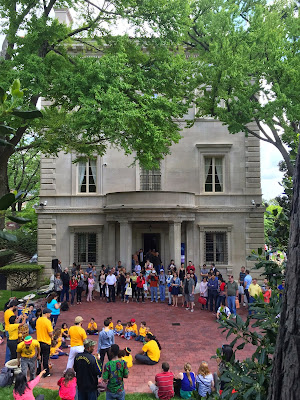
This past weekend was the annual Embassy open house (Passport DC) and I headed straight for the Embassy of Brazil. Not because I love Caipirinhas but because the mansion was designed by master Architect John Russell Pope for Robert McCormick in 1911.
Here is the house as it appeared in 1911 after completion back when this area of 'embassy row' was nothing but farmland outside of the city. The house has a unique siting on a triangular lot which creates a very grand entry sequence from Massachusetts Avenue. I think that is what has always intrigued me about this Italian High Renaissance styled Villa, so I was excited to finally get a chance to get in (along with 1,000s of other curious Washingtonians!).
The vintage photograph and these floorplans come from one of my favorite books which I've mentioned before: Mastering Tradition, the Residential Architecture of John Russell Pope by James B. Garrison. As with all Italian Villas the house has a piano nobile plan, ideal for the city with cars whizzing by on Massachusetts Avenue (on the right hand side of the plans).
The rooms are spacious but the plan is more of a house than a large mansion. Notice how the public spaces are kept very separate from the private spaces. In order to access the upper levels where the bedrooms and family quarters are, one has to go up a tiny side stair which at first glance of the plan appears to be for servants. This is why houses like this become great embassies! Ambassadorial duties can be performed downstairs with the family housed in their own private apartment out of the way.
True to any Pope designed structure the limestone facade is a very cleaned up form of Classicism. This simple classicism inspired some of the best works of the early 20th century.
Every detail is carefully planned and thought out. Notice how the watertable which runs around the entire building (the limestone ledge) runs past the basement window well, not disturbing the line.
The house appears exactly the same as it did in 1911, down to the shutters on the bedroom level.
These marble bowls of fruit were found throughout the gardens, dozens and dozens of them. A sign of hospitality perhaps?
The details are incredible -all done in limestone.
I love the ball detail where the metal bars intersect.
The planting has become full and lush lending privacy to the house which is on a very exposed site.
This side porch off the library is where Mr. McCormick planned on smoking his cigars. Unfortunately he didn't live long in the house before passing but his wife remained until 1932. After her death it was sold to the Government of Brazil, including all of the contents, so that it retains a lot of the original furnishings.
Brazil has been an excellent caretaker for this beautiful house!
Now shall we go inside for a peak of the public spaces?
The interiors are eclectic and range from a number of periods, typical of many houses of the time.
The beautiful plasterwork in the entry and the faux painted walls continue up the grand marble staircase to the public rooms.
Even the stair niche has niches! I wonder if they ever held anything? The vase is probably 6'-0" tall.
Here you can see how the stair-rail dies into the wall -a rather odd detail but it works and is executed very neatly.
The elevator door features this charming little porthole. I had never seen something like that before other than on a service door.
The ornamental plasterwork continues on this level.
Everything clean and tidy -amazing for a house that is over 100 years old and in public service.
A close up of the faux painted plaster walls -painted to resemble stone blocks.
These lovely sconces light the stair landing.
The main salon measures 60' long and 25' across -an amazing room for entertaining!
Check out those amazing chandeliers and again all of the crisp ornamental plasterwork.
As Mitch Owens commented on my Instagram feed, the curtains are somewhat skimpy -but I like the color they add to the spaces, keeping them from being too cold.
Chandeliers with little shades like this may be one of my favorite things -not sure why. I have them in my own dining room on a much less grand scale!
The small salon operates as a more private and intimate space and features a dining table, probably used by the family as a family room.
Each room naturally features a fireplace or two!
The dining room features an unusual Tudor plasterwork ceiling. I've never seen one with the design picked out in a dark paint but it really is a nice detail.
The original bronze hardware throughout the house is gorgeous.
The table was elegantly laid for a meal. Oddly though the dining room doesn't have a chandelier but is rather lit by lamps on all of the sideboard surrounding the room; Dining by candlelight.
Notice the scale of these rooms - that is a standard 7'-0" door. Also notice the decorative tape surrounding the grasscloth wallpaper.
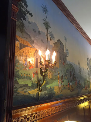
The library on the ground level features a scenic wallpaper (Zuber?) and beautiful 2nd empire furnishings.
I loved the Egyptian influence in all of the furniture.
We were serenaded by an excellent jazz band.
I can't get enough of this wallpaper! I've said it before and I'll say it again, sconces are the best lighting source for a room. They add beautiful detail and the quality of light is the most flattering.
I know this last picture isn't the best but I loved this clock and had to share it. I hope you enjoyed this little tour of John Russell Pope's Brazilian Embassy with my snapshots, it really made my weekend!
Subscribe to:
Post Comments (Atom)






.JPG)







9 comments:
Gorgeous! That is all. : )
I have admired this house for years but never been inside. So I really appreciate all your photos!
Wish I could have joined you! Its always been one of my favorite Pope buildings as well. So nice to see that it has been so well preserved and respected inside and out!
Thanks,
Michael
Parabéns pelo belo post!
A casa é muito linda, bastante apropriada para a embaixada do Brasil, com traços da arquitetura italiana que traduz um pouco da identidade brasileira. Acredito que você se divertiu muito neste passeio conhecendo este magnífico edifício e só estava faltando a praia para beber uma deliciosa caipirinha para comemorar :D
Grande abraço!
Cesar
Thank you for that most awesome tour. The library was my favorite, too. Cheers.
How good that the Brazilian Embassy has preserved the original look of this building, but then again, what's to improve upon? What I like about that taping in the dining room is that it gives a needed balance to the darker color that's picked out in the plasterwork.
What a well preserved 104 year old building, such nice details and envious plaster work.
I do agree on the curtains, they could have been better, however it must be a treat to visit this nice historic mansion and thanks for sharing with us.
Best wishes.
Stefan, as always your tours of these historic properties never cease to amaze me. The details are so glorious. The sconces are always so unique, I adore the scenic wall covering and that dark detailing in the dining ceiling.
Loved your comment that even the niches have niches (and a 6ft urn!)
Michele I have always wanted to visit Charleston and this hotel is so European in style and so charming!
xoxo
Karena
The Arts by Karena
Bunnies by Hunt Slonem!
Great post. I love that bowl of fruit motif. There are similar 'finials' in the form of bowls with flowers and I think fruits on the facade of Claridges hotel in London, presumably from their 1920s remodeling. I always enjoyed noticing them when I used to work near there. They were recently repainted and look a bit bright now (shades of Jeff Koons!), but that will soon fade in the dirty London air. It must have been an expression of Edwardian/Art Deco (or first-quarter-of-the-twentieth-century) taste.
Post a Comment