Tuesday, April 16, 2013

2013 DC Design House

As I mentioned in my teaser yesterday, last week I attended the preview of the DC Design House open now through May 12th. The showhouse raises money for Children's National Medical Center, a very worthy cause. The bar, located on the first floor, was one of the few built-in spaces (kitchens, baths) which was totally changed. Andrea Houck changed out the builder grade bar countertop for luxurious onyx and filled it with fun, vintage barware. I love that she subtly lit the glass shelf edges with LED lights causing them to glow and also added a beautiful glass lamp for ambiance.
Victoria Neale completed the cozy family room, centrally located off the main hall. I love the curtains which really complete the room and the linen and bleached oaks tones are very trendy right now.
At the very top of the house, Savant Interior Design included a built-in fish tank into their media room; an underused element in such fun spaces I think!
Yes; family room, media room, library, living room - this house is BIG, huge in fact. You certainly get your money's worth on the tour this year!
David Mitchell decorated the wood paneled library with views out to surrounding trees; a very cozy space which almost feels like a treehouse. Mitchell believes in comfortable rooms where all the furniture can be used and enjoyed. This room certainly fits the bill!
 I loved this mission style chair with the wool plaid fabric.
 The mix of warm elements makes this one of the coziest rooms in the house.
As I mentioned the house contains many sort of 'extra' rooms - such as a lower level dining room (in addition to the formal dining room and the breakfast room off the kitchen!).
This dining room was beautifully decorated by Scott Cooke in a very traditional vein which you know I love. The room is very large and even contains a sort of library nook looking out onto the backyard.
Cooke took a cue from the elaborate tray ceiling and placed a round table in the center of the room. Round dining tables are my favorite and I love the comfortable upholstered chairs he choose, perfect for lingering over long dinner parties.
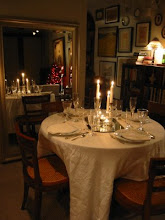
Beautiful antiques fill the room such as these candle sconces. Dining by candle light is a beautiful thing, I'm so glad he included them (wicks correctly pre burnt I might add )!
Another corner of the room featured this beautiful vase atop a gilded pedestal, artfully lit. I love the wood floor detailing.
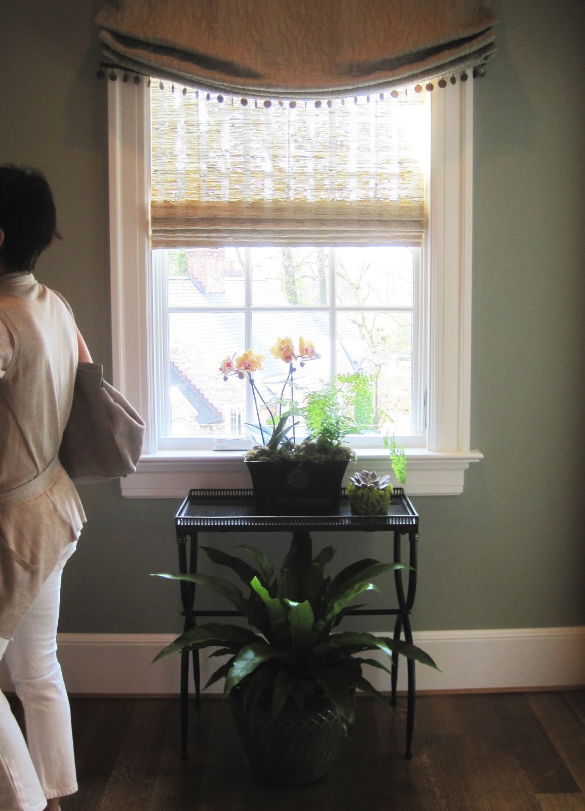
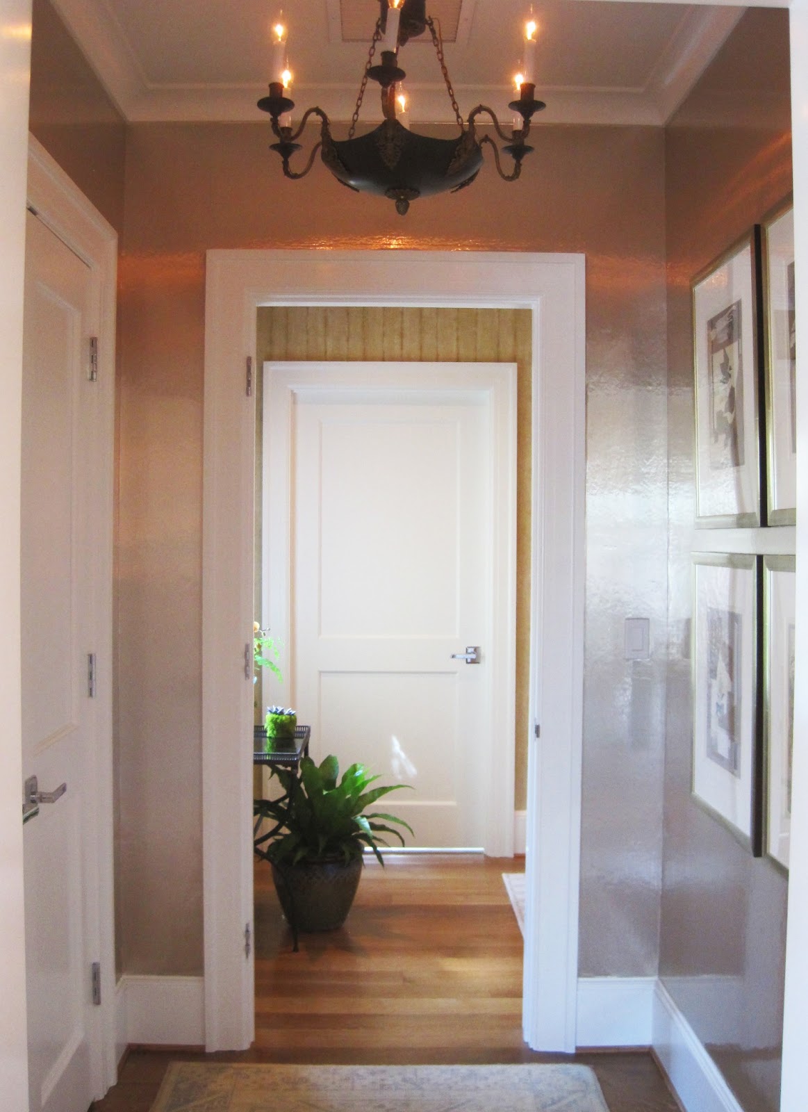
The large hall on the 2nd floor outside of the master suite was decorated by Claire Schwab out of Alexandria. Schwab choose beautiful moss tones with hints of orange to create a cozy landing out of what otherwise would be a banal hallway.
 I mean this as the highest compliment when I say it felt very 'Martha Stewart', particularly the plants in front of the window.
One of the most talked about spaces was the morning room decorated by Iantha Carley. The cheerful, sunny room was fitted out with a variety of beautiful textures and patterns but what I most appreciated was the attention to small details, such as the orange colored dog bed in the corner!
Saving the best for last, by far the most successful space in the house is the Master Sitting room on the 2nd floor designed by Michael Hampton.  Hampton based the room on the beautiful flame-stitched carpet from Patterson Flynn he had always wanted to use on a project; showhouses are great for such experimenting!
The room is a luxurious retreat with soft, warm neutrals comforting the user. While the house this year feels harmonious with the rooms flowing nicely together for the most part (unusual for a showhouse), this was still a soothing room to enter. Recognize the side table from Bunny Williams's Beeline Home collection?
Much loved were the towering Circa light fixtures on either side of the bookcase. Notice the faux bois wallpaper which has been cut into squares and alternated to create movement on the walls? Great details!
The vestibule is papered in a fantastic luxe lacquered wallpaper which adds glamour to the tiny space. I loved the neoclassical light fixture which Hampton says he got off ebay for only $200 years ago (I love finds like that)!
The room is anchored on a comfy daybed in the center of the room ideal for lounging or even extra sleeping. Great light fixtures throughout the room provide a nice layer of detail and finish.
Be sure to visit the showhouse this year located in Wesley Heights along Foxhall Road, you won't regret it!
Read more coverage by other local bloggers here:  Design du Monde, DC by Design, and My Notting Hill

Monday, April 15, 2013

DC Design House teaser

Last week I attended a preview of the DC Design House which is located on Foxhall Road. Before I bring you my favorite rooms, I thought I would bring you some fun ideas from Designer Regan Billingsley.
Generally bathrooms in design houses are either filled with loud wallpaper, passed over, or simply left with the door closed.  However, Billingsley made it a prominent feature of her Teenage Boys Room.  The black painted doors were highlighted with the sides painted a bright red. That pop of color with the door open was amazing!  I also loved the message she put on the wall backwards only legible in the mirror "Don't grow up, it's a trap".  Wise words from a clever designer! More tomorrow......

Friday, April 12, 2013

Artful handles

While out and about today I noticed these great brass & glass door handles on the soon to open new J. Crew store at the former Georgetown Park mall. Aren't they terrific? I'm just loving these doors with glass and brass combination. As a side note; I'm very excited about this new development near my office which will include some great lunch time diversions!

Tuesday, April 9, 2013

General Post Office and Tariff Building, DC

Last week I attended an event at the Monaco Hotel, one of my favorite buildings in DC, and thought I would share it with you. The hotel actually started out life as the General Post Office in 1839 and was later turned into the Tariff Building. It wasn't until 2002 when the building was converted into a hotel.
Robert Mills, architect of the Washington Monument, originally designed the structure. Later, Thomas Walter, architect of the U.S. Capitol building, designed an extensive addition. Impressive roots for a mere hotel!
The beautiful plasterwork in the hotel has been expertly restored but what really amazed me was this cantilevered limestone staircase, rising up to the ballrooms on the 4th floor.
 The original iron and wood railing is solid yet elegant.
I have been to the hotel many times to the restaurant, Poste, but had never ventured beyond the lobby. The 4th floor was astounding. The Paris ballroom was designed in the 1860's as the library for the Postmaster General and what a lucky man he was.
The space has the same intricate plasterwork as below but an elliptical, groin-vaulted ceiling contains skylights which flood the vast 3,500sf space with light. No wonder the space is popular with weddings and other events!
The building features extremely wide hallways which are dotted with fashionable furnishings which refer back to the hotel's capital location. Recognize the eagle console from Vanguard?
These chairs appear to have a Fornasetti fabric, does anyone recognize it?  Next time you're in DC take a look around the Monaco Hotel, you won't regret it!

Friday, April 5, 2013

Italian design in DC

As many of you know by now, I am not a modernist.  However I do appreciate the clean lines of many modern products. Last week I attended an event at the Boffi / Maxalto showroom and thought I'd share some of my favorite pieces with you.
I loved the LED lit console seen at the top of the page, even if it felt a bit commercial. The soaking tub above was pretty great too.
The egg shaped tub was probably my favorite, it looks so comfortable! I could see it in a more traditional bathroom with a different faucet.
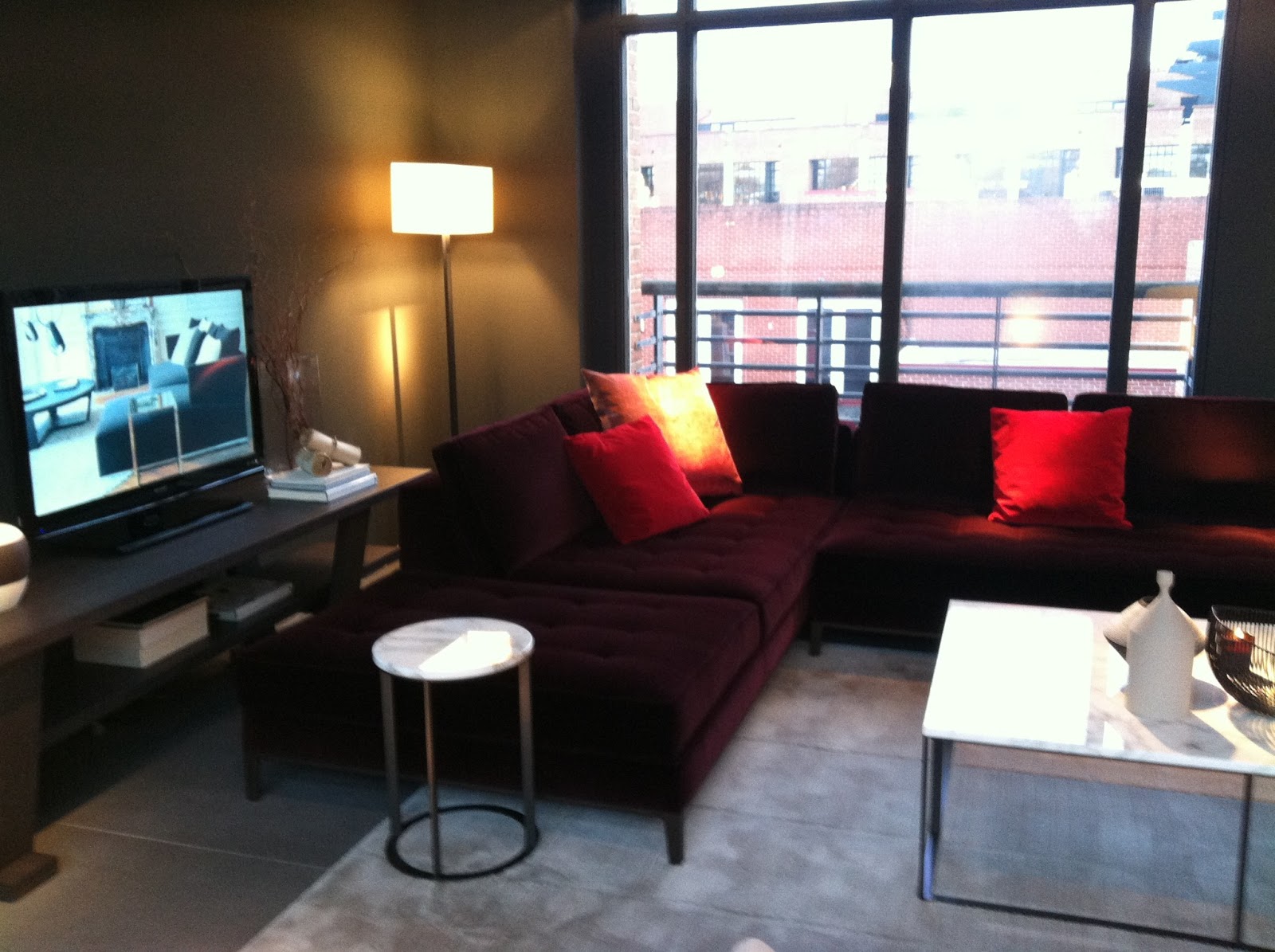
The furnishings from Maxalto were more my speed especially the sectional above in this great maroon velvet; great for stretching out on movie nights.
Probably my favorite item on view though was an installation of these paper butterflies by artist Paul Villinski which fluttered as one walked by. What do you think, would you install any of these modern fixtures in your house?
Friday, March 29, 2013

ICAA upcoming lecture


Join the Mid-Atlantic chapter of the ICAA (Institute of Classical Architecture & Art) on Thursday, April 18th, for a lecture given by Gary L Brewer, partner at Robert A. M. Stern Architects, on their latest book Evidence. I've already purchased my copy and can assure you it matches the quality of Stern's other books and is such a beautiful exhibit of their work. Copies of the book will be available for purchase at the lecture.
Also I'm pleased to announce that I'm now a board member of the Mid-Atlantic ICAA and I encourage you to join us for our lectures and tours located in the area; join the organization at the website. I'll be sure to share them all with you here on the blog for those unable to attend.
Information on the lecture is available here, hope to see you there!

Tuesday, March 26, 2013

An artist at home, Pierre Bergian


As a blogger one receives masses of press releases, most of which prompt you to hit delete before even opening. Once in awhile though something intrigues me and pulls me in -this happened recently when someone from the Purdy Hicks Gallery contacted me about the artist Pierre Bergian who currently has an exhibit in their London space.
Pierre Bergian is known for his stark views of interiors -think "World of Interiors" magazine painted. It's no surprise his work is so intriguing to me as he studied art history and archaeology.
Pierre also took these photos of his own house so it's an intriguing look at how the artist perceives his own interiors in life as well as in his work. I love the book filled library above.
See the similarities between his own house and his work? The paintings are kept spare so that the eye focuses on composition and proportion.  The rooms are from memory; of abandoned grand country houses he visited as a child.
Pierre lives in Bruges, Belgium, with his family in a 19th century former soap factory (circa 1825) which has the proportions of a house from the 18th century. While he loves the diversity of the architecture in the small town he loves to travel to more cosmopolitan cities as often as he can. Notice the shelter magazines piled all over his house, (similar to my own!). There is more than one way to travel after all!
Pierre collects an assortment of items from all time periods. I love the eclectic assemblage in his rooms.
I also love the feel of casual European kitchens like his below; so much more cozy than our American counterparts which often feel like cold showrooms. Don't you love that light fixture above the stove too?
Pierre's favorite thing about his house is the amount of windows -light is always important to an artist. The living room has a beautiful skylight with stained glass laylight and overlooks the rear garden. New Replacement Windows, perhaps?  I wonder if the fireplaces work? 

Pierre's wife, Angele Boddaer, is also an art historian and works as a muralist and restorer of wall art. Don't you just want to be friends with this fascinating couple?

The spare use of strong color is found throughout the house. Why be afraid of color when you know how to use it? Restraint is key.
 Their bedroom is a serene baby blue but is kept from being too sweet by the spareness of the furnishings.
Pierre at work in his studio - the organized clutter is a keen insight into how his mind works.
 Each photograph is composed as a still life. I wonder what the stacks of drawings contain?
Inspiration is found throughout the many magazines and books he collects.
Pierre's work is available through the Purdy Hicks Gallery in London, how I wish I could visit! If you find yourself in London, stop in and tell them ArchitectDesign sent you!
The Purdy Hicks Gallery is located at 65 Hopton Street in Bankside. All images in post are courtesy of the artist.