The space is so good that in fact it was the only room to be directly COPIED on a sound stage for the filming of The Grass is Greener - in which it appears for only a matter of moments. That's a lot of expense although perhaps it was used in scenes which hit the editing room floor? I wonder what happened to the scenery after filming?
Above is Cary Grant on a brief walk through the house (actually sets on a London sound stage) with his butler before opening to the paying public in The Grass is Greener.
Although it was meant as the Entrance Hall today on a tour of the house it's actually one of the last rooms you see; although you catch a glimpse of it from the long gallery central doors (below) earlier in the tour. Those are the 'front doors' of the house.
The Entrance Hall was completely redesigned by Robert Adam during the extensive renovations to the Tudor house by removing one portion of the block of the house, essentially creating a U shaped plan. One enters up a grand exterior stair and through what was formerly a totally enclosed courtyard which makes for a truly impressive processional entrance. The wing of the house which was removed was replaced with a classical screen which acts as a covered porch. Even the ceiling of that outdoor space has elaborate plaster-work. One only wishes the current tour took this same path rather than in through the family entrance past service spaces on the Ground floor.
The hall was used for more than just grand entrances though; the family would use the room for dining and overflow from the long gallery during the weekend parties and balls they would throw.
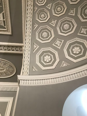
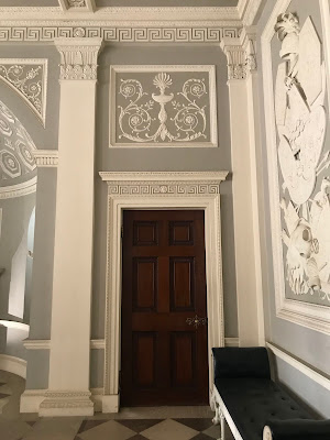
Every inch of this space and surface is designed to complement all aspects of the room. The floor reflects the ceiling, the wall panels encase armorial panels, and even the furniture was designed by Adam.
The soft french grey and ivory white are excellent foils for the limestone floors and mantelpieces.
These lovely 3-branch oil-lamp sconces designed by Adam grace elaborate plaster brackets. These would make for fantastic electric uplights today!
At either end of the room are apses which function as inglenooks without the built-in seating.
The flowers in the firebox are decidedly odd but don't distract from the perfection of every detail.
This limestone mantel would be stunning on a flat wall let along softly and impressively curved to fit the wall.Imagine having to do the math to figure out the details of the curved ceiling - no 2 pieces are alike.
Notice too the built-in window seats facing the courtyard.
I think mahogany doors within painted trim are one of my favorite details in life.
The Greek key cornice, which normally would be one of the first things I'd notice, is almost lost amongst the exuberant plaster-work.
Greek key too in the classical overdoor (and who doesn't love an enfilade?).
The small vestibules on either end of the entrance hall have the most beautiful groin vaulted ceilings perhaps I have ever seen. A shame more discreet smoke detectors could not be found! Perhaps it would be better more in alignment with the pattern?
Here I leave you with the recommendation to visit Osterley House & Park on your next visit to London!





.JPG)







4 comments:
Another Adam winner! It just goes to show how neoclassical ornament can be extended without giving that living-in-a-candy-box feeling. After Notre Dame, we shouldn't be too upset at seeing smoke detectors, but you are right--with such an elegant room, they could have planned better. Perhaps there are some weird regulations--4 feet from each wall, etc.
--Jim
As you say, the soft french grey and ivory white are excellent foils for the limestone floors and mantelpieces. More surprisingly, later Deco wall sculptures in low relief look as if they were directly inspired by Adam's work. Love it!
Perfection...!
I was crazy about the house AND the color -- it was divine and I was nearly alone the day I visited!
Nicely done...
Post a Comment