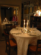
In the January 2013 issue, the townhouse of designer Michela Imperiali Klemos is featured in a short article thats long on style. I adored the custom door she created between her dining room and kitchen; covered in antique mirrored tiles with hidden Euro hinges and no hardware so it virtually disappears. She even used the tiles vertically to hide the seam where the door opens - brilliant! What do you think of this detail?
Photos by Tom Parker


.JPG)


15 comments:
That is quite clever and visually stunning! I love it!
I know how you feel about the shelter magazines. I subscribe to at least twelve. In the past, I could not wait to get to them...now they sit in a pile and some even remain unread when I bring them to the recycle bin.
xo
Andie
Andie, I find myself doing the same thing -they sit on my coffee table for months until I say "ok, I have to clean this off and READ these!".
I agree with all of the above...and sadly I have to thow in AD right there on the compost pile. Can't tell you how much I hated the last "cutting edge" edition. Like you, I do read my pile o mags them... and pass them on or recycle.
Regarding the door, I think it is fab. I, however, could not be trusted after a couple of drinks or misplaced glasses to find myself safely on the other side!
HBD, I still haven't seen that issue yet (under the pile on the coffee table)..but in general I love the direction AD has taken.
Yes, I think the door would be kept propped open more often than not, but I'm not really a fan of the open concept kitchen. I want to hide the occasional mess and the smells (even the good ones!).
I see more clearly when I click and enlarge the second photo that 2/3 the mirror opens and 1/3 remains stationary art. It is brilliant, and leads one to consider how the same principle could work with other works of art!
Glad you saw that, Mark -it's the best part! I assume it's for symmetry on the dining room wall.
I always worry that my pictures are too small on the blog but I find it loads so much quicker. You can always click on it to enlarge!
I find that there are so many innovative sources on line that I have done away with subscriptions. Now that door is all "smoke and mirrors" and I love it.
pve
yes and yes. magazines have been really lacking and that door is stunning. I am afraid my love for antiqued and smokey mirrors defines me.
Fabulous. I love the doors and agree about the US magazines, snore. You should try Russian decor mags... stupid expensive but fun, my Russian dec friend showed me a few... it gives a new perspective.
Thanks for the great idea.
Great idea, human mind is so inventive from small and simple to big and complex it is all possible.
My last subscription to run out was that of Architectural Digest, I don't have any now. I thought some thing was wrong with me that I couldn't find anything interesting. I am glad to know that is not the case.
I can't image ever closing the door for practical reasons and my eye doesn't wan't to be fence in when there's a view. It looks better open anyway as Mark pointed out.
I've seen it done with a Chinese screen, (as in the door was hidden in a central part of the screen), and it was very effective.
Totally agree. And have been subscribing to even the fashion magazines from Europe. Love following our log!
Jamie Herzlinger
I wrote a long screed the other day and it disappeared – thanks to blogger.
I buy the British H&G every so often more for the nostalgia than anything else. I used to think that interior design over there had a strong streak of quirky traditionalism that mixed very well with modernism – occasionally I still think so. My favourite remains WoI.
I love Blue's phrase 'quirky traditionalism', I think it sums up this fantastic door perfectly. Thanks again for sharing the treasures you stumble across. David.
Post a Comment