 This past Thursday I was able to hear Stephen Drucker (current editor in chief of House Beautiful magazine with quite an impressive resume behind him) speak here in DC about how Nature informs interiors. Unfortunately, the opening of the DC showhouse at the design center meant a small audience.
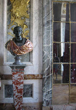
He spoke in the beautiful neoclassical lecture hall of the Corcoran College of art and design. One of the first things he spoke about was to rave about this room. I had to agree! His lecture was very informal, extremely realistic and down to earth. Rather than preach about green living and practices, he tackled first how 'green design' isn't something new. Rather, it has been brought about every 30 years on average. He even showed the first 'green' issue of House Beautiful....from 1949!
 One of the problems he cited was that people will talk the talk but when it comes to the practice of environmentally friendly living, they don't want to be bothered other than with cleaning products. Green issues of magazines are among the worst selling issues each year. People want fantasy and pretty pictures from magazines (I have to agree). Stephen realizes that and admits it freely; when people want hard information and facts, they turn to the internet.
  Stephen ended the lecture with a slide show of different 'natural' interiors through time as featured in House Beautiful-starting with Frank Lloyd Wright in the 40s, going through Michael Taylor in the 70s and ending with Axel Vervoordt now. It was such a great opportunity to hear him speak and I hope if all of you get the chance you will go for it! He has really turned House Beautiful into a wonderful magazine and I hope to see its continued success!
 His lecture was very informal, extremely realistic and down to earth. Rather than preach about green living and practices, he tackled first how 'green design' isn't something new. Rather, it has been brought about every 30 years on average. He even showed the first 'green' issue of House Beautiful....from 1949!
 One of the problems he cited was that people will talk the talk but when it comes to the practice of environmentally friendly living, they don't want to be bothered other than with cleaning products. Green issues of magazines are among the worst selling issues each year. People want fantasy and pretty pictures from magazines (I have to agree). Stephen realizes that and admits it freely; when people want hard information and facts, they turn to the internet.
  Stephen ended the lecture with a slide show of different 'natural' interiors through time as featured in House Beautiful-starting with Frank Lloyd Wright in the 40s, going through Michael Taylor in the 70s and ending with Axel Vervoordt now. It was such a great opportunity to hear him speak and I hope if all of you get the chance you will go for it! He has really turned House Beautiful into a wonderful magazine and I hope to see its continued success!


.JPG)








14 comments:
How lucky you were to have experienced this!
That sounds like a swell lecture!
Stefan-I agree with your thoughts on House Beautiful. Especially since the demise of my beloved Domino, it has become my favorite shelter magazine. It is appalling how few there are left. Elle Decor is also good, but I detest Architectural Digest.
It was a great lecture!
SR, It is sad that there are so few great magazines left. Stephen even commented on how hated architectural digest is right now...Saying no one wants to see 'perfection'. I can see the logic in that.
I love architectural digest, not from an interior design point of view, but as an architect. The focus of the magazine is on the 'background' -the architecture (good and bad) that 'decorating' magazines tend to ignore.
AD is hated because of its sterility which is not the same thing as perfection.
'perfection' was Stephen's words - sterile is a better word. Like I said, it's not a decorating magazine to me, it's more of an architectural publication -which is why I like it - i appreciate it on a different wave length. It never has tried to be a decorating magazine, like house beautiful or domino was. It's the 'backgrounds' that the magazine is representing I think, what is BEHIND the pretty stuff shown in other publications.
It's not hated here :-) I think we just agree to disagree, hehe.
What a great opportunity to hear him speak - lucky you. Funny that AD doesn't seem to have difficulty finding advertisers like the design magazines that we all love seem to.
–Lana
I wonder if readers would enjoy the 'green issues' more if they weren't so silly.
Featuring a 'green' 7000 square foot LEEDS certified house is a joke that isn't lost on anyone.
The to do lists in some 'green' issues often suggest activities that are wrong and harmful. Switching to biodiesel, for example:
http://www.energyjustice.net/biodiesel/
It's as if the magazine editors don't take the green issues seriously and don't do the homework that could make them worthwhile.
I'd like to see a green issue featuring houses and apartments that are truly energy efficient and low impact - that are also of beauty and style. Such places are featured sometimes. They just aren't presented as 'green.' Instead, something dull or ridiculous is trotted out as an example of 'green living' for the 'green issue.' No wonder readers aren't interested.
Magazine editors can change that if they choose to.
Regarding the death of the beloved magazines...
It's sad to see the good ones go but every once in a while I'm reminded of how many more good house magazines there are now than when I was growing up.
My mother subscribed to House Beautiful, House & Garden, and Vogue.
The grocery and drug stores carried Better Homes & Gardens, Ladies Home Journal, etc.
Unless you lived in a big city near a good newstand, there wasn't much in the way of shelter magazines back in the dark ages of the 50s and 60s. It was pretty slim pickins.
Sounds like a fun lecture! I agree with the whole green thing. It seems so trendy and people do the smallest things possible (like use canvas totes at the grocery store) and think they are all "green"
That' defintely a step in the right direction, but there is so much more we can do each day in our homes to really make an impact.
I don't understand hating AD but it does trigger my jealousy instinct a bit more often than some of the others. AD photo standards for showing details is unmatched and I'm sure that sucks some of the life out.
About this "green" business: Is there any product or service that isn't sold as "green" these days? Can you read 3 paragraphs of anything with about green browbeating? I think most folks recognize the pop-marketing-fad too-muchness that green is today.
Most folks have to live where they are with what they have.
Regarding the green issues, the entire reason behind shelter magazines is to sell products. Reducing consumption is green, but then, that would counter the reason the magazines exist in the first place.
AD tries to have it both ways: As an interiors magazine and an architecture magazine. Take the regular "celebrity's home" feature--the only reason people want to read about "Martin Sheen's Summer Home," for example, is to see the interiors.
I wish I could attend the lecture. Thanks for giving us some insight and for showing us that amazing room.
That room is great. Agree - he has really turned House Beautiful into a great magazine again.
Post a Comment