 I've always loved the juxtaposition of the modern with the classical and we're seeing a lot of that latey here in DC. One of my favorite buildings is the Wilson building, otherwise known as the District Building, which houses the offices of the Mayor and city council on 14th street.
 The beaux arts facade with the crisp glass curtain wall always drew my attention. Both are great examples of their style and together just are that much more interesting. The original structure was built between 1904 and 1908 and the extensive renovation which includes the glass additions was completed in 2001.
 Recently I was able to view the interiors. The original building was a U shape which has been filled in with the 'glass box' you see on the exterior, but also leaving this interior atrium.
  What a great space this creates! I love that the modern additions respect the original structure both in scale and by not overpowering them. They work together as a team rather than fighting one another.
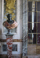
This interesting statue was inside the atrium; a gift from the people of Thailand to the citizens of Washington, DC to celebrate July 4th in 1945 (I think, correct me if I'm wrong on the year). It certainly adds some vibrant color to the very neutral tones in the building. Do you like this mix of old and new together, or do you prefer things to be one or the other?


.JPG)







16 comments:
This is a great example of contemporary and classic architecture sharing the same space. They both have a respect of the others lines and I believe this is what is making this juxtaposition work so perfectly.
Wow!!! Gorgeous..... I'm all for mixing new with old, modern with classic. This building is Amazing!!!! X, Carmie.
I like the marriage of old and new on most buildings, especially museums. To me, if done right, it signifies the new respecting the old, and the old embracing the new. It can be beautiful together. I love the new and old Louvre together.
i love it when old and new meet like this...
the detail in the juxtapositions really make or break the entirity of the build dont they...
i shud post a few topics fr you on my own blog...i know you will enjoy looking at it...
Well I'm glad you all agree with me! I was expecting some architectural purist to yell at me!
Stefan-This is a great example of how well it can be done.
I'm no purist. I think in this case the new makes the old look even better in contrast. There is a Portman building at Emory where the facade of a classic building is the interior centerpiece of the new building. It's breathtaking and a complete surprise. Washington must be full of these, some better than others I'm sure.
I think the DC building is beautiful, better than the Pei Pyramid at the Louve because it is integrated not an add on. I am not such a fan of what the Nelson Art Museum in Kansas City did. Their much "celebrated" addition looks like a Butler building lit up at night. Details and vision. Sounds simple. In extreme short supply.
what great images. what a great reminder of the synergy created by good design - both classical and modern.
thanks for posting!
I'm a student of classical architecture and can attest to the qualities of the original Nelson Atkins. The addition is growing on me, the interiors are very interesting and provide wonderful isolated peek-like glimpses back to the original. I also worked for Shalom Baranes at the time of the Wilson Building project. Patrick Burkhart was the lead designer and I agree with you that he achieved some major between contemporary and traditional. Patrick also was lead designer for the Turkish Chancery project on Mass Ave. - let us know what you think.
DC is really good at engulfing the old with the new, so that when you walk into a very modern building (on the outside) its totally different on the inside. I've always loved that.
Very striking building that I'm embarrassed to say I have never seen. Must do a driveby...
Allie, it's at the corner of 14th street NW and Pennsylvania Ave.
Anon: I'll have to check out the Turkish Chancery, I'm not sure offhand where it is.
i love your architecture posts! great pictures.
To anon 10:18: I appreciated your comments about the Nelson. I promise I will try to see potential when all I have seen is a butt-naked Emperor. Being a University of Oklahoma alum, I have been gobsmacked by the Hugh Newell Jacobsen addition to the OU art museum. Do you know that work? I find it both familiar in form and yet very new. It doesn't hurt that it is simply, radiantly beautiful. It fits in a traditional environment but tilts so ravishingly to the future.
Arch Design: Turkish Chancery on Mass Ave, just south of Islamic Center, same side of street (east).
HBD: I know HNJ from his residential projects in DC and Eastern Shore, MD. A little too po-mo for my taste actually. Same goes for the house he did here in KC, he's defintely on a line between worlds. My preference is for traditional architecture that recomposes language within the grammar of classical proportion and detail, nothing less, or taken away, or "stream-lined."
Post a Comment