
The last issue of the now defunct 'O at Home' was probably the most enjoyable magazine I've read for quite awhile. I read it cover to cover, every article. Fascinating! Yet another amazing magazine to bite the dust :-( Why??????

Labeled the color issue, first up was a home that used color very effectively and judicially against a white background. This family weekend home in Massachusetts was TOO fantastic. I mean -just check out that welcoming entryway with the yellow shutters and antique chandelier (and gravel sidewalks, which I think are so charming AND green!). The living/dining room had such marvelous things! Cobalt patent leather french armchairs, antique rugs and marble rococo marble mirror against a modern backdrop? SIGN ME UP!! Don't you just die a little (as Rachael Zoe would say)?

This sunroom would be the perfect place to relax all day long catching up on magazines (with the exception of
O at Home, Cottage Living and
House & Garden :-( ).

Now, you all know I don't like animal prints, but this Kelly green family room and modernized arm chair are too special to not post!

Next however was an apartment that had a more subtle and sophisticated palette by DC's own
Darryl Carter. I could move in tomorrow. I don't even need to pack my bags! I'm a fan!

I love this minimal kitchen. It's NYC so it's not like a whole lot of cooking will be going on.

As it's an apartment with limited space, the foyer was repurposed as an office. I love that he thought of using a floor lamp for a desklight. One thing I hate: the barn sliding doors -REAL pocket doors would have been so much nicer and more minimal. These look like an afterthought. I totally approve of sliding doors into the kitchen though! Sometimes you just want to close off the mess!

This room is heaven. The dining room was repurposed as a dual library. The shelves line the windows acting as a screening device but allows in all the light: the shelves have glass inserts. What a great idea for a room without a great view! I could see this working for someone who has a large china collection as well : great display space. Lamps on the table: divine.

Here is another wall of the library/ dining room and a close up of one of the lamps. I love the white frames against the white walls: I think the most important thing to point out are the interestingly shaped and generous mattes.

The bedroom has a desk as well -a tad confusing, no? I'll just assume this is an apartment for 2 busy professionals who need seperate work spaces. I think this bedroom's interesting mix of styles and furniture is very personal. You would almost think this was 'undecorated'.

The bathroom is lovely but generic. I loved that Darryl decided to place a more traditional framed mirror against the plate glass wall: it adds so much more interest to the otherwise bland room.

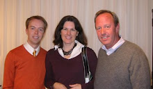
Lastly, here is the suave Darryl seen in the library dining room. O at home, COME BACK!!
 The last issue of the now defunct 'O at Home' was probably the most enjoyable magazine I've read for quite awhile. I read it cover to cover, every article. Fascinating! Yet another amazing magazine to bite the dust :-( Why??????
 Labeled the color issue, first up was a home that used color very effectively and judicially against a white background. This family weekend home in Massachusetts was TOO fantastic. I mean -just check out that welcoming entryway with the yellow shutters and antique chandelier (and gravel sidewalks, which I think are so charming AND green!). The living/dining room had such marvelous things! Cobalt patent leather french armchairs, antique rugs and marble rococo marble mirror against a modern backdrop? SIGN ME UP!! Don't you just die a little (as Rachael Zoe would say)?
 This sunroom would be the perfect place to relax all day long catching up on magazines (with the exception of O at Home, Cottage Living and House & Garden :-( ).
  Now, you all know I don't like animal prints, but this Kelly green family room and modernized arm chair are too special to not post!
 Next however was an apartment that had a more subtle and sophisticated palette by DC's own Darryl Carter. I could move in tomorrow. I don't even need to pack my bags! I'm a fan!
 I love this minimal kitchen. It's NYC so it's not like a whole lot of cooking will be going on.
 As it's an apartment with limited space, the foyer was repurposed as an office. I love that he thought of using a floor lamp for a desklight. One thing I hate: the barn sliding doors -REAL pocket doors would have been so much nicer and more minimal. These look like an afterthought. I totally approve of sliding doors into the kitchen though! Sometimes you just want to close off the mess!
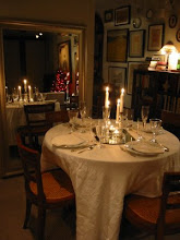
 This room is heaven. The dining room was repurposed as a dual library. The shelves line the windows acting as a screening device but allows in all the light: the shelves have glass inserts. What a great idea for a room without a great view! I could see this working for someone who has a large china collection as well : great display space. Lamps on the table: divine.
 Here is another wall of the library/ dining room and a close up of one of the lamps. I love the white frames against the white walls: I think the most important thing to point out are the interestingly shaped and generous mattes.
 The bedroom has a desk as well -a tad confusing, no? I'll just assume this is an apartment for 2 busy professionals who need seperate work spaces. I think this bedroom's interesting mix of styles and furniture is very personal. You would almost think this was 'undecorated'.
 The bathroom is lovely but generic. I loved that Darryl decided to place a more traditional framed mirror against the plate glass wall: it adds so much more interest to the otherwise bland room.


.JPG)









17 comments:
Drat. Another one?
Great post! Will definitly get the last O when it gets to Norway :)
S-
i must get a hold of this issue.
the living rm with the tea height round table in the center is perfect for nyc, when so many rooms have to have double, and triple duty.
i have done the emerald green walls with zebra several times. it is truly fabulous. i love it.
I'm going to pick up a copy of "O"! These pix are fantastic.
I hate to hear it's going away. Bummer. I must pick it up.
O darn, another one to bite the dust. It is a time for many to shift and re-group. Survival of the fittest!
Meanwhile, your post prompts me to get that last issue. Looks like it is loaded with a great finale!
I had your same thoughts about this last issue of O at Home. Had their issues been of this caliber, the magazine may have held on.
I'll have to pick up the issue - It looks great. Have always been a fan of Darryl Carter. He is great at making spaces modern and traditional at the same time.
Renee, I agree with you on the high coffee table! That shade of green is just so striking with the black & white.
Everyone should rush out and get the magazine -I was tempted to scan in the entire thing and post it all LOL. I'll really miss it :-(
I really like the metal lamp with the black shade. I think you get that through Hinson Lighting:
http://www.hinsonlighting.com/
Love the white frames and mattes.
Another one bites the dust!
Thank goodness for blogs!
xo xo
I haven't seen it yet - I like the last one a lot - her library was to die for.
Who do you think is going to get the White House? Carter or Bridges? I hope they pick an Afro American interior designer!!
Joni, Her library was stunning! I hope they pick Carter -but who knows.....
Support the magazines we have left! What would we do without them!!
Talking of magazines that have gone out of production...I've never seen "O" At Home, but your post makes me wish I had. Darryl seems talented in so many ways. Thanks for adding me to your blogroll. I thought you were on mine, but somehow it slipped...will rectify today.
Seriously. I am so sad to see all these mags disappearing. I just want H&G back!!!
BTW, congrats on your mention in Elle Decor!
Wow what a place to call home! I love Darryl Carter and this is especially exciting- a little more edgy for him. The dining room turned library is fantastic and I love the comment about china on display on the shelves... great ideas!
I don't have the magazine... thanks for sharing, I'm so glad I didn't miss out on this!
Post a Comment