I hope everyone enjoys their weekend! Is it the middle of summer already? I'll be enjoying the weekend in NY and hopefully will have fun and interesting things to post when I get back!
Picture of mosaic above my kitchen sink.
I hope everyone enjoys their weekend! Is it the middle of summer already? I'll be enjoying the weekend in NY and hopefully will have fun and interesting things to post when I get back! I think it's been too long since my last 'house tour' -so todays tour is courtesy of the July/August 1986 issue of 'The World of Interiors' magazine: Grimesthorpe Castle. Grimesthorpe is the last house worked on by the amateur architect, Sir John Vanbrugh although the roots of the house date back to the 13th century. Come on in!
 We start in 'Vanbrugh's Hall' which has always been used as the houses sitting room. Not exactly a cozy place to curl up with a book, but impressive, isn't it? The house's decoration, circa 1986, was by the Lady of the house starting in 1951, Lady Ancaster (cousin of Nancy Lancaster) and John Fowler.
 My favorite parts of these grand estates are always the hallways -odd, huh? I love how they are an impressive space to guide guests (and residents) from room to room through a gallery of sorts. Natural light is a big help too!
 The state drawing room is naturally meant to impress. Imagine taking tea here!
 I'm sure the Chinese Drawing room will be your cup of tea. The furniture was brought from Florence to the house in 1844. John Fowler had wanted to paint the dado white, but Lady Ancaster insisted on keeping it black - I think it gives the room a more exotic feel. Isn't the wallpaper wonderful? The tea table is Chippendale.
 The bay window of the room contains this wonderful gothic fretwork ceiling. Lady Ancaster and John Fowler added the side mirrors to visually enlarge the space.
 Another room with wonderful wallpaper is 'the bird cage room' - suitably named! Housed in a tower dating from the 13th century, Lady Ancaster insisted on covering the floor with rush matting. This became quite popular with country houses all over GB following this. The 'wallpaper' actually consists only of the birds and flowers, all seperate and pasted to the walls. The foliage was then painted in, connecting the scene. The birds on the ceiling were added by Lady Ancaster from a packet of 'spares' found on the estate.
 My favorite room though, is probably the Tapestry Room. The tapestries lining the room were all done by inhabitants of the house, mostly all men! Here again you see the rush matting.
 In this corner view of the tapestry room, you can see the latticework pilasters that surround the bay windows.
 The state dining room is incredibly large! I don't know enough people to seat here! The light fixtures come from the old House of Lords.
  The bedrooms are no less impressive. The bed in this room was a gift from King Charles I.
 In another bedroom, seen below, the bed again has kingly associations -the canopy once hung over King George IV's throne.
  In a corner of the room is a very pretty dressing table set with items belonging to a former resident, Nancy, Lady Astor.
 I hope you enjoyed the tour!
 Have you noticed that there are a lot of deals to be had right now? I stopped by my local West Elm this past weekend and found a huge storewide clearance going on. I got the above silk pillow with cute birds for 60% off; it lives on one of my dining room chairs which you see as you walk into my apartment. Softens up all of the wood, don't you think?
 Something I didn't need but couldn't passs up was one of their ladderback chairs in white, for only $30! I love the stylish simplicity of these and the construction is surprisingly good. Extra seating for guests: check! (till then it holds a stack of books and a plant).
 On a sad note, Smith & Hawken is closing its doors. They have carried the most perfect gardening and houseplant items since 1979. Coincidentally -their logo is also my initials! As they're clearing out their stores, I had to grab one of their glazed terra cotta pots with a crackle finish as it prominently displays my initials for my window sill at work.

 I'll go through some of these topics with examples of his own apartment (which he is in the process of moving from at this very moment as he sold it! another apartment, another design!).
 Another fun use of color is the powder room off the entry. He had a decorative artist do the blocks of color (same size as the tile!) in the colors of the Davis paintings. It really brings interest to a rather basic room.
 CURVE: By this he means repitition of forms; in this case the circle. In his living & dining room the same curved elements show up in many forms: candles, the bookcase, chairs, chandeliers and most prominently in the artwork above the couch.
 Purple seems to be a color threaded throughout most of his work. However, when asked what his favorite color was, he responded "I don't have a favorite color, which of your children is your favorite?". Always witty ;-)
 TEXTURE: The use of texture is seen most readily in his guest bedroom, pictured below. The walls are a form of venetian plaster he invented to look like pieces of leather or parchment. I love the turquoise accents! He likes to make heirlooms work - the dated looking nightstands were his grandmothers.
 The mirror above the bed was his first major purchase at the age of 21 at the Paris Fleamarkets (I'll be there soon enough, I'm counting the days!). He mentioned that the piece had a lot of sentimental value for that reason but that he sold it with the apartment! His answer to that? 'Oh well, buh-bye'!
 LUSTER & THE MIX: These were the last two subjects and I think you can see evidence of them in each and every picture. He definitely goes for an instinctual, eclectic mix of objects and it all works! Luster is evident in not only the walll and floor finishes, but in the highly polished furniture and lots of glass, crystal and mirror. Notice the glass and crystal lamps featured in many of his rooms -including the master bedroom above. He said he never thought he would be a person with a yellow bedroom; I just wonder what he thinks of people with yellow bedrooms then! He's adventurous with color and loves to experiment.
 These last pictures are not his own apartment but I loved them so much I had to post them. He seems to like to pick 2 colors and use a neutral or 'structural' color in between. Here the colors in this living room would be shades of peacock blue and chartruese with a structure of black & white. Notice the textured finish to the walls (and the pillows). Luster is provided by the coffee table. The tall scale of the lamps is unexpected but works so well! I want to live here!
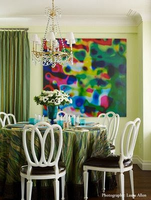 Another room I loved was done for a show apartment in a complex that he modeled on Grace Kelly (a former resident; her father's companies bricks were used in the building's construction). This dining room again features 2 strong colors; green & turquoise. The eclectic mix of furniture and art is a trademark of his.
  If you haven't read it yet, please check out his fascinating book, 'New American Glamour'.


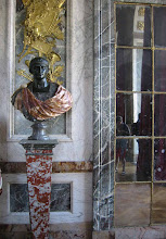
 the theater at Versailles
 The Hello Kitty Castle, that is. Located in Shangai, China, a rabid fan built this in honor of his favorite character and operates it as a museum. Surprisingly: A popular museum! I think I would put this up there with world's largest ball of twine....
 The pink living room. What is that shade? bubblegum? strawberry ice cream?
  Can you sleep in a room this pink? Scientists want to know.
 After seeing all of that sweetness, do you really want to sit down to dessert in the dining room?
 The backyard is a relief in its lack of pink! Can you believe this is in Shangai, it could be Omaha, Nebraska or the like by the looks of the yard. I hope you enjoyed the travel-log!
 American Gothic, by Grant Wood, has always been one of my favorite paintings. Cliche I know, but I just love it. While in Chicago this past weekend I was able to see not only the original painting (1930) in the Chicago Institute of Art, but also a sister work of art from 2005 that mimics it nearby across from the famous Tribune Building.

 While at the Chicago Institute of Art, I came across a piece that was surprising to me: A ceramic vessel by Paul Gauguin. Yes, THAT Paul Gauguin: the post-impressionist with the colorful exotic paintings based in Polynesia. I had no idea he was so prolific!


 Adjacent to the Pritzger Pavilion, by Frank Gehry,are 2 other interesting pieces of sculpture that really capture 2 different styles of monuments.
 The first is a very classical structure, the Millennium Monument in Wrigley Square. It is a slightly smaller version of a Greek (doric) styled monument, designed by Edward Bennett, (who also designed the famous Buckingham Fountain nearby) which stood nearby from 1917 till 1953. I love classical structures like these, but sadly it was the emptiest part of the whole park.
 The Cloud-gate, lovingly nicknamed the bean for obvious reasons, was immensly more popular. I could see why: totally interactive, people loved to look at their own reflections 'carnival style' and walk in, around and under it.
  The sculpture sits in the AT&T plaza section: built of polished steel, it weighs in at 110 TONS! The heavy work was the first installation by artist Anish Kapoor in the United States and cost upwards of $23 million -about 5 times more than the classical Millenium monument! It is meant to depict a drop of mercury right before impact with the ground. The sculpture was hand polished on site after delivery to hide the weld-lines. They did a good job because it is amazingly PERFECT (although it could do with a good washing with windex!). You can easily see why this is the most popular piece in the park! If you plan a trip to Chicago (and you must!) plan to visit the Millennium Park!


 Posts
All Comments
Posts
All Comments














.JPG)