
This past weekend, I bought a cabinet on craigslist to replace a console table I had in my entry hall (slash dressing room), seen above. While the old console table was very pretty, it lacked essential storage. While advertised as antique, it's actually a newer piece which was a disappointment (especially as I had driven out to Ashburn!) but the quality is outstanding. It is unmarked though so I can't figure out the maker.

Here is my old console table. I kept the mirror which oddly enough, is a near perfect match for the cabinet, which even odder still, is nearly the same exact size as the table!

I can't make up my mind whether to use my old wedgwood lamp, which was my grandparents (the beige and brown urn) or to use a simpler white wedgwood lamp which needs a little work (the lamp shade extension needs to be removed as it is out of scale). Which do you prefer? I realize my
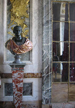
Napolean bust from restoration hardware is also a bit big, but I like him and don't know where else he could go in my tiny apartment.

I lined the top 2 drawers with a beautiful marbelized paper which I think goes nicely with the marble top as well as 2 plates from my
John Derian collection. How was your weekend?
 This past weekend, I bought a cabinet on craigslist to replace a console table I had in my entry hall (slash dressing room), seen above. While the old console table was very pretty, it lacked essential storage. While advertised as antique, it's actually a newer piece which was a disappointment (especially as I had driven out to Ashburn!) but the quality is outstanding. It is unmarked though so I can't figure out the maker.
 Here is my old console table. I kept the mirror which oddly enough, is a near perfect match for the cabinet, which even odder still, is nearly the same exact size as the table!
 I can't make up my mind whether to use my old wedgwood lamp, which was my grandparents (the beige and brown urn) or to use a simpler white wedgwood lamp which needs a little work (the lamp shade extension needs to be removed as it is out of scale). Which do you prefer? I realize my Napolean bust from restoration hardware is also a bit big, but I like him and don't know where else he could go in my tiny apartment.
 I lined the top 2 drawers with a beautiful marbelized paper which I think goes nicely with the marble top as well as 2 plates from my John Derian collection. How was your weekend?


.JPG)









26 comments:
i think the lamp you have on it looks nice.
it is really tough to buy through the internet.
it looks like a fine piece though,
enjoy it.
xx
Renee, thank you! I'm pleased that you like it as well, especially since you're the professional!
I like the new arrangement as much as I admired the previous one. It's a handsome cabinet and makes a good plinth for the bust which to my eyes fits the space very well.
It really looks fantastic in your apt. Obviously it was a wise acquisition! It's almost like it was made for that space.
Thank you, Blue and Todd! It's in a narrow hallway, Blue, but maybe you're right and the scale isn't too off -just dramatic. I'll live with it for awhile this way.
The new cabinet is beautiful, it will be an antique in the future if it is not now :) Though I am not an interior designer but I think the existing lamp with it's brown accent and the brown in the marble top, go well together.
By the way I love the rug in front of the cabinet.
Stefan It is a gorgeous piece. I love the wood grain on it and the mirror is perfect over it. What if you just move the lamp a bit over to the side?
xoxo
Karena
Art by Karena
The cabinet is lovely and I would love to see small wall hung sconces with black shades.
pve
Stefan- a gorgeous find and though not as old as you'd thought-the storage is vital. Stick with the original brown WW lamp, elevate it a bit to get a little balance and maybe you can use the books and the bust as a "pair of bookends to add more books. I hope you kept the console! PGT
Loving the suggestions- thanks! I'll have to try a few things out.
Gaye - the console is off to the side currently but will find a home in my storage unit once I can clear enough space!
I agree that the older lamp looks great where you have it. Now the big question is, what are you going to do with the console!?
What a score Stefan, it's beautiful. I like big Napoleon setting on it as well. Both lamps are handsome, my personal preference would be the white urn with a small black barrel shade, but I don't think you can miss with either option.
Wonderful piece. You did great and I agree use the orig lamp and raise it a bit. Love!
Stefan, it's all looking marvelous. The over-scaled
bust is exactly right. Just lose the bell-shaped lampshade and all will be perfection.
Considering the mass of the bust, you might try placing it in the middle of the cabinet which would provide a vertical axis. This would enable- as pve has suggested- to use small wall hung sconces and introduce an element of symmetry- always pleasing.
Very dramatic! I love it!
I love it! Looks great! I also love the bust but what if you put the lamp on top of the stack of books so it would balance out the height of the bust? Just an idea.
LOVE Daniel's ideas which also incorporate Patricia's sconce idea. You got a lucky find there my friend! What a great storage piece. The only thing I have to add is that perhaps you could hang the mirror a bit higher on the wall now that the piece hides the bottom of the mirror. Might give more height to the whole composition and then the bust would have less mass, proportionally. And I also agree that the rug is wonderful too!!!!
Love it! A stack of large books on the floor might serve as a good base for Napoleon. Its an easy fix if it looks bad.
It does look rather good. While Napoleon might be a bit large, he actually looks quite at home!
I love the bust of Napoleon... I can't believe that's from Restoration Hardware.
I am in the minority by feeling Napoleon benefits handsomely by the previous location's overhead shadow. That's an awfully pretty surface on your new cabinet, I think I'd want that pretty surface to advance rather than recede underneath so many objects. Some commenters want to raise the lamp, but I'd suggest trying a much lower harp for the lamp, which would put the lamp/shade more in scale with the base. And you're right about your happy accident, your mirror complements your new chest beautifully!
-Flo
Stefan -- loving the scale of the bust and, of course, the marbled paper liners!! Great styling as usual.
Never say NEVER...you can always find treasures in the Secret Garden - like this cabinet with marble top. It is beautifully grained.
First impressions are everlasting, and that console is so Empire which truly fits Napoleon...the shadows cast upon his face from his former perch made him all the more evocative and antique. I thought your original entrance vignette ideal...open and visually inviting.
Perhaps you can find the right place in the home for the woodgrain and marble cabinet to sparkle in its own brilliance - I see it used as a console/buffet for your fine dining as you do so often with beautiful china from your collection....you'll be surprised as all will fall into place as should be.
a little late, i like the bust - how about flanking the mirror with two sconces instead of lamp - that would increase the horizontal look of the vignette. just a thought. you could use candles even instead of electricity 0r you could use those battery operated bulbs. just a thought.
now, i'm worried about the console. what a great piece. it would make such a great bar or in the bathroom with piles of fluffy white towels and glass bottles. what a stylist. where did it go?
I would try two tall stemmed candlestick lamps with smaller shades and place the bust either between them or you could try one lamp but I'm a "symmetrical" person. I do like your new piece, it eliminates some of the business of the table. Great blog. Ann
Post a Comment