
This evening I attended a lecture given by the talented and O.T.T. (over the top - coined from Jamie himself!) designer Jamie Drake at the Corcoran Museum here in DC. He was just as personable and funny as one would hope he would be. His personality matched his fun and imaginative work! He broke his lecture down into the components of design he focuses on in his book with many of the same images. I love his book, it's very well written, so it was a treat to have him talk about it.  I'll go through some of these topics with examples of his own apartment (which he is in the process of moving from at this very moment as he sold it! another apartment, another design!).
COLOR: He has been inspired by art since early childhood (his mother is an artist) and has always loved the work of Gene Davis (as do I!) which is featured prominently in his entryway. The color seen in this room was taken directly from the paintings. Another fun use of color is the powder room off the entry. He had a decorative artist do the blocks of color (same size as the tile!) in the colors of the Davis paintings. It really brings interest to a rather basic room.
 CURVE: By this he means repitition of forms; in this case the circle. In his living & dining room the same curved elements show up in many forms: candles, the bookcase, chairs, chandeliers and most prominently in the artwork above the couch.
 Purple seems to be a color threaded throughout most of his work. However, when asked what his favorite color was, he responded "I don't have a favorite color, which of your children is your favorite?". Always witty ;-)
 TEXTURE: The use of texture is seen most readily in his guest bedroom, pictured below. The walls are a form of venetian plaster he invented to look like pieces of leather or parchment. I love the turquoise accents! He likes to make heirlooms work - the dated looking nightstands were his grandmothers.
 The mirror above the bed was his first major purchase at the age of 21 at the Paris Fleamarkets (I'll be there soon enough, I'm counting the days!). He mentioned that the piece had a lot of sentimental value for that reason but that he sold it with the apartment! His answer to that? 'Oh well, buh-bye'!
 LUSTER & THE MIX: These were the last two subjects and I think you can see evidence of them in each and every picture. He definitely goes for an instinctual, eclectic mix of objects and it all works! Luster is evident in not only the walll and floor finishes, but in the highly polished furniture and lots of glass, crystal and mirror. Notice the glass and crystal lamps featured in many of his rooms -including the master bedroom above. He said he never thought he would be a person with a yellow bedroom; I just wonder what he thinks of people with yellow bedrooms then! He's adventurous with color and loves to experiment.
 These last pictures are not his own apartment but I loved them so much I had to post them. He seems to like to pick 2 colors and use a neutral or 'structural' color in between. Here the colors in this living room would be shades of peacock blue and chartruese with a structure of black & white. Notice the textured finish to the walls (and the pillows). Luster is provided by the coffee table. The tall scale of the lamps is unexpected but works so well! I want to live here!
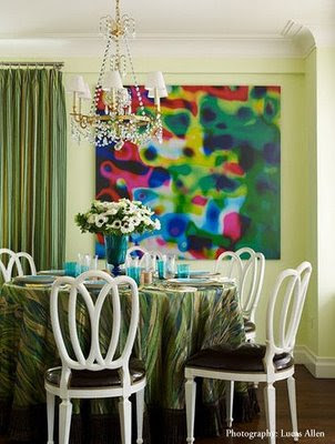 Another room I loved was done for a show apartment in a complex that he modeled on Grace Kelly (a former resident; her father's companies bricks were used in the building's construction). This dining room again features 2 strong colors; green & turquoise. The eclectic mix of furniture and art is a trademark of his.
I'll go through some of these topics with examples of his own apartment (which he is in the process of moving from at this very moment as he sold it! another apartment, another design!).COLOR: He has been inspired by art since early childhood (his mother is an artist) and has always loved the work of Gene Davis (as do I!) which is featured prominently in his entryway. The color seen in this room was taken directly from the paintings.
Another fun use of color is the powder room off the entry. He had a decorative artist do the blocks of color (same size as the tile!) in the colors of the Davis paintings. It really brings interest to a rather basic room.CURVE: By this he means repitition of forms; in this case the circle. In his living & dining room the same curved elements show up in many forms: candles, the bookcase, chairs, chandeliers and most prominently in the artwork above the couch.Purple seems to be a color threaded throughout most of his work. However, when asked what his favorite color was, he responded "I don't have a favorite color, which of your children is your favorite?". Always witty ;-)TEXTURE: The use of texture is seen most readily in his guest bedroom, pictured below. The walls are a form of venetian plaster he invented to look like pieces of leather or parchment. I love the turquoise accents! He likes to make heirlooms work - the dated looking nightstands were his grandmothers.The mirror above the bed was his first major purchase at the age of 21 at the Paris Fleamarkets (I'll be there soon enough, I'm counting the days!). He mentioned that the piece had a lot of sentimental value for that reason but that he sold it with the apartment! His answer to that? 'Oh well, buh-bye'!LUSTER & THE MIX: These were the last two subjects and I think you can see evidence of them in each and every picture. He definitely goes for an instinctual, eclectic mix of objects and it all works! Luster is evident in not only the walll and floor finishes, but in the highly polished furniture and lots of glass, crystal and mirror. Notice the glass and crystal lamps featured in many of his rooms -including the master bedroom above. He said he never thought he would be a person with a yellow bedroom; I just wonder what he thinks of people with yellow bedrooms then! He's adventurous with color and loves to experiment.These last pictures are not his own apartment but I loved them so much I had to post them. He seems to like to pick 2 colors and use a neutral or 'structural' color in between. Here the colors in this living room would be shades of peacock blue and chartruese with a structure of black & white. Notice the textured finish to the walls (and the pillows). Luster is provided by the coffee table. The tall scale of the lamps is unexpected but works so well! I want to live here!Another room I loved was done for a show apartment in a complex that he modeled on Grace Kelly (a former resident; her father's companies bricks were used in the building's construction). This dining room again features 2 strong colors; green & turquoise. The eclectic mix of furniture and art is a trademark of his. A wise bit of advise Jamie gave and I couldn't agree more, is that 'rooms should be colored to match their sensibilites'. In other words, a room which recieves little light should be painted a bold color - no amount of white paint will make that room bright! In the same way, very bright rooms should receive pale colors. No wonder why he has been proclaimed the 'king of color'! He mentioned this but quipped "then where's my crown!".  If you haven't read it yet, please check out his fascinating book, 'New American Glamour'.
If you haven't read it yet, please check out his fascinating book, 'New American Glamour'. Pictures courtesy of the New York Social Diary house tour of his apartment.
Visit Jamie's Official website


.JPG)


17 comments:
I, too, applaud making heirlooms work. Sometimes it is the grit in the oyster, sometimes the pearl. I also appreciate his emphasis on texture. When I worked in pr for a mental health center, I was intrigued by the artists/psychologists who interpreted the rorschach tests. They gave "more points" for texture related responses as it indicated a reaching out to others. Or so they said. Then. Hummm. What I envy most is the Corcoran. In is beautiful. Walking out seems like a set of an Edith Wharton novel. How many days to Paris?
6 weeks to go, HBD! It seems like forever!
The corcoran is beautiful, but so is this whole area of DC, I love living here :-)
interesting that texture signifies reaching out to others!
The wall behind the bed looks like brown bags ripped up and wallpapered?
Very opposite of his color saturation, a great contrast.
L
Whoa, I almost purpled-out for a minute. But you brought me back with the guest bedroom. I like that he dumped the mirror, his sentimental attachment. Miles Davis once said he didn't play ballads any more because he liked playing them so much. Designers can get over attached too I guess.
Jamie's color sense is phenomenal! I love each and every image you posted and the artwork, amazing!
The comment about the mirror jumped out at me. Lately, I've been really sensitive to the idea of being "possessed by your possessions" (like the couple in the NYTimes who take off their clothes at the door of their white apartment). His sort of flip attitude about the mirror is really attractive to me...he had it, enjoyed it, and is passing it on. Cool.
I have been following his work since I was in design school and think he really masters the use of color. I love that he takes risks and it all comes together so well. Great post, wish I had been able to hear him speak. Thanks for the recap!
I'm immensely jealous! Rubbing elbows with the great Jamie Drake!
he is a MASTER in colors !!!
Very much looking forward to picking up Mr. Drake's book. I adore color & admire those who use it so superbly & with abandon.I am infatuated with his apt. & it's lilac hues & the turquoise. What an attitude to admire. I'm going to remember next time I'm asked, "what is my favorite color", his exact answer. Priceless!
Thanks for sharing about your terrific experience.
i love his style. i did a mini 'jamie drake' post myself.
yours is super !
i would have killed to listen to him instead of my BORING lecture today.
(for a NEW job)
xx
I thought he was quite charming and I liked his rooms more than I thought I would. They look a bit more subdued in a slide show on a large screen than in magazine photos.
What a glamourous evening. Thanks for sharing and the color purple!
pve
I'm sorry I didn't see you there the other night! Here is my blog version from Jamie's lecture:
http://www.washingtonspaces.com/blog/articles/2009/07/15/designer-jamie-drake-fabulously-ott
-- Jennifer Sergent/ Washington Spaces
No, I haven't seen this book, but I like his work and should get the book just to study his use of color... and I love a designer with a sense of fun...
Its been SO long since Ive popped in... this was fantastic reading for my saturday:) thanks...
Your blog keeps getting better and better! Your older articles are not as good as newer ones you have a lot more creativity and originality now keep it up!
Post a Comment