Last weekend I had the pleasure of visiting the
Kips Bay decorators showhouse while in New York. This years house is a historic 4 floor neo-Federalist mansion once owned by John Hay Whitney at 163 E. 63rd Street.

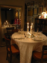
The house has a piano nobile design with the primary spaces on the 2nd floor. However, a study and dining room open out onto the back yard from the first floor (the front entry is on the right on the plan above while the backyard is to the left).

The study was decorated by
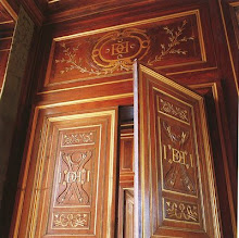
Celerie Kemble (who has an unusually thick and beautiful business card) and is shown on the floorplan above as room #3. Probably one of my favorite rooms in the house. It didn't feel decorated so much as stylishly lived in. While the paneling was original and the focal point of the room, she covered the ceiling with some great antiqued mirror that held up visually to the walls.

Next to it was the dining room, done by
Matthew Patrick Smyth, shown on the plan as room #4.

Many features of the current house were required to be kept by the current owners who generously loaned the house, leaving a lot of fixtures and finishes for the designers to work around.

One such thing was the wallpaper in the dining room which Matthew ingeniusly decided to frame using drapes, much like a view. I loved the fresh look this gave the traditional space.

The living room, located on the 2nd floor (see #7 on the floorplan above) stretches out along the width of the house on 63rd street. Decorated by
Richard Mishaan, the room contained some SERIOUS art, unusual for a showhouse, including pieces by Leger,
Niki De Saint Phalle, Hirst and Botero!

Also on the 2nd floor was
Campion Platt's "Ode to Jock" room, room #10, taking the place of the 'his' master bedroom with a game room or den of sorts.

The finishes in this room were spectacular, however I'm not sure what was original and what Platt was involved with. I especially loved the hidden doors flanking the fireplace which had venetian plaster above a low wood wainscot. That door hardware is like jewelry.

The 'her' master bedroom was decorated by
Amanda Nesbit and is seen on the plan as room #9. These rooms face south and were light filled and really beautiful.

The paneling had to remain and I suspect some wallpaper as well, which Amanda covered with some silk fabric.

I loved the gilt lucite table with the 'floating' design.

The glamorous master dressing and bathroom were done by
Cayley Barrett Associates, seen on the floor plan above as rooms 8 & 8A.

While the design/build firm has been involved with the showhouse many times in the past -this is the first time they have done a room designed by themselves.

Joy Licht, the owner and founder of the company, was able to show me around the spaces and point out some of the great details. I especially loved the 'mirror' in the dressing room - a video camera and tv screen so you can see yourself 'live' (modeled so well by my friend Eric who joined me on the tour!).

The tile work was done by artistic tile while the floors were the original antique wood parquet.

These cute light fixtures dotted the space.

No less glamorous than the master bedroom was the one done by
Barbara Ostrom on the 3rd floor in room #13.

The room was tiny and lacked a fireplace, unlike most of the other main rooms. Barbara added an antique mantel and filled it with wood -who would have guessed it was fake!

Winning most fun room of the house (awarded by myself) was a childs room (#16) decorated by
Harry Heissmann.

Antique, smokey mirror covered the walls and the furnishings were colorful, fun and inventive with a lot of personal touches.

If I was able to stay overnight in the house this is the room I'd choose; how fun would that be?! The pillow cover was a couture fabric covered in rhinestones adding a lot of fun 'bling'.

Next to Barbara's bedroom was a den done by
Jeff Lincoln (#12). I loved the blue painted woodwork and the furnishings he chose.

After the closeness of the house below, it was like breathing fresh air when you walked up onto the fourth floor of the house. Wide and open with balconies on either end, this is the space any homeowner would spend their time in.
 Brad Ford
 decorated one end of the room with a really fun wood coffee table housing a built-in record player!
 Robert Stilin
 decorated the other end and terrace with a seating group around the fireplace. Again, art was the focus of his room.

The rear terrace housed these really great trellised pavilions that I had to share with you to close; painted a french gray. See what I mean - beautiful rooms but you would never leave the top floor!
 Adjacent to Giudecca and sharing a bathroom in the southeast tower is the guest room Goyesca. Named after the Neoclassic murals which cover the walls which depict Roman styled grotesques, I'm not sure the theme is the most appropriate or restful for use in a bedroom but they are none the less lovely!
 Despite the pink lined bed canopy and delicate plaster ceiling medallion, I think this room has a decidely masculine feel to it, don't you? Maybe it's just the restrained neoclassical decorations which appeal to me.
 The advantage of a tower bedroom is multiple exposures; here facing the bay as well as the gardens.
 Other guest rooms feature just as much detailing in the wall coverings, such as the one below which has a strong chinoiserie influence.
 So many guest rooms, could you possibly just choose one? I wonder how many guests would switch rooms weekly to experience them all!

 The Southeast tower holds 2 guest rooms which share a bath. Giudecca, shown here, is simpler than the rooms downstairs but no less elegant. The centerpiece is, again, a magnificent canopied bed.
 I love the decorative plaster work on the walls highlighted in mint green and tan, so evocative of the time period. The room is named after an island in Venice as it overlooks the Venetian-styled bridges and ornaments along the


 Chalfin chose to decorate the room in a romantic Venetian interpretation of French Rococo style. The room features an antique period mantelpiece but the centerpiece remains the magnificent canopied bed.


 Posts
Posts










.JPG)