Well the special and surprising thing here is that these rooms are housed in the 'modern' building above. YES, no lies! They have been designed over the past 5 decades in order to provide a suitable place to entertain visiting dignitaries and share the history of our country through design.
I don't think one is intending to fool visitors that these spaces are in any way antique or aren't a part of the modern office building they are housed in. Since 1965 when architect Edward Vason Jones started designing historically appropriate rooms to house the collection of important artifacts they have slowly multiplied to a suite of 42spaces and fill a large part of 2 floors. Above is the main elevator vestibule where guests arrive into the set of rooms.Notice the excellent faux painting on the flat metal elevator doors to look like paneled wood. I love this more than if these had been actual wood!
The faux work stops there. The rooms are filled with elaborate paneling and plasterwork done very academically on historic precedent.
The enfilade above wouldn't be out of place in an 18th century house in Philadelphia's Germantown area such as Cliveden (compare with my blog post HERE).
The collections however are greater than anything found anywhere in the country; more historically important anyway. They start in the mid 18th century and stop at the year 1815 where the White House collections begin.
Don't begin to think you can sneak anything away or make yourself comfortable, the rooms are heavily guarded (as is the entire building!).
So how are these classical rooms fitted into a modern office building you may wonder? Notice the modern curtain wall structure outside of the Palladian window assembly above. The rooms are simply built within the floorplan with a few inches of buffer. Every effort has been made to align the modern muntins and structure with the classical rooms.
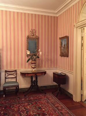
The ladies lounge was probably my favorite room with the 'newest' antique furniture and where the collections drop off (early 19th century). The art however isn't from this period and dates to the turn of the last century such as the Childe Hassam painting of Cape Cod above.
Here is the current curator pointing out the unusual upper drawer on this chest-on-chest who provided us with an amazingly in depth tour. I love those tourguides who can answer any question no matter how random it may be. It shows their love and appreciation of the collection!
Most of these rooms are used for meetings only -no food or drink. Even the couches and chairs are important parts of the historic collection.
The architect's desk below was one built for 3rd president and architect Thomas Jefferson to his specifications from the Chippendale patternbooks.
The Thomas Jefferson room, seen below, was the favorite of most of our guests on the tour.
Here is Jefferson surveying the room (where food and drink are allowed).
The lighting in these rooms is soft and residential: so important to the feeling of the spaces instead of bright office lighting.
I wonder if any of the fireplaces work? I suppose it would be too great of a risk to the collections.
The only thing which doesn't fit into the Classical ambiance is the glaringly ugly EXIT sign.
The State Dining room, where you have no doubt seen many broadcasts from on the news, is the largest room in the suite.
Would you believe this grand room was built in 1985?! Ok maybe the giant gilded seal on the ceiling gave it away.
Who says "they don't build them like they used to"?
Not a single recessed lighting fixture to be found - thank god.The rooms vary in size to host different sized functions.
A large roof terrace surrounds the rooms. The state dining room opens onto it through these paneled and curtained doors.
The ICAA is of course a group of mainly architects and interior designers so everyone had their phones out to capture the niftiest details such as hiding modern light switches behind a little piece of hinged door casing above.
And if historic interiors and collections aren't your thing you'll at least enjoy the rooftop views of the city!
Some of the recent award winning work was completed by Allan Greenberg on the 7th floor but pictures weren't allowed beyond the elevator vestibule as this is afterall a working office for the State Department! Who says offices have to be ugly?
Tours of the rooms are available with prior planning -visit the official website HERE for details.




.JPG)







4 comments:
Well done, but also so... odd. All of that - so many treasures, really - set up in that ugly box of a building. An interior is rather lost without its properly mated exterior, an exterior is rather lost without its properly mated setting. I guess this is like any - actual - historical room or rooms installed in a museum. For me, though, as beautiful as those rooms are, somehow I can't quite get them in focus, can't quite "digest" them when they've been prised from their original settings. Strange how that is....
Stephilius I know just what you mean! It is a really odd experience to walk through linoleum office-grade 1960s building and arrive into THIS......feels very fake. Not sure thats good or bad, it's just how it is. They showed pictures of the rooms BEFORE they matched the architecture to the collections and it was also rather odd..... I would think they could have simply upgraded the finishes and had a modern space with the antique collection but that would just be another direction not chosen. Definitely odd!!
Wow, what a treat to get to see this! I love the color of the wall in the Jefferson rooms. Maybe I didn't catch it in your post, but are those rooms ever open to the pubic? What a memorable experience. Interesting to read the comments above too.
How fascinating Stefan! A treasure indeed! It is a shame that this wan't accomplished in a more appropriate architectural setting.
Have a wonderful holiday weekend!
xoxo
Karena
Featuring Artist Scott McBee
Post a Comment