Wednesday, June 26, 2019

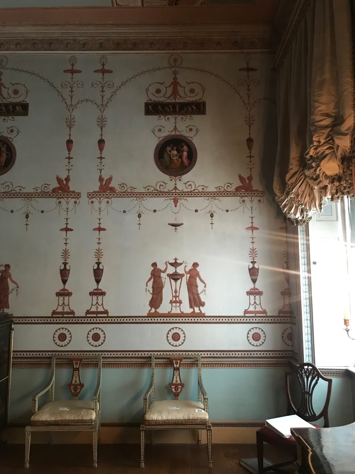
Etruscan dressing room at Osterley Park

I recently took a birthday trip to England to fulfill a lifelong obsession with English Country houses by touring 8 houses in 8 days. Many of these houses only survive thanks to the National Trust and visitors. I have to say they are exquisitely run with great cafes, well maintained gardens, and really good gift shops (I bought a tea towel for the kitchen at each house).  With a membership to the National Trust (or their sister organization The Royal Oak Foundation) you gain access to many of these houses for free and help in their preservation.  American house museums take note, you have a lot to learn from the British!
Rather than share over 2,000 photos I took and bore everyone to death I thought I might perhaps share a highlight.  Both my favorite house AND my favorite room are the one and only Osterley Park by Robert Adam and the Etruscan dressing room.
I first became aware of the house not through any scholarly research on Robert Adam but rather through my love of film. The house has been featured in dozens over movies over the years and uses the fees to help in restoration as well as raise awareness(brilliant!). In fact a portion of the house was closed the day we visited due to filming; I missed the upstairs family bedrooms, the library, and most of the service spaces on the ground floor (although saw what was the nicest servants hall in all of England I would bet).
My favorite movie featuring the house is the charming "The Grass is Greener" from 1960 featuring Cary Grant, Deborah Kerr, Robert Mitchum, and Jean Simmons. While only the exterior of the house was actually used in filming, a number of the interiors were used as inspiration for the extravagant sound-stage sets (more on that in my next post).
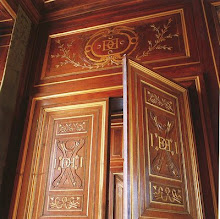
The State bedchamber is one of the major public spaces off the gallery and salons, never really used for sleeping, and the Etruscan dressing room was really more of a sitting room. It all starts with the doors, below.
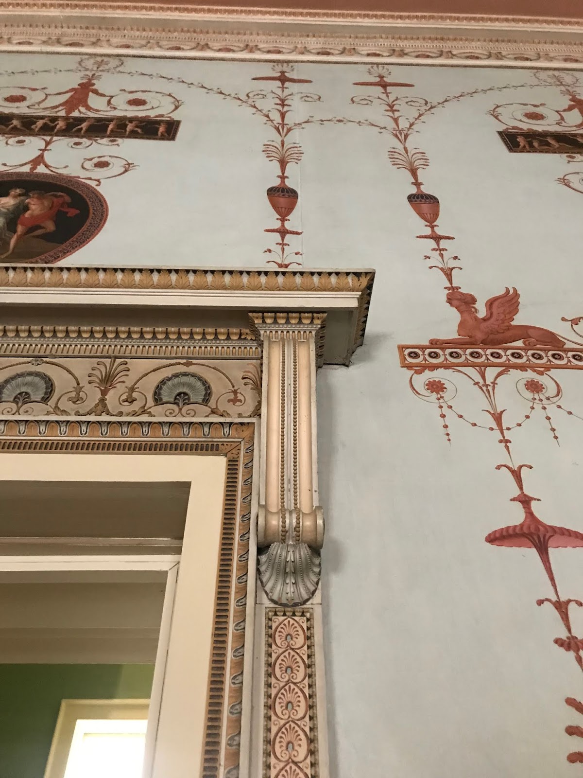
Probably the most scholarly room in the house, Adam took 4 years to research the design of the motifs scattered around the space (1754-1758) during his 20 years of completely renovating this Tudor house from top to bottom into the height of (his brand of) classicism. As throughout the house he designed everything: trim work, wall treatments, furniture, curtains, in fact everything down to the very design for the firescreen which the lady of the house embroidered. Actually, his first design was overly complicated for Mrs Child so he designed a 2nd simpler version.
Most of the designs are individually hand painted onto paper and pasted onto the walls: almost like decoupage. Imagine having to paint dozens of identical decorations!
While the house was built in the 16th century, in 1761 the owners of the house, the Child banking family, hired Robert Adam to renovate the house on the outskirts of London into a weekend party house for entertaining.  It stayed in the family until 1939 when it was opened for public tours and then it was used by the government during WWII.  This is a very abbreviated version of its history but we're here for pretty pictures, not a full history lesson.
The reason the entire Adam's design stayed intact was the house was never actually fully lived in and was only one of many houses within the family. The house was given to the National Trust in 1991 and some of the artwork (removed by the 9th Earl of Jersey in 1947) has slowly been returned by the family.  The furniture stayed together as a collection because it was sold to the V&A after WWII and so was returned to the house.
I apologize for so many of my photographs but it was all so beautiful I couldn't weed any out!
Notice how the details in the woodwork are all picked out in different colors. Imagine painting all of that with a tiny little brush!
Here is the aforementioned firescreen designed by Adam for Lady Child.  These firescreens kept the heat of the fire from melting the makeup from the faces of women (and probably some men given the time period!).
The details in the frame were just amazing - grey background with black and red detailing -yes please!
Keep in mind this was the 18th century and everything you see was hand carved: so intricate!
Lion motifs everywhere. I love the ribbed and swirled base.
A pineapple finial for hospitality.
The fireplace garnitures are also just painted onto the wall on either side of the mantel.
Notice the pin prick in the center of the motif above? That's from the compass used to draw the circles.
This chair-rail almost looked Egyptian to me with the leaves at the very bottom. I love that when you see everything from afar it looks crisp and perfect but when you get close you see the wonkiness and can tell its all hand done.
So many patterns. Notice below the jambs of the integrated window shutters with the swags and urns? That just screams Robert Adam to me.
See a great video of the house exterior and interior on youtube HERE
Read more about the Childs family and Robert Adam HERE at a great blog, lostpastremembered.
Visit the house yourself and be sure to stop in the cafe for lunch HERE.
All photos with the exception of the movie poster are my own. 

Friday, May 10, 2019

Highlights from the Kips Bay showhouse 2019

This past week I had the pleasure of touring this year's Kips Bay Showhouse,  the most venerated of showhouses, where the best of the best get together to raise funds for after-school programs in New York City through what may best be described as a celebration of design. I toured the house from the top down, always a good idea, and so these pictures are in that order.
The first room I visited was that of talented designer Matthew Monroe Bees who created a sitting room straight out of Charleston which spoke to my classicist collector. This is a cozy room for LIVING and I could spend all day here.
The most fun room of the house had to be that of designer Young Huh where she created a lively and exuberant artist's loft. While I hadn't fully appreciated the room in photographs before my visit, in person it really blew me away with its witty details and lovely scents (most designers spend as much time on fragrance in these rooms as they do on the look!).
On the other end of the color spectrum was the room of Sarah Bartholomew. Her quiet room whispered elegance and fine detailing with a lot less color than we have come to expect from her. This was hands down the most beautiful room in the house I think, but one that has to be seen in person to fully appreciate.  The ribbed plaster walls were show stopping.
This mirror from Cox London would have come home with me had I been prone to stealing; I'm rather obsessed with it now.  Readers may remember her more colorful but no-less-sophisticated room from the 2017 Atlanta Showhouse which I covered HERE.
 The painted floors warmed my heart - casual yet elegant in shades of warm grey.
While not technically a room, one of the vast improvements (to the rather rough house) had to be the stair decorated by Brian Gluckstein. His sophisticated treatment of the lovely round stair made traversing the crowded showhouse a pleasure.
The cherry blossom mobile was an inspired addition that tied all of the floors together. The lovely architectural molding you see on the walls is actually painted onto grasscloth with the punches of gallery-wall art featuring paintings by artist Jeremiah Goodman.
Robert Passal has created a stunning sitting room with modern details that is pure comfort with an edge. I was a bit obsessed with the rock crystal box on the coffee table above (and it wasn't even the only one in the house!). 
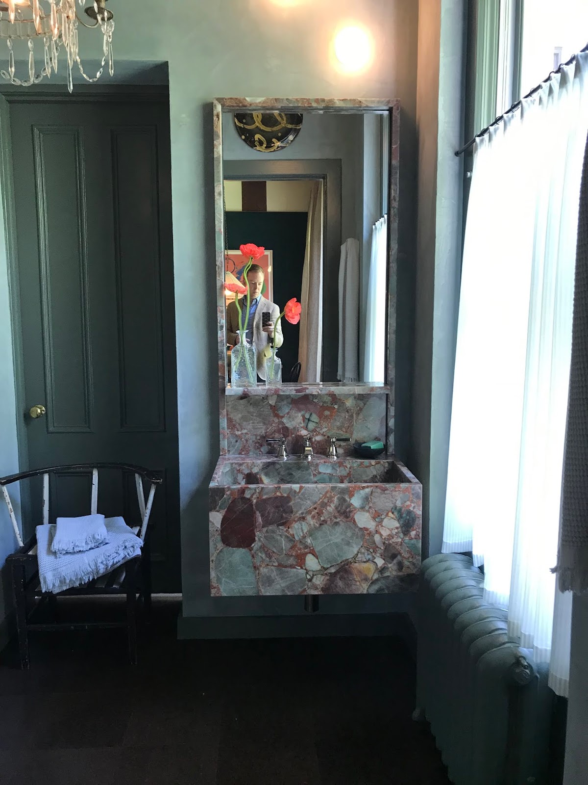
Very much following my own maxim of taking what you have and making it better, the team at Pappas Miron inherited a room with amazing terrazzo floors and fireplace and used them as the basis for a room rich in detail. This dark and stylish room is straight out of Milan.
However it was the marble vanity and mirror in the adjoining bathroom that took my breathe away. Stunning! Quick design house question though - why so few bedrooms, designers?  Are sitting rooms inherently more interesting or easier than bedrooms? When I think back to prior showhouses it is always the bedrooms which stick out in my mind. Remember Mark Sikes room at last year's Kips Bay (Video HERE)? Probably my favorite Kips Bay room of all time.  Just a thought....
Lovely designer J Cohler Mason won for best wall covering in the small vestibule leading to her exquisite space. The handpainted wallpaper covering the walls and ceiling appeared to be cast bronze - and the painted bees swarming the ceiling stole my heart.
I'm not sure if designer Eve Robinson installed this amazing mid-century glass doorknob outside of her fun room or elected to keep it -but either way it was a winning decision!
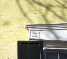
One room getting the most buzz has to be the room done for Peter Pennoyer architects by their designer Alice Engel. I wanted each and every item in this room. While the pieces themselves are exquisite they were tied together by the upholstered walls and bed.  Just google her name to see myriad detailed images of the Greek key tape on the retro blinds (which I adore).
Details matter - doorknobs, electrical outlets, mechanical covers. Don't believe me? How special is this light switch? Every night one would appreciate the brass switch on a glass cover....rather than the standard gross plastic.  Details matter and this room is full of them. Don't get me started on ugly mechanical vents you see in projects littering magazines, straight out of home depot.
 The yellow lining to the canopy bed is a surprise and makes the room.
Seriously good guys - congrats to Alice Engel.  Why do I repeat her name? Well I always feel when one works for a firm ones name can get lost in the mix. I know. But teamwork and identity is a good thing.
Moving on - the dining room by Cullman & Kravis was as stunning as one would expect from this team that continually knocks projects out of the park. The mix of modern and antique is very real world, if your world is picture perfect!
The depth to these walls was impossible to photograph and the gilt specs and then applied gilt plaster medallions are just stunning. Also notice the unlaquered brass light switches.
Kitchens and built-ins always interest me most and Christopher Peacock is known for the best kitchens around. The details here did not disappoint.  I loved the brass detailing around the walnut shelves.
The inset door's sticking was a little chunky but obviously intentional.  Notice the fascinating marble backsplash and the shiplap walnut hood cover:2 thumbs up. Stained wood interiors to a painted glass front cabinet is going into my mental idea book.
These are not a comprehensive look at the entire showhouse but rather what caught my eye  (it is my blog afterall!).  Everyone involved put forth tremendous effort and every single designer is to be applauded; talk to me privately about my more negative feedback! KIDDING (mostly) although I admittedly had a few "WHAT" moments! Visit the house for yourself now, daily through May 30, 2019.

Friday, May 3, 2019

Single-Handedly, Contemporary Architects Draw by Hand

In this age of computer-aided everything (CAD, sketch-up, photoshop, etc) it's refreshing to know there are those in the architectural community who still draw by hand. No computer model, no matter how realistic, can ever replace the warmth and depth of information imparted by hand rendering. More than just an art form, it's a communication technique!
New from the Princetown Press, Nalina Moses brings us a collection of more than 40 architects, designers, and artists, who are still proud to produce by hand without aide of a computer in 'Single-Handedly, Contemporary Architects Draw by Hand'.
Architect David Barrett McTyre, whose proposed chicken coop for Esther's farm in Olive Branch, Mississippi, seen above, is proof that even the most informative construction drawings don't need to be boring. McTyre states that "hand drawings are much more enjoyable and descriptive than Autocad drawings". You know that these drawings are later cherished and probably framed by the owners, not thrown in the trash like most construction sets.
Architect Robert Mellin, in his drawing of the Lane house, seen above, shows how the analytique can impart more information on a project than an entire stack of drawings. As stated about his work in the book, these drawings straddle the line between the ordinary and the extraordinary. 
In her book Moses allows the drawings to mostly speak for themselves, imparting a short blurb on each architect or designer, and speak they do.  Never forget that a picture is worth ten thousand words!  Let's revive the art of hand drafting and be sure to check out Single-Handedly!

Thursday, April 18, 2019

Summer Houses by the Sea: The Shingle Style

Just in time for summer Rizzoli has a new, soon-to-be-released book about the ubiquitous beach house: Summer Houses by the Sea: The Shingle Style by Bret Morgan.  Of course I have to lead this post with the most famous house featured in the book, Grey Gardens, which recently sold.
What makes this book different from others on the same subject is not only the never-before-published, full-page photographs to drool over but FLOORPLANS for many of the houses! I know that will draw some attention from ArchitectDesign readers!
Not all of the houses featured are turn of the last century either, with many new builds and even some modern projects such as this sinuous house built for a scientist, seen above, in Seal Harbor by architect Peter Forbes. I love the little 'labs' on the roof.
 My favorite of the featured houses though has to be the gambrel roofed Mallinckrodt Cottage from 1898, seen above, in Jamestown, RI. Notice the charming views from the living room windows below.  If one has to be indoors at a beach house you may as well have water views (including views of other houses!) and a fireplace.
The sweeping screened porch of Rosserne, below, in Northeast Harbor isn't so bad either! Nap time on that chaise longue perhaps?
I think Summer Houses by the Sea: The Shingle Style is the perfect addition to any design library as the definitive grouping of the style: definitely check this one out!
All images © Bret Morgan