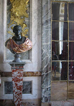
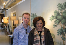
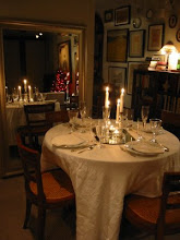
Who says art museums need white walls? One of the finest art museums in the world, the Thyssen-Bornemisza in Madrid, sports walls in numerous natural shades of umbers, orange, sienna, and yellow (see my recent post on the Givenchy exhibit in the museum HERE)
The pleasant shades complement the art and flatter the skin; great spot for a date!
What do you think of this color palette? The great lighting helps as well. Thanks to my Australian Penpal as always for the photos!
Friday, April 3, 2015
Monday, March 30, 2015
Details Matter
If you follow me on Instagram (@architectdesignblog) this weekend you probably saw a number of pictures I posted of a grand apartment building here in Washington DC in the historic Kalorama neighborhood.
Buildings such as these are listed in the Washington real estate bible, Best Addresses, by the local authority on such matters, James Goode. I live in a 'best address' building myself, although not as grand as this, and it really was one of my apartment's selling features. It's always the first statement of any real estate description of any apartment in these buildings in Washington. I would recommend the book to others who don't live in DC as a great compilation of grand apartment buildings from 1900 till the 1970s, full of floorplans and historic photos.
The details matter here and separate this building from common apartments. Symmetry and aligned spaces are key, but delicate plasterwork, marble mosaic floors, and charming original stairwell doors and exit signs are all details that speak of care and quality.
Notice the well thought placement of modern HVAC grilles discretely placed above the exit door. I think also important to notice are the signs that this building is a home; minimal quality non-cluttery furniture and artwork grace the spacious halls. Compare this to atrocious new-construction apartments we see going up all over this city and also cities around the country as we experience this (wonderful) return to urbanism. Why do people prefer new construction to this again?
Labels:
apartments,
classical architecture,
DC,
details,
houses,
Interiors,
Kalorama,
open houses,
Washington
Subscribe to:
Posts (Atom)