The Refectory, or main dining room, at San Simeon is suitably grand for a captain of industry or even the King of a small country! Located behind the
Assembly Room, the use of architectural salvage is the highlight of the enormous space.

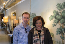
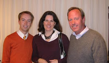
The room was modeled on a monastery dining hall. Notice the scale of the space: the 2 tour members seen above could walk right into that fireplace.

The flags decorating the room are Sienese banners, I love the color they add.

The estate was added on to many times over the years (1919 until 1947), indeed building started before the drawings were even complete and with constant changes. This results in a lot of odd spaces, such as this window which looks into one of the stair towers in one corner of the hall.

A close up of one of the sconces which light the space between the banners.

Some beautiful wood architectural salvage from a European cathedral.

Hearst's art collection was legendary (mainly for its size) and ancient statues and artifacts dot every spare inch of space; more is more! Again more antique tapestries insulate the stone room.

While dining in such grand surroundings, the food could be quite plain: this was afterall "the ranch". Paper napkins were always used and the condiments were laid out on the table: ketchup and mustard!
 In 1903, Roosevelt had a very grand piano commissioned from Steinway & Sons for the East Room. Steinway commissioned noted Aesthetic artist Thomas Dewing to paint the inside of the gilded case in a patriotic theme which he entitled America receiving the 9 muses.
 In the painted scene, women in colonial revival gowns representing art, music, poetry and learning pay homage to America, the new steward of western culture, as represented by the seated woman. The piano now resides at the National Portrait Gallery, but I think it should be brought back to the White House, don't you?
 The Refectory, or main dining room, at San Simeon is suitably grand for a captain of industry or even the King of a small country! Located behind the
  The room was modeled on a monastery dining hall. Notice the scale of the space: the 2 tour members seen above could walk right into that fireplace.
 The flags decorating the room are Sienese banners, I love the color they add.
 The estate was added on to many times over the years (1919 until 1947), indeed building started before the drawings were even complete and with constant changes. This results in a lot of odd spaces, such as this window which looks into one of the stair towers in one corner of the hall.
 A close up of one of the sconces which light the space between the banners.
 Hearst's art collection was legendary (mainly for its size) and ancient statues and artifacts dot every spare inch of space; more is more! Again more antique tapestries insulate the stone room.
  While dining in such grand surroundings, the food could be quite plain: this was afterall "the ranch". Paper napkins were always used and the condiments were laid out on the table: ketchup and mustard!

 Despite an extremely grand facade, the interior floor plan is quite simple, without a cobweb of hallways and vestibules. The main entry leads into a small vestibule seen above, and then directly into the Assembly Room (the living room of the estate). I suppose this is an example of California outdoor living.
 Most of the estate is composed of European architectural fragments. The ceilings, doorways, fireplaces and really, every piece that you see, began life in another building.
 Above is the main entry to the room.
 You could walk into this fireplace it was so large. Just a cozy little room for pre-dinner cocktails!
 The room is lined with ancient choir stalls, an interesting, if uncomfortable, choice for additional seating.
 All of the stone could feel cold, so antique tapestries were brought in to soften both the acoustics and add insulation.


 As I mentioned in a previous post on the White House, unless you are on official State business, you will enter through the East Wing, seen above. This allows for the extensive security to be hidden around the side and rear of the building.
 The entire house was decorated for the holiday. I loved the red berries and ribbons in these iron urns decorating the porte cochere.
 In the holiday decorations, I especially liked the use of these magnolia garlands.
 From this hallway, you enter into the east colonnade which was originally open when constructed in the 1902 renovation. It was enclosed in 1942 when the east wing was expanded.
 These transoms let light into the spaces adjacent to the colonnade which includes the family theater.

 I liked the playfully decorated trees in this area the best.


.JPG)


