Earlier this week I had the pleasure of attending one of those lectures which snaps you right back to life career-wise in a "oh, thats why I'm doing this" kind of way! Award winning architect and president of the ICAA, Gil Schafer spoke in Georgetown about his life, his work, and his book, The Great American House: Tradition for the way we live now.
Many of you are probably familiar with his work through the many national publications in which it has been featured as he works with many top name designers such as Miles Redd and Bunny Williams. However, his work stands strong on its own and it was a pleasure to hear him speak of his childhood inspiration, his grandmother's country house in Georgia. Ever modest, Schafer is quick to speak on how a great house is 3 parts: Architecture, Decoration, and Landscape. He explained how these topics made his grandmother's house so special and in turn, he pays strict attention to them in each of his projects.
Schafer pointed out that he strives for dignity and comfort in his houses but not strict elegance (although one could argue they are also quite elegant just not in a 'fancy' way.) Hierarchy of spaces is important; so living and dining rooms will be detailed quite differently from family and breakfast rooms ( no bloated, oversized mcmansions here!). Like me, Schafer thinks of himself as an architect who thinks like a decorator. How will you live in a space? Is it comfortable, is there room for curtains, is it so contrived so that someone won't feel at home? Schafer believes decorators teach architects, if they listen, to loosen up.While he tries to give new houses a 'history' he warns one to be careful not to become too kitsch or slavish in its historical decoration: this is a modern time of course. Schafer also stressed the importance of landscape in a project from the get go and not 5 years later when the money is available. He advises someone building a new house to plan on a fully developed landscape with a SMALLER house at first and then later put on an addition as needed.
Schafer practices in the classical language but is not a purist; he believes it's important to live in the current moment in a modern, comfortable way; not a museum (here here!). His new houses are designed 1 or 2 rooms deep with traditional, proportionally sized rooms that aren't too big so that natural light is spread throughout the space. While his work contains much larger interior openings and windows than found in older houses he keeps the proportions the same so the buildings appear 'correct'. And most important to me during his poetic and inspiring lecture, he correctly used the words house and home; home was rarely uttered. Nails on a chalk board!
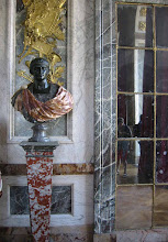
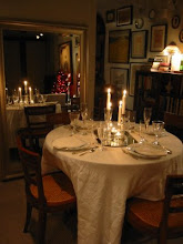
Images of Schafer's New York City apartment courtsey Gil Schafer.
Friday, May 10, 2013
Thursday, May 9, 2013
An ingenious solution
While reading through the April 2013 issue of House & Garden I came across an intriguing little project that I just had to share! When designer Roger Hall had proposed an addition to his 17th century listed house and had it rejected by the planning authorities, he decided to build a garden folly which would give him and his family the extra space they needed as well as provide a focal point to his garden.
He calls the space his 'Posh Shed' and it certainly is closer to posh than shed. What shed do you know of contains a kitchen, bath and working fireplace? The pavilion houses guest quarters as well as a studio for his work in an 18'x18' square; talk about small living at 324 SF (the size of the smallest studios found in NYC).
The pavilion matches the style of the main house which you can just glimpse in the image below including the same beautiful stonework and slate roofing. Behind the fireplace above are a compact mini kitchen and full bathroom for guests. I think I would spend all of my time out here and never go into the main house!
Above you can see how from the garden the pavilion looks like one small albeit tall room but when seen from another perspective 2 floors are clearly visible. I vote this is a clever solution to a problem that makes the end result better as a whole than the original proposed addition - what do you think?
Photography via the article by photographer Sarah Hogan
Labels:
Architect,
clever ideas,
designer,
Gardens,
House and Garden,
Interiors,
magazine
Subscribe to:
Posts (Atom)


.jpg)


.JPG)


