Reading and writing blog posts everyday I can sometimes forget to mention I'm more than a blogger: I also work in the design industry! I thought I would share the design process with you on a recent project, a renovated master suite (above is a finished teaser of the bath).
Lets get the ugly stuff out of the way first. My friend had a vintage 1920s house in the lovely Cleveland Park neighborhood of DC (you may remember a built-in I completed for him in the family room HERE). Old houses are great, I think we can all agree there, but old bathrooms are NOT so great - just look at it above!
Above the partial floorplan shows the original layout of the area I worked on which had great potential but didn't work for the client. A small, worn hall bath serviced the master bedroom as well as a small bedroom which my friend used as a dressing room as closet space was inadequate. The front half of the plan not shown on the left had the formerly renovated master suite which had been turned into another hall bathroom, separate laundry room, and a large bedroom facing the street.
Previously one came up the staircase and was confronted with the L shaped hallway seen here (remember, this is the BEFORE!).
Lots of square footage was wasted on the hallway in the tight plan and I had to come up with a way to best utilize the space.
The criteria was for a gracious master bedroom suite complete with en-suite bathroom, separate generous dressing room with loads of storage, and a separate sitting room.
The bones were all there but how best to reconfigure the space while respecting the vintage charm of the house? Another piece of the puzzle was leaving the exterior of the house untouched as it lies within a historic district where exterior changes are hard to get approved.
I decided to claim the 2nd hall closet and a fair amount of the hallway itself to enlarge the bathroom and provide all of the amenities one expects today in a house of this caliber. Above you see the 'demo' plan and how I was going to accomplish this.
The plan worked out nicely. Instead of coming up into a vast L shaped hallway, a more compact hall was created with a flush wall great for art at the head of the stairway. The master suite is now entered through a private vestibule which separates the bedroom from a dressing room. The opening between the dressing room and sunny sitting room was filled in to allow for more storage in the closet and a built-in bookcase in the sitting room.
The bathroom walls were completely removed to both insulate the exterior walls as well as reclaim any space we could find which previously housed ductwork and pipes which could easily be moved out of the way. Our contractor was a great help here! I decided to panel the walls with wide beadboard which added a vintage charm to the bath of the 1920s time period while also providing a 'warm' environment.
A separate soaking tub and large shower were added as well as an additional sink thanks to the space gained from the hallway. Now lets see how it turned out!
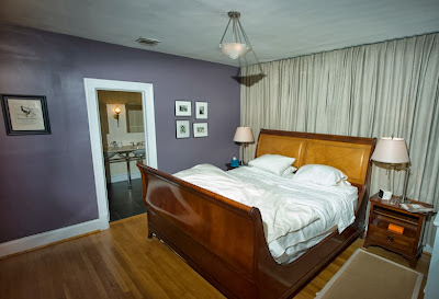
The hallway is still a generous size and makes sense for the house. Two bedrooms are left on this floor with a 3rd on the floor above. In the photo above you are looking into the new vestibule (painted the same purple as the bedroom) lit by an antique sconce found at my favorite lighting source just down the street in Cleveland Park, Artisan lighting.
Another antique frosted glass ceiling fixture was found at Artisan Lamp for the bedroom, on a dimmer switch for ambiance of course! You can see through the former closet door into the newly enlarged master bathroom.
Looking the other direction one can see into the sunroom sitting area. The natural linen curtains lining the wall hide an off-center window as well as provide a focal point for the bed.
The small bedroom became a proper dressing room with ample storage. Double hanging rods fill one entire wall while a large dresser sits opposite. The antique lamp on the dresser is also from Artisan - you can tell I love to shop there! The closet of this former bedroom was lined with cedar to become storage for sweaters and other off-season items.
The sitting room received a fresh coat of sage green paint as well as a major clean-up. An odd closet was ripped out of the corner as well as an unnecessary non-working but extremely HEAVY radiator.
However the piece de resistance is surely the newly created master bathroom. Wide 6" painted wood paneling was installed rather than drywall or tile as it created a warm, vintage feeling environment. Foam insulation was blown into all of the walls for sound isolation as well as temperature control. The window received a cafe height plantation shutter for privacy and a new marble sill perfect for additional storage. Antique neoclassical sconces were found at Artisan which really become the jewelry of the space.
As the brass and black enameled sconces are really focal points I didn't feel the other finishes needed to match and they were all spec'd in a polished nickel finish sourced from the Waterworks studio line ( a wonderful lower priced line which still has the great quality and heft of other Waterworks fixtures). The tile also came from Waterworks. I used a large format dark stone-like porcelain tile for the floor and the coordinating 2x2 tile for the shower floor. The shower walls were lined with a miniature subway tile and a long niche was created for soaps and shampoo. I love the industrial exposed surface-mounted shower fixtures from Waterworks! In-floor radiant heating was installed which can be controlled with the thermostat by the door for warm feet in the cold winter.
You can renovate your own bathroom into your DREAM space - be bold! Use Plumbtile to make all of your selections online and for easy ordering. From traditional to modern they have all of your bathroom needs as well as kitchen and lighting!
The same Italian Crema marble from the Restoration Hardware Gramercy vanity was used for the window sill, shower curb & surround, as well as to line the shower niche. I know you're wondering why I selected an open vanity as opposed to one with storage but I was worried the bathroom would feel tight when it lost that visual space below the sinks. Large medicine cabinets provide tons of storage. The freestanding bathtub from Victoria & Albert was clean lined while still having the appearance of an old Victorian soaker tub (seen best in my drawing earlier in this post). I'm very pleased with the entire renovation and more importantly so was my friend! What do you think?
Special thanks to my fantastic photographer friend Bill Bramble who provided the before and after pictures!
Actual things that happened on book tour
21 minutes ago


.JPG)


