 This past Thursday I was able to hear Stephen Drucker (current editor in chief of House Beautiful magazine with quite an impressive resume behind him) speak here in DC about how Nature informs interiors. Unfortunately, the opening of the DC showhouse at the design center meant a small audience.
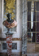
He spoke in the beautiful neoclassical lecture hall of the Corcoran College of art and design. One of the first things he spoke about was to rave about this room. I had to agree! His lecture was very informal, extremely realistic and down to earth. Rather than preach about green living and practices, he tackled first how 'green design' isn't something new. Rather, it has been brought about every 30 years on average. He even showed the first 'green' issue of House Beautiful....from 1949!
 One of the problems he cited was that people will talk the talk but when it comes to the practice of environmentally friendly living, they don't want to be bothered other than with cleaning products. Green issues of magazines are among the worst selling issues each year. People want fantasy and pretty pictures from magazines (I have to agree). Stephen realizes that and admits it freely; when people want hard information and facts, they turn to the internet.
  Stephen ended the lecture with a slide show of different 'natural' interiors through time as featured in House Beautiful-starting with Frank Lloyd Wright in the 40s, going through Michael Taylor in the 70s and ending with Axel Vervoordt now. It was such a great opportunity to hear him speak and I hope if all of you get the chance you will go for it! He has really turned House Beautiful into a wonderful magazine and I hope to see its continued success!
 His lecture was very informal, extremely realistic and down to earth. Rather than preach about green living and practices, he tackled first how 'green design' isn't something new. Rather, it has been brought about every 30 years on average. He even showed the first 'green' issue of House Beautiful....from 1949!
 One of the problems he cited was that people will talk the talk but when it comes to the practice of environmentally friendly living, they don't want to be bothered other than with cleaning products. Green issues of magazines are among the worst selling issues each year. People want fantasy and pretty pictures from magazines (I have to agree). Stephen realizes that and admits it freely; when people want hard information and facts, they turn to the internet.
  Stephen ended the lecture with a slide show of different 'natural' interiors through time as featured in House Beautiful-starting with Frank Lloyd Wright in the 40s, going through Michael Taylor in the 70s and ending with Axel Vervoordt now. It was such a great opportunity to hear him speak and I hope if all of you get the chance you will go for it! He has really turned House Beautiful into a wonderful magazine and I hope to see its continued success!
 You can see the old knobs above: Cheap aluminum finish and just a boring design. I've tried out a few different knobs but nothing has ever worked -TILL NOW! I found these Ephram knobs at Restoration Hardware that I just LOVE!


 Although she has full electricity (of course) she says it goes out for hours a day which has taken some getting used to. She has all of the western appliances at home but has to plan their use around times when power is available. All of the outlets are high up on the wall near the light switches.


 I think this is the same toilet I have in my apartment! A bit odd that the shower doesn't have walls or even a curtain....in a humid environment it must be hard to keep it all dry! But how nice must a shower be after a long hot, humid day!


 I'm loving this statement piece they call the entablature mirror (which is what it is really, no weird name here). It's huge; great for taking up a whole wall in a room as shown or in a foyer. Imagine it in a bathroom or dressing room! Now we're talking.... that would be so wonderful.
 Now, I worry about the quality of this piece just a bit. If you look in the upper corners at the medalian'ish urns - those worry me a bit. They look very pasted on like an afterthought. I'm not losing sleep over it though, I love these mirrors. I wish the mirror itself was done in an antique finish though as they're obviously meant to look weathered and old. That is an easy fix if you're already shelling out the 3.2k for the piece - mirror is cheap. And really...I guess a lot of people who buy new things want them to look new (which is sad in my opinion, or at least not how I see the world).
 Now, my #1 hobby, other than writing this blog, is the perpetual search for a better daybed than the crap one I have from west elm (sorry west elm, I still think you're a great place for fun inexpensive home fresheners!). Do you know how hard it is to find a non-feminine and non-ugly daybed? Impossible! I'm really loving this antique empirish daybed that RH offers though called the Marston. They've had it awhile but I'm only recently appreciating it.
 I logged into their website to see details on it from the catalog but I came across this piece of perfection.
 This is my dream daybed - the 'Atwood'. When I say I want a real piece of furniture daybed, that isn't girly, old fashioned or bedroomy -this is what I want. This is beautiful and if it was in my currently slim budget I would buy it NOW, EXCEPT...(yes there is an except) for the UGLY visible hinges that are hard to see in this image but are OH so there - right under the mattress and above the runner board. Would it really be so hard to do an invisible hinge, RH? Really? This design choice makes me lose sleep. But no, if I had the money I would go out and buy this tomorrow -no really! I just hope those hinges wouldn't scratch me when I get up in the middle of the night.
 I really love this 'larkspur' daybed too -even though it verges on being a little 'arts and crafts' which isn't normally my thing for my own house. It's not girly, it's not neccesarily bedroomy and it's simple. It's well designed. Is that so hard to ask for in a daybed? Apparently it is everywhere except at RH. Seriously - go look! I dare you!
 I've always loved their Delaney collection of upholstery. It's just basic, classic and comfy. LOVE the symmetry of the reading lamps flanking the sofas in this photo. It bothers me there are no magazines on the coffee table though....I mean -REALLY bothers me.
  The last picture is just for laughs a bit. They have these really great bullseye mirrors that they call their 'portal' mirror -which above is seen in a bedroom. HOWEVER-potential staging problem. Reflected in the mirror is what appears to be a grand piano....in a bedroom......as well as a rather un-staged and uninviting room. OOPS! Be careful what you photograph in mirrors people - remember they reflect the room! This can't have been on purpose? Or maybe they just didn't think anyone would notice? Did I let the cat out of the bag?
 I love a simple white subway tile in an all white kitchen, but something more interesting with a bit of pattern would really be eye-catching, don't you think? Not everyone can live with all of that heavenly white. I love this full wall treatment of star and cross tiles from the Lascaux Tile Co. (featured in House Beautiful, Feb.09). It really is attractive against the painted woodwork and stone countertops. What type of backsplash is your favorite? Tile or stone? 3" or whole wall treatment?


.jpg)


.JPG)


