While in Atlanta I attended the last open day of the extremely popular Southeastern Showhouse which benefits the Atlanta History Center ( based at Swan House which I have blogged about HERE).
The showhouse benefits from being a private home in which the homeowners worked hand in hand with the selected designers in order to create a home for themselves unlike many showhouses which become disjointed rooms with no flow. This was possibly the best showhouse I've ever visited (and I've been to many!).
The original house was built in 1962 by architect James Means of reclaimed materials, making the house feel historic while offering the best of modern day conveniences. In similar fashion, architect Yong Pak with Pak Heydt & Associates worked with the homeowners in updating and expanding the Means house for 21st century living.
Landscape architect Richard Anderson was brought on to make the best of the truly breathtaking site.
But lets move inside, shall we? Above is the first floorplan which will help orient you. The house is enormous so I'll only be showing a few of my favorite spaces. The original James Means house is seen in the lower portion of the floorplan.
Decorator and chair of the showhouse, Jackye Lanham, decorated the stairhall. The marble floor was original from James Means' design but was only installed during this renovation.
I loved the treatment of this hall which goes up to the attic level. Notice the black painted stringer and railing with white pickets and trim.
Up towards the attic level a pair of eagles mounted on gilded brackets anchor a dormer window.
The attic bunkroom featured interior windows which are so charming and help bring light into the stair.
The dining room (room 9 on the plan) located inside the original James Means house and decorated by Tammy Connor, features a large Chippendale printed grasscloth wallpaper and lovely woodwork.
Off the dining room is a wetbar perfect for parties, with an antiqued mirror backsplash and gorgeous zinc countertop.
The library decorated by Chad James (#3 on the plan) was a more modern, cozy but luxe retreat. It featured enormous steel windows with views of the backyard though they were unfortunately covered with a grasscloth blind! I couldn't tell if this was part of the original house or the addition (which is a sign of a good reno!).
Speaking of steel windows (which are EVERYWHERE in Atlanta), this huge opening was about 9' wide and 13' tall opening off the family room (#21 on the plan) decorated by Phoebe Howard.
The large covered porch off the family room above was a great indoor/outdoor space.
The Man Cave in the basement was decorated by William Peace and featured reclaimed wood clad walls and an enormous kitchenette/bar. What a great movie watching space this is!
Loved the detail of this iron arrow into the wall near the entry -perfect for hanging coats.
The wine cellar by Randy Korando and Dan Belman was built with even more reclaimed lumber and ingenious metal pegs to hold bottles. This made the room feel much larger than the more traditional wood crates.
The master suite was a large part of the ground floor addition (rooms 4-6 on the plan). I loved the vestibule and master dressing rooms decorated by Anna Braund. Great lighting by Visual Comfort also.
Between the vestibule and the dressing room was a lovely round window for more shared light.
I loved this treatment of the narrow hallway: a coved, uplit ceiling with antique mirror at one end and the bedroom doors at the other below a leaded glass transom.
The master suite also included a small office which was charmingly decorated by Margaret Kirkland. Loved this wallpaper!
The sunroom off the master bedroom, decorated by Tristan Harstan, was tented with fabric - the best room in the house!
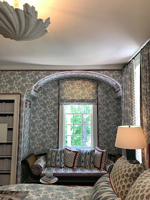
Saving my favorite for last however, a small bedroom on the 2nd floor (#13 on the 2nd floorplan above) really stole the show.
Designer Sarah Bartholomew created a haven wrapped in a lovely blue and white fabric with red trim.
I loved the window seat which is a great spot to read (notice the tape trim on the sides and ceiling).
The red frames on the antique prints above the dresser really tied everything together. I could move right into this charming bedroom!
I so love visiting Atlanta. The entire city appreciates good design and fine living on a level that makes Washington look barbaric. This design house was packed on a daily basis and appreciated by all. I know I'll be making a visit to Atlanta next spring to see the new Southeastern Showhouse!
Thursday, June 1, 2017
Subscribe to:
Posts (Atom)




.JPG)


