Saturday, April 5, 2008
a good idea

Thursday, April 3, 2008
first entry!
 the all white
I also have the Blue Half Lace and love it, just a few pieces, not an entire set, but I have picked up some over the years at sales for a song. I love it with white or color, solid yellow, pale pink, red, or silver. I love anything Royal Copenhagen, take a look at the site, now I love also all black shine which is chic.

 I've always loved this blue and white pattern as well! Like she mentions it mixes so well with other pieces so is a fun one for mixing and matching. I have a teacup in this pattern but really don't have much blue & white -i need to work on that!
The perfect cut
This is how a suit is SUPPOSED to fit. Fitted but not tight, with 1/2"-1" of sleeve showing - perfect!
 via the sartorialist
fretwork
 One of my favorite mass marketers is William Sonoma Home. Their collections are high quality for a reasonable ( but still high-end) price and it's a great mix of traditional and modern pieces with great lines. Recently on their website I saw under the sale items these Fretwork tables.
 While there check out this SERIOUSLY stylish Essex Dresser! which would go very well with my cartier clock ( see below! )
Wednesday, April 2, 2008
Clock


Architectural Digest
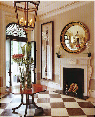 the foyer -you know I love a foyer
There has been a lot of bashing in the blogosphere about Architectural Digest lately and it makes me sad. I understand the point of what bloggers are saying that the homes featured have no personality -but in my opinion it is because it's called ARCHITECTURAL digest for a reason. It's not called 'interior design homes'. The focus here is on the interior ARCHITECTURE ( right up my alley! ). I always think these are what the homes look like before being turned over to the owners. the library - BEAUTIFUL couches and love the mouldings!
To prove my point about how fabulous this magazine is and maybe sway some opinions here is a home featured in this month's issue, April 2008.

 2 images of the living room -i love the tall ceilings, french doors and the mirrored console table!

 the master bedroom -got me again with the beautifully mirrored nightstand and that coffee table! Sigh for a fireplace!
Tuesday, April 1, 2008
Dwell
 I used to like Dwell magazine but then felt it was getting a little too generic. This article however made me change my mind. Check out this remodeled Barn!
 online at www.dwell.com
Monday, March 31, 2008
Fred and Ginger
 ginger's "skirt"
I generally dislike Frank Gehry -there I said it. I do agree that his buildings' form in the past 10 years are unique and stunning but after seeing the documentary about him and his way of working and his blatant love of publicity(more suited to britney spears ) I really dislike him and think he gives architects a bad name. He may bring architect's closer to 'art' but I think his connection to what a REAL architect is is thin at best. He gives the impression to the general public not associated with architects ( and other designers as well ) that architecture is play and 'drawing pretty pictures'. The fact that his part of the process is crinkling a piece of paper and then getting the credit is a little bit unnerving to me. However.......that being said.....
 My love of old movies and the sheer whimsy of this apartment building in Prague really speak to me. I love the fluid lines and how easy it is to read Fred grasping Ginger and twirling her around the dancefloor. One of these days I'll get to Prague to admire it ( then later talk about how over-rated Frank Gehry is! ).
close up of 'fred'


.JPG)


