Before the
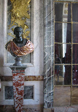
Rococo, there was the excessive and sometimes heavy baroque style, popular in the late 17th century and in France, associated with Louis XIV (whose bust appears in the overmantel above). The room seen here is another period room found at the
Getty Museum.

Meant to impress, the style is excessively styled with every surface taken into consideration for ornament. Unlike the rococo which was meant to be fun by focussing on light and elegance, the baroque was meant to impress (much like Louis's political regime).

The inlaid ebony writing table above was actually in the inventory of Versailles in the king's mistresses' small palace, the Trianon de Porcelaine (Madame de Montespan). I'm in love with that Japaned box and gilded stand in the window!

Notice the parquet de Versailles flooring in the room, also alluding to the regime. This begs the question, if it isn't baroque, should one fix it? (sorry, I couldn't resist!)
 This carved wood relief at the Getty really took my breath away. Full sized and carved from a block of limewood by Aubert-Henri-Joseph Parent in Paris, 1789, the thickness of each petal and leaf is the real-life equivalent. You can practically smell the lilac!
 The lower half is unfortunately as realistic, ahhhh snakes! This allegory, as so much else at the Getty from the time period, portrays the birds (aristocracy) protecting their feathered nests from the snakes (revolutionaries). I suppose we know who won and now we enjoy the fruits of the snakes' labor as so many of the aristocrat's belongings are now in the hands of museums such as the Getty; very...mixed...feelings.


.JPG)


