Saturday, November 23, 2013

The Belgian ambassador's residence by Horace Trumbauer

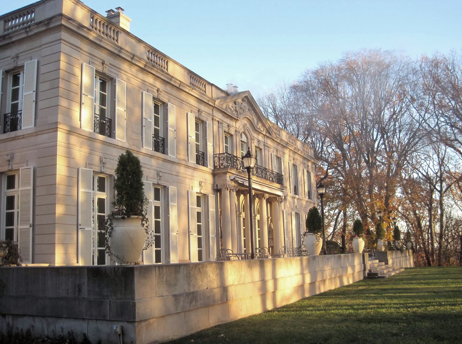
Recently I had the pleasure to tour the Belgium ambassador's residence in DC with the Mid-Atlantic ICA. Designed for the Dodge family as a wedding gift for daughter Delphine and her husband Raymond T. Baker  in the early 1930s, the house was purchased in 1945 as the ambassador's residence and has been thoughtfully maintained ever since. This was a precursor to the much more famous Rose Terrace commissioned by Anna Dodge Dillman which was demolished in 1976.
The house sits on exclusive Foxhall Road here in Washington which at the time of its building was mainly lined with large estates such as this. The house is barely visible from the road behind a large gate and bushes.
One would imagine that the Dodges would recognize their house immediately as blessedly nothing appears to have changed.
The gardens are simple and act as a gorgeous setting for this magnificent house designed after the Parisian Hotel Rothelin-Charolais by Lassurance from 1700. I thought of my talented blog friend Andie from Divine Theater immediately upon seeing these urns!
The detail on the house is stunning, restrained, and in immaculate condition thanks to good care and a recent renovation.
The front was in shadow when I arrived but thankfully the rear is a mirror image as these photographs turned out much better. Contrasting the circular entry drive, the expansive rear terrace looks out over a large lawn on a wooded promontory overlooking the Potomac River far below.
The intricate railing was also recently restored and is a work of art. I wish we saw more ironwork this detailed today but it is a rare thing.
 Small wings at either side house a breakfast room and morning room.
 The lamp posts were only recently added but fit in nicely.
 As you can see the view is stunning although somewhat hidden by the trees.
The bronze hardware itself deserves a blog post (or two).  Oddly enough it was different from room to room (I'll have more pictures of those in future posts).
 This cozy corner off the dining and breakfast room would make a great spot for breakfast in good weather.
The ambassador naturally loves living in the house but is sadly leaving the post next month. He says while grand it is a comfortable and ideal home for a family. Successive ambassadors have carried on the tradition of the utmost care for the mansion and hopefully future residents will as well.
 Leaving the house at night was just as beautiful as arriving in the light.
 Join me later this week as I bring you inside for a tour of the principal rooms!
All photographs by myself.

Friday, November 15, 2013

Michael Hampton at Baker furniture 'tabletop'

Last night I attended a fun event at the Baker Furniture showroom here in Georgetown where 4 designers worked their magic to get everyone into the holiday spirit by decorating tabletops.
My favorite table design was by my good friend designer Michael Hampton I'm pleased to report! Michael's interesting modern table focused on a new china pattern from Bernardaud in collaboration with Prune Nourry et JR.
The best thing about this china pattern isn't seen at first sight, the backside features the rear of the two hands! Learn more about his interesting tablesetting at his blog.
The fun part of attending such events, other than the chance to catch up with friends, is the chance to checkout the beautiful showroom. I loved this fun new chandelier called Syro.
 Another beautiful table was decorated by local designer Patrick Brian Jones.
Vintage crystal and china mesh seamlessly with new atop sparkling placemats. While I prefer a proper tablecloth it would hide the beautiful Baker furniture and that does rather defeat the point!
Events director and boutique owner Timothy Albrecht used a number of beautiful items from his store, Consider it Done, to decorate his own table. He was also kind enough to lend items to the other designers!
I love the modern brass utensils and gold and white is always classic.
 See anything to inspire your own holiday dinner table?
Many thanks to Baker Furniture for hosting the event and the fun evening!

Wednesday, November 13, 2013

Cardboard architecture

This past weekend while reading the Wall Street Journal Magazine (Nov 2013) I noticed a short article on the demise of Gilbert Scott's neo-gothic Cathedral in Christchurch, New Zealand which had been decimated by many recent earthquakes.  The replacement (which the article failed to mention was temporary) was designed by architect Shigeru Ban completely out of cardboard! Ban, who has donated his services on similar churches throughout areas of the Eastern Hemisphere which faced similar acts of God, expects the cardboard cathedral to last 50 years if needed.
Above you can see Scott's stone ChristChurch Cathedral from 1904 before the damage and below the devastation numerous earthquakes in recent years had wrought.  The decision phase has been hard on the church as they decide whether or not to rebuild or if the damaged building was salvageable; turns out that sadly the existing church could not be saved. The city and preservationists were also involved as the Cathedral is a local landmark and a category #1 historic place ranking within New Zealand.
When I first read the article I was outraged at the current state of the architectural profession that a 50 year life expectancy was deemed an adequate replacement for such a structure - or in fact any structure. We talk so much about being 'green' but replacing buildings every 20-50 years is the anti-thesis to green. Buildings in Europe are in use that are a thousand years old which is a whole lot more 'green' than a lot of current building practices.....but that's a topic for another blog post. I was wrong in fact and the cardboard Cathedral is a temporary structure; crisis adverted.
Can you imagine such a tragedy to your own church or landmark? So sad.
Ban's design was a simple A-frame structure of huge cardboard tubes covered with a clear polycarbonate roof to keep off the weather. The ends are then infilled with stained glass with super-imposed photo images from the old Cathedral (see last few images). 
Above you can see the structure getting erected a few blocks away from the old Cathedral while it continues to be demolished and the site prepared for rebuilding.
The finished project is a beautiful example of modern ecclesiastic architecture in my opinion, and you know I'm primarily a classicist!
The finished space holds 700 parishioners.  I love that it includes something of the old Cathedral (the stained glass images) while leading the way for the congregation to the future and their rebuilding; hopefully a structurally sound replica of the old Cathedral.
What do you think of the temporary replacement and cardboard buildings in general? Could you worship here?
Images sourced from various news sources and not my own.

Saturday, November 9, 2013

That touch of black

I'm a firm believer in the design principal that every room needs to have a touch of black; it grounds the space. Recently I helped a friend add a touch of black to his own living room in one of my favorite spots - the fireplace surround.
Before the fireplace lacked presence in the room. It also unfortunately had been rebuilt at some point and featured a very new, ugly brick surround in contrast to the original antique brick hearth (floor). Ignore the unpainted trim to the right, I also helped redesign the trim throughout the room and it hasn't been painted yet!
While my cell phone snaps don't do it justice, the new painted brick surround is a great focal point, won't show soot stains if the fire smokes, and now pairs nicely with the untouched antique brick hearth. Small changes can make such a large difference. 
I did the same in my own home. The fireplaces in my old COOP building are no longer functioning for insurance reasons but the fireplace remains a focal point in my living room. Above you can see how I painted the interior and the surround black.
Before (on a walk through with my Realtor before purchasing the apartment) you can see the surround painted white with no contrast to the mantel (and the hideously old wall to wall carpeting). What do you think of adding a touch of black to a space?

Tuesday, November 5, 2013

Thomas Pheasant: Simply Serene

I was so excited to receive a copy of internationally renowned local designer Thomas Pheasant's book, Simply Serene, that I sat down and read it immediately upon opening! Pheasant is well known for his contemporary classical work that is precisely the style I admire most as well as his beautiful collections of furniture for Baker Furniture.
The book is organized into chapters and even sub chapters in an organized fashion that one expects from Pheasant based on his work. The formality ends there though as the book is intimately written on his musings on design, his background, and what got him to where he is today.
Pheasant finds inspiration everywhere and is not shy about sharing his secrets with the reader. While the book features huge lush color images that invite the viewer to study them in detail, every 3rd image or so is in black and white so one can focus on the form or actual design of the space in question.
Included in the back of the book was a great surprise: under the "perfection" chapter a number of before & after projects shown in succession so that you can see just where his work and vision begins. Pheasant believes that before the decorating begins, the space and architecture must be right. I couldn't agree more!
While symmetry abounds in the book I was particularly drawn to the b&w image above of a asymmetrical hallway with interior window, skylight, paneling, and beautiful detailing. This is what doing it right looks like! Pick up your copy today and devote some time to learning from a master!
Photography provided by Durston Saylor and Thomas Pheasant.

Monday, October 28, 2013

Weekend shopping: Artisan Lamp CO

You may have heard me speak of Artisan Lamp Company before, an antique lighting store in the Cleveland Park neighborhood of DC. They recently got in a large container of fixtures from France where they do much of their sourcing and I wanted to share with you some of my new favorites! This old bouillette lamp is a great classic.
One of my favorite things about Artisan is they change their window display every few days - especially as I live a few blocks up the street and pass daily! They have something for everyone from the most classic to funky mid century pieces.
The owner is particular to art deco style and great examples are to be found throughout the shop like this pair of lamps. Can't see see these on 1930s nightclub tables in a Fred Astaire movie?
This cute little arts & crafts bronze lamp would look great on a bookshelf.
I blogged about this interesting peacock lamp before and it's still available!
This aesthetic movement lamp on the right is a stunner. The lit lamp on the left had daisies handpainted on the shade -ideal for a girl's bedroom.
I've been in love with this marble specimen lamp for awhile now (yes, I visit the shop on a near weekly basis!) and can't believe it hasn't yet sold. Now if I could only find the right spot for it in my apartment....
Speaking of marble, this stately lamp is of a red marble with gilt capital and base.
I was obsessed with this fascinating French bronze lamp above but again -no room at the inn.
This very tall chased silver plated candlestick had been turned into a lamp and the detail is just stunning.
This cute little French cherub is a great addition to any traditional interior.
I love this neoclassical orb chandelier; I couldn't tell if the base is metal or stone. Artisan also carries a wide variety of antique decorative arts such as this bronze sculpture and a variety of paintings and glassware.
Don't forget to support your local businesses, especially unique ones such as Artisan Lamp-a real neighborhood treasure. They also sell online through their website and 1stdibs profile.
No payment or sponsorship was received for this post -just sharing an inspirational resource!