Marie Antoinette's bedroom at the Petit Trianon is a perfect reflection of the young queen. Recently restored, the bedroom is one of the most elegant rooms in the house. You can see it located below on the plan in blue.

The placement of the bedroom would become important even with the planning of the Petit Trianon's gardens: the Temple of Love is on direct axis from the daybed out the window, seen below. Who says Marie Antoinette wasn't a romantic?

Below you see the Petit Trianon from the Temple of Love, the bedroom highlighted in blue.

The room features an exquisite bedroom suite by
Georges Jacob made for Marie Antoinette that is probably the most famous furniture in the small palace. The furniture and embroidered upholstery all display her love of flowers.

The bedroom breaks from the pale green color scheme found throughout the main floor of the Petit Trianon and is instead an icy blue. Seen below to the right is a clock featuring 2 eagles which represent the house of Austria. Marie Antoinette always discretely remained loyal to her roots. She must have felt at home at the Petit Trianon surrounded by the things which were important to her: a love of nature and her Austrian roots.

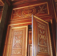
Even the boiseries are adorned with flowers. Below is a sketch from the 1913 Petit Trianon book that shows the carving in detail.

The hardware, which I have been admiring throughout the tour, is extremely organic in form: again harking back to nature and details of flowers.

I can't discuss Marie Antoinette's bedroom without including a picture of her as played so excellently by Kirsten Dunst in Sofia Coppola's movie.
 Spring is in the air this morning. After a long hard winter, I can hardly wait for the first buds to flower here in DC.
 One of my favorite memories of Paris this past fall was having lunch at the Palais Royal in the gardens. The roses were the most fragrant I have ever smelled!
 Spring, come quicker so I can take some time to smell the roses!


 Arguably, the most important room to the mistress of a 18th century house is her boudoir. The derivation of the word is from the French word Bouder or 'to pout' . Here she can unwind in her own personal space, far from the worries of her household (simliar to a 'mancave' today I think)! Technically, the boudoir is a private sitting or dressing area off of a bedroom. In the case of the Petit Trianon, this little room has some big impact, impressive features!
 The room lies in the northeast corner of the first floor, in between the Salon (to which there is a jib or secret door) and Marie Antoinette's bedroom, marked in blue above.
 Many of the details match that of the adjacent bedroom, including the pale blue color scheme. However, as this is a less public space, the boiseries are even simpler than in the bedroom. They saved the most showy spaces for the public, much as we do today in our own homes. The level of ornateness often would correspond to the level of privacy held by the space.
 Above you can see the mirror half covering the window. While in the full height position, the mirrors act as part of the paneling and you can't even tell they are covering anything. A daybed (for naps or lounging) as well as a tea table with comfortable chairs furnish the room.
 I wish I had a better photograph of the fireplace than the one above, but the drawing below shows it in detail. Beautiful white marble, delicate carvings and the diminutive scale emphasize the femininity of the small space.
 Here you can see the mirror from above which is half covering the above window and starting to be visable in the servants quarters.

 As promised yesterday, today we are having a house tour of Mark Coy's previous apartment on Lakeshore drive. Located in a grand old building, the apartment has great bones but needed a LOT of work when he first moved in. Lets see the results!

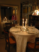
 The dining room has beautiful moldings, a window bench and original sconces. I love the white painted trimwork throughout the apartment and dark stained floors! Another seagrass carpet is used here and recognize the fabric on the pillows on the window seat? Tying the rooms together through fabrics and color brings a modern flow to a traditional compartmentalized apartment.
 I was crazy for this gorgeous chandelier and guess what....it's from the HOME DEPOT! Yes, such style for only $495 plus the added black shades which were used again on the sconces. The high and low real world decorating is used here to full affect: using what he had to work with (sconces), adding a 'low' touch from home depot (the candelier) and hanging it above a Milo Baughman dining table (the 'high' statement piece).
 The master bedroom continues the same color palette but in a much more soft and subtle environment. It looks like it could be a room at a spa hotel, doesn't it? So relaxing.
 The bathroom is probably my favorite room in the entire apartment. I instantly recognized the Ann Sacks Bellarita Travertine flooring in a herringbone pattern: I've used it in projects before and hope to use it someday in my own house! I'm all on board with white subway tiles, befitting the apartment's age and the glam sink and ebonized doors make me so happy. No seagrass blinds in here but the wallpaper (continued onto the ceiling I might add) tie in that aspect from the rest of the apartment.
 The 2nd bedroom, used as a den, uses the same color palette in a darker tone: A perfect room to curl up with a good book and cup of tea. I love the blocky lamp in the background and again the seagrass shades.

 The huge windows let in tons of daylight and expansive views (as I can testify to in my own apartment) but the natural grass shades really offer great texture and help moderate the harsh daylight; this is especially important with the hot summer sun! The placement of the couch in front of the windows might seem a bit counter-intuitive, but helps the room feel cozy and also blocks the unattractive window mechanical unit. The room remains open and airy with 'leggy' furniture and an bent glass coffee table. The seagrass carpet compliments the room nicely, much better than the wall to wall carpeting that was here previously!
 Look for the tour of his magnificent old apartment in a classic beaux arts building on Lakeshore drive here tomorrow, you won't be disappointed!


 Bacon and eggs (fried and runny), wheat toast, english breakfast tea with milk and OJ were on the menu. While the bacon fried (and then eggs done in the same pan afterwards), I took a few pictures. Daisies were snipped from a larger bunch ($4 at trader joes) elsewhere in my apartment and put into a bud vase to brighten up the winter gloom. Daisies are the most cheerful flower in my opinion and really last a long time (up to 2 weeks if you change the water frequently!).
 NPR was on and featured the listener's favorite top 10 soprano solos which was a wonderful backdrop. Renee Fleming singing o mio babino caro by Puccini was #1. I hope you are all finding ways to brighten up your winter as well!

 Posts
Posts







.JPG)