
I'm sure everyone has seen this already, but in the January 2009 issue of House Beautiful is a showhouse apartment in NYC by McAlpine Booth & Ferrier Interiors that I really loved. I know, I've been posting too many magazine articles lately and not enough NEW stuff - it's on my NY resolution list! This is MY take on the article. Since there was no client, Susan Ferrier (head of the project) chose this painting above in the living room as inspiration for the color palette of the space.

I think this is the PERFECT color palette for a city pied-a-terre. Actually -this is exactly the palette in my own apartment so maybe i'm biased! Even in a new building like this, the hushed gray tones help to soften the hard edges and create a soft environment. It's just pretty!

The living room has this cozy screen surrounding the couch, making a little nesting pod. I love this unusual industrial coffee table that was found in France.

These old fashioned blinds cast the best light in my opinion. I love the antique fragments used as lamps throughout the space.

I do love a modern kitchen. This Poggenpohl system blends seamlessly with the rest of the apartment. I love the topiary in the window too!

The really great updated retro-looking stove is by Gaggenau. The photographer (Thomas Loof) had a genius stylist; So many beautiful vignettes in this article!

The 2nd bedroom was treated as a den; the bed made into a cozy couch. Everyone prefers to lounge in a bed while watching tv anyway, admit it! The darker colors are very cozy for an evening spent with a movie and book.

The designer chose to use a lot of open console tables in front of the windows. I think this helps the space feel more closed in and cozy -otherwise your eyes would go out past the glass, making you feel exposed. So many modern floor to ceiling window apartments are not very comfortable.

This entryway is really charming - I LOVE the antiqued mirror treatment. Honestly though, how often would a candle get lit in the entry way? Thats a bit hokey, don't you think?

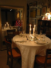
The dining table, in the corner of the living room, is adjustable so during a party this can become another seating area with coffee table. So smart in a small space!

How pretty is this vignette in the dining room? The stylist is a genius.

The bedroom is very beautiful, I love the bone covered sidetable. The antique anchors on the wall are an interesting touch.

Yet another console alongside the windows. I know a lot of people hate them, but I will always love these vintage looking shades. The thick tape adds so much personality and stability to the blinds. Those antique fragment lamps are so beautiful - I always love dark shades.

This goes to prove that you can make even the smallest, most boring 'modern' bathroom interesting. The sculpture in the window and the benches under the sink help to humanize the space. I hope House Beautiful keeps up with these wonderful articles!!
 I'm sure everyone has seen this already, but in the January 2009 issue of House Beautiful is a showhouse apartment in NYC by McAlpine Booth & Ferrier Interiors that I really loved. I know, I've been posting too many magazine articles lately and not enough NEW stuff - it's on my NY resolution list! This is MY take on the article. Since there was no client, Susan Ferrier (head of the project) chose this painting above in the living room as inspiration for the color palette of the space.
 I think this is the PERFECT color palette for a city pied-a-terre. Actually -this is exactly the palette in my own apartment so maybe i'm biased! Even in a new building like this, the hushed gray tones help to soften the hard edges and create a soft environment. It's just pretty!
 The living room has this cozy screen surrounding the couch, making a little nesting pod. I love this unusual industrial coffee table that was found in France.
 These old fashioned blinds cast the best light in my opinion. I love the antique fragments used as lamps throughout the space.
 I do love a modern kitchen. This Poggenpohl system blends seamlessly with the rest of the apartment. I love the topiary in the window too!
 The really great updated retro-looking stove is by Gaggenau. The photographer (Thomas Loof) had a genius stylist; So many beautiful vignettes in this article!
 The 2nd bedroom was treated as a den; the bed made into a cozy couch. Everyone prefers to lounge in a bed while watching tv anyway, admit it! The darker colors are very cozy for an evening spent with a movie and book.
 The designer chose to use a lot of open console tables in front of the windows. I think this helps the space feel more closed in and cozy -otherwise your eyes would go out past the glass, making you feel exposed. So many modern floor to ceiling window apartments are not very comfortable.
 This entryway is really charming - I LOVE the antiqued mirror treatment. Honestly though, how often would a candle get lit in the entry way? Thats a bit hokey, don't you think?
 The dining table, in the corner of the living room, is adjustable so during a party this can become another seating area with coffee table. So smart in a small space!
 How pretty is this vignette in the dining room? The stylist is a genius.
 The bedroom is very beautiful, I love the bone covered sidetable. The antique anchors on the wall are an interesting touch.
 Yet another console alongside the windows. I know a lot of people hate them, but I will always love these vintage looking shades. The thick tape adds so much personality and stability to the blinds. Those antique fragment lamps are so beautiful - I always love dark shades.
 This goes to prove that you can make even the smallest, most boring 'modern' bathroom interesting. The sculpture in the window and the benches under the sink help to humanize the space. I hope House Beautiful keeps up with these wonderful articles!!


.JPG)








11 comments:
Now that's really nice. Smart AND comfortable. (also, I light a candle in the entry anytime I'm having company!)
Happy New Year!
I've stopped buying magazines, so I really appreciate your showing this.
I can just see you living in such a sophisticated space.
xo xo
i would kill for that horse head.
actually , the whole apt is to die for.
great big new years eve hug to you.
renee
I LOVE this apartment and the color palette is wonderful! This designer is a genius! Love it all!
Gorgeous! If you had asked me about grey... I would have said "no way"
but I love it!
Loved that apartment. I have that article torn out for color inspiration for my own place. I think gray is the color for 2009.
I thought this apartment was the best thing in the issue. I know that this is all for an imaginary client but what a stunning job. What is particularly interesting to me, is that Town & Country did an apt. in this same building for their imaginary client and it is just as inventive, layered and luscious as HBs. Something about the space really set these designers on fire!
I love all those neutrals - however I also love a splash of color and think color can truly lift one's mood. I think I would need something with a shock of color.
Great blog!I love grey as well.
It's good to combine with black and velvet.
I am an interior architect from Norway.
My (grey..) blog is:
http://conceptinteriors.blogspot.com/
If you like European style, check this website!
http://www.slettvoll.no/kataloger
:)Henriette
It is so funny that you posted about this...I have read House Beautiful in YEARS. But yesterday I happened to pick up the current issue and was seriously impressed!
so beautiful.
Post a Comment