 This is undeniably a beautiful kitchen. But a few things worry me. Shelves in front of windows? Whats going on there? Like -take your dusty shelves and put them in the BRIGHT light. Also, I don't like blocking windows in general like this -you can't enjoy the beautiful view!
 Also, this is obviously a renovation of an older house -but do you really need to block the windows with the cabinets? You can see that the windows go BELOW counter height - YIKES. Thats just a formula to get dust and crumbs stuck down there - plus looking at the house from the exterior -those windows will look WHACK. What do you think? I love the look of all the white dishes though, those huge windows (A shame they block them with counters, dishes and shelves) and the TALL ceilings!


.JPG)










13 comments:
Good points. I'd add the fact that the sink faces a wall, with the shelf-covered windows on each side of it. It's something that would bother me.
Yes, kathleen!! I see they did it for symmetry -but who wants to wash dishes and stare at a dusty shelf 1 inch from your face? (coming from a self-proclaimed dish-washer addict, it's so relaxing!)
I just don't get any of this open shelving I see so often now. It's a trend that is very dusty!!!!!!!
Yes, Dianne, I think it's something thats pretty but best left to advertisements!
I agree ..bad idea..it just looks a little strange to block two large windows with shelves.. I think it would look much better if they built smaller shelves in between the windows! Beautiful kitchen nonetheless...
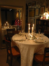
I agree with you on this and glad you did not decide to "shelf the issue" but can we talk about that table and those chairs. I love that.
I just cannot imagine blocking the windows and the dust bunnies would drive me insane.
See open shelves over at Isuwannee.
Isuwannee is where I got the inspiration. They're beautiful but not totally a good idea. I love your pun :-)
I like the charming table and chairs, but I would have painted the chairs white. I like wood but not TOO much of it in a room.
I have to agree with your points. I'm sure they can be beautiful in the right situation with the right daily cleaning team, but I really wouldn't want to put them in front of windows to block a beautiful view.
yeah... no... file that under "only suitable for a photo shoot."
Precisely, NF!
They have the capability of looking like a huge old mess!
first symmetry, now crumbs under the counter - you are one anal type of guy, right? You must be such a neat nick. But, alas - you are correct!!! those dishes have to be washed before anyone can use them - the dust!!!!
did you realize that with your black background and white lettering - you see reverse images of your blog? yep!!! I swear!!!
haha, not anal, CDT! More laid back than you'd think, but I like to be practical -and I do like things to be kept neat!
Post a Comment