The stone house is built in the (very) rolling hills outside of Charlottesville, Virginia, where these type of new "old" farm houses are in their native climate.
The architects designed a house with a traditional floor-plan where an old house appears to have been added onto over time. I love the flow of this first floor; very open but still distinct spaces. No separate dining room but then again this is a country house for family living; you always have your formal dining room at your place in the city, right? hehe
While the master bedroom is on the first floor to take advantage of a beautiful porch, 3 more bedrooms are located upstairs with an additional guest suite above the garage.
Hands down my favorite room was the 'tavern'; a sort of cozy library space with knotty pine paneling. I would happy live in this one room! Notice the comfy sofa, fireplace, and bar (hence 'tavern' on the floorplan).
This is where Bunny Williams excels. The showhouse felt very much like a family home; Art collected during your travels, grandma's chair in the corner, etc.
The bookcases flank the window on the front of the house -instant library. Never trust a house without books (even show houses).
I loved the basket holding fire starter and a cozy bench from which to tend the fire.
Everyone lives in their kitchen today: parties gravitate there, families hang out there, so why not make it THE best space in the house.
This kitchen is literally at the very center of the plan, flooded with natural light and views of the entire property so you can't miss out on anything.
Great idea to have these corner cabinets for extra storage where it becomes difficult to seat people anyway (always bumping knees!).
The room is large enough to hold this elegant 'kitchen table'. The dining area is grounded by a rug and still has the ubiquitous tv hung on the wall nearby.
Where do all of your extra dishes go in such an open kitchen? In the pantry! I love that in the pantry which is the only room in the house to lack natural light, it's taken dramatically opposite. It's never going to be light so embrace it and paint it DARK - charcoal in this case.
A large sunny family room on the back of the house affords the best views, access to the screened porch (a necessity in this part of the world), and another beautiful fireplace.
Always the problem -how do you hide those HVAC grilles? At least this one is high up enough that you barely notice it above the deep mirror frame.
This cozy chair by the family room fireplace is the perfect place to curl up with a good book.
The master bedroom, opposite the library (sorry I can't call it a tavern, it's a ridiculous name), feels like a serene sanctuary from the house with its' own porch and fireplace.
The breezeway between the pantry and garage is the actual front door which anyone would naturally use. The bench is a good idea - take off those muddy boots, set down your bag to find your keys, etc.
The 2 rocking chairs remind me of that Jerome Kern song I love 'the folks who live on the hill'.
That long bank of windows above to the right of the breezeway are above the kitchen sink, with the library located to the far right.
Not a bad looking house really - no?
A house like this is made for outdoor living and this one has plenty of entertaining areas for all types of weather.
And you can't beat those views.
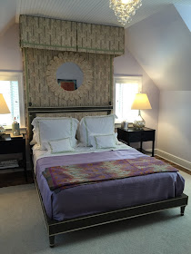
Upstairs are 3 bedrooms off a cozy den.
Each of the 3 bears has their room to choose.
Notice a lot of Bunny William's furniture collection in the house, like her elegant 'star chair' above.
I loved this charming art, a box of crayons was painted onto an antique (looking) metal ceiling tile.
The bunk room is a great space for kids - lots of play area, 2 built-in beds, and a desk for homework.
You've missed your chance to visit the idea house (I saw it before my recent visit to Monticello) but you can still read all about it, and Bundoran Farms, on their website HERE.


I'm not happy with the floor plan in terms of the arrangement and flow of rooms. I understand the development is built with large reserves of land, so perhaps the views account for some of that. It seems that the concept of added-on masses for exterior effect played more of a role than interior cohesiveness. But Bunny Williams' furnishing of the house is charming. Do they say the asking price for the house?
ReplyDeleteHi, Stefan,
ReplyDeleteI'm always pleased to see a library filled with books that are obviously meant to be read. I see a lot of beautiful spaces with "designer books," and think to myself, why didn't you just put up wallpaper!?
I'm late to the party too, I guess. She's the best, hands down.
ReplyDelete