Our local chapter of the ICAA conducted a tour a few months ago and has another coming up next week (information on that tour here). Unfortunately I wasn't able to attend the prior tour nor the upcoming one but my friend, Architect Erich Stanley, was good enough to share his pictures with me (and subsequently us!).
Pope based the design on the Mausoleum at Halicarnassus and it was completed in October of 1915.
Before heading inside I thought I'd share some of the extraordinary details on the exterior. The building is quite the attention grabber and I never pass the building without noticing many people stopping to admire it. Notice the huge scale of everything in relation to the handrail above.
Pope won a gold medal from the Architectural League of New York in 1917 for his design of this structure and it quickly became widely known at the time. It has since become one of the most beloved landmarks in the city.
Knowing Pope every detail is just right, highly studied, and faintly unusual. The Egyptian influences are hard to miss.
For those of you not familiar with Washington, this is a prime location in the city, about 1 mile directly north of the White House. Most of this neighborhood was built up around the same time period and gorgeous buildings line the avenues.
Primarily residential, the Avenue hosts many apartment buildings and grand townhouses (seen in these images taken from the Temple's roof), with hundreds of townhouses lining the side streets. This is ground zero in Washington real estate!
The entrance lobby hints at the details yet to be seen. Notice the beautiful marble Greek Doric columns and all of the many custom light fixtures.
Don't forget to look up as the ceilings are as detailed as the floors and walls in most spaces. All of the light fixtures were designed by Pope's office expressly for the temple.
Beautiful Egyptian revival murals surround the space.
The enfilade effect of the side halls is really a striking part of the design itself.
The building is maintained to within an inch of its life. People don't take as good of care of modern buildings as these ornate Classical structures do they? Just had to point that out..... They're just not as loved.
The entry to the sanctuary (correct wording?) is of course the grandest facade in the building.
Even the details of the simple library are stunning. Notice all of the custom light fixtures and the pilasters separating the beautiful wooden shelves.
This paneled conference room is a cozy space despite being so grand.
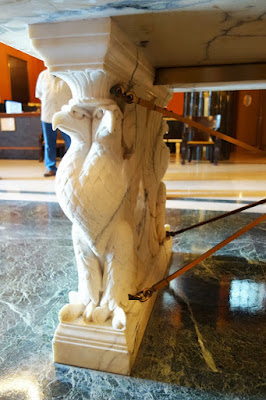
All of the furniture was also designed for the space -see the table base above.
As with any classical Pope designed structure, Greek keys run rampant throughout the space.
These solid brass door surrounds may be one of my favorite things in the building.
No surface forgotten or unadorned; this is a temple after all.
I don't know which light fixture is my favorite but this one might be the one.
Notice how well polished even the most ornate brass details are; not a job I would want to have!
I love the lines in these Egyptian revival murals, with multiple Greek key borders no less.
I'm not sure if the base of this floorlamp in the main stair is more interesting....
or the top of the same floorlamp is better. I guess it's all just great?
The wood details are as extraordinary as the stone and metal ones.
Notice the brass portiere hardware in this doorway; imagine this with thick velvet curtains in a vivid hue which I'm sure it once had.
More and more details!
This sconce is everything...or at least has a bit of everything.
Natural daylight is to be found in the deepest recesses of the temple -this skylight is amply sized (and detailed again to within an inch of its life).
Not all spaces are highly detailed however. The building is built of structural Guastavino tiles which were popular in the day. They're so beautiful it's a shame they often get covered up!
Don't miss the ICAA tour next week. If you can't make it don't miss this virtual tour online HERE or plan your own visit to the public spaces HERE!
Thanks again to Erich for supplying us with his gorgeous photography!


What a delight - such craftsmanship!
ReplyDeleteWow! Great post, as always.
ReplyDeleteWow, what an amazing tour of a building I'd enjoy visiting. Every detail has been thoughtfully designed leaving the viewer wanting to absorb it all. If only modern buildings were as beautiful as this one.
ReplyDeleteIf I didn't know better...I could've sworn I was in the T.H.Robsjohn-Gibbons designed interior of Casa Encantada.
ReplyDeleteThanks for the tour because I haven't even heard of this place and yet it is stunning!
ReplyDeleteI must visit this place. I am just mad for the black columns... gorgeous details How much must this have cost?? Solid brass and decorated everything. Heaven. Thanks so much for the tour. I so love your eye.
ReplyDelete