Thanks to my Australian penpal today I bring you another folly from the Schloss Nymphenburg park in Munich, the Pagodenburg (click on the link for an amazing 3d tour of the building and the pretty view it faces).
Designed by Jospeh Effner and finished in 1719 as a royal teahouse in the gardens of the palace, the rococo exterior gives way to an exotic Chinoiserie interior.
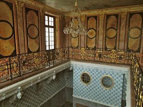
The lower level of the octagonal building is lined with over 2,000 delft tiles with a ceiling mural in the same blue & white color scheme.
The tracery moulding framing the tiles would have been originally gilded as in other areas of the room. Above you see it during restoration in white which I think I personally prefer. Remember though that 'more is more' in the rococo language!
Upstairs the plan is split into two rooms. One has fantastic wallpaper, an inlaid floor, and gilded wall decorations and ceiling.
The little emerald green silk covered bed looks like a perfect spot for a post-lunch nap.
The niche's painted silk wallpaper is intense and dramatic.
The other half of the 2nd floor contains an ebony and red lacquered room with the same parquet floor. Just imagine what a cute little house this would make! Read more about the Nymphenburg palace and gardens on wikipedia HERE.
Friday, July 25, 2014
Wednesday, July 23, 2014
Chinese wallpaper at the Baths at Badenburg, Nymphenburg Park.
Whilst on his travels my Australian penpal stopped at Nymphenburg where the park is full of fascinating follies. Built in 1722 by Joseph Effner the Baths (or sauana) was the focal point of the park.
I love that the building is set in a lawn of daisies. I hate the American preference for pristine green lawns; give me wildflowers!
The main room right when you enter is the banqueting hall.
The ceiling frescoes were badly damaged by the bombing of Nymphenburg during WWII but have been recently restored.
I love these mirrored niches mirroring the transoms over the french doors. Both transoms and niches hold a collection of busts.
The baths are shockingly opulent. The balcony above was for people to observe those in the pool below.
The most amazing part of this pavilion though are the original but recently restored hand-painted Chinese wallpaper in the 4 rooms of the "Elector's apartment".
This room featured beautiful pink tea-stained and emerald green birds and flowers.
Another room features a more scenic Chinese wallpaper.
The details are fascinating.
The colors also are amazingly vivid.
The houses in this wallpaper are the main attraction.
The park is full of beautiful follies and looks like a great place to spend a day. Thanks to my penpal for sharing his travels with us all!
Monday, July 21, 2014
Charlottenhof Palace, Sanssouci, by Schinkel
After my last post on Sanssouci many of you expressed your distaste for the Rococo. I thought I would share with you some photos sent to me by my Australian penpal of the neighboring neoclassical Charlottenhof Palace.
The palace only recently reopened after a long restoration. Notice the chairs above -one with older caning and the other with brand new replacement (which will age and darken over time).
I think designer Miles Redd would appreciate these red leather studded doors.
Notice the fixed transom panel above the open lower doors seen above so that the height visually matches the adjacent taller doors.
Let us not forget that things are rarely new....gallery walls might be trendy now but have been around for centuries!
I love the gilt bands framing each separate wall plane - a technique designer David Hicks was fond of using amongst others.
To my eye having such a luxurious gilt bedframe with staid religious iconography is odd but fitting.
Notice the jib door hidden in the green fabric lining the walls to the left of the photo above; Service door or perhaps a bathroom of sorts?
The silver leafed door is stunning. Designers were matching silver and gold 2 centuries ago!
The reading chair above would have been a comfortable place to sit each evening.
This beautiful collection of green glass would be one I would love to bring home with me!
I hope you enjoyed this rare look into Charlottenhof Palace in the Sanssouci gardens!
King Frederick William IV of Prussia shared this distaste and had the fantastic neoclassical architect Karl Friedrich Schinkel renovate an existing farmhouse on the Sanssouci grounds into a staid palace for his family.
You may recognize this secretary and chairs designed by Schinkel from my earlier POST on the book on Potsdam.The palace only recently reopened after a long restoration. Notice the chairs above -one with older caning and the other with brand new replacement (which will age and darken over time).
I think designer Miles Redd would appreciate these red leather studded doors.
Notice the fixed transom panel above the open lower doors seen above so that the height visually matches the adjacent taller doors.
Let us not forget that things are rarely new....gallery walls might be trendy now but have been around for centuries!
I love the gilt bands framing each separate wall plane - a technique designer David Hicks was fond of using amongst others.
To my eye having such a luxurious gilt bedframe with staid religious iconography is odd but fitting.
Notice the jib door hidden in the green fabric lining the walls to the left of the photo above; Service door or perhaps a bathroom of sorts?
The silver leafed door is stunning. Designers were matching silver and gold 2 centuries ago!
The reading chair above would have been a comfortable place to sit each evening.
This beautiful collection of green glass would be one I would love to bring home with me!
A tented bedroom with simple striped fabric makes a big statement.
While the rest of the structure is simple as shown the entryway was still designed to impress. This was the palace of a king afterall!I hope you enjoyed this rare look into Charlottenhof Palace in the Sanssouci gardens!


