Last month I had the pleasure of attending the Fall Design Fete hosted by our local AIA chapter at the Pan American Building. You may remember me talking about this building by Paul Cret before HERE, as it is one of my favorites here in Washington DC. Oddly enough my other favorite is also by Cret, the Mary Stewart Mansion.
I snapped some photos while at the event with my phone as the building really does come alive at night; ambiance is everything, no?
The central courtyard was ablaze with light and music thanks to a live jazz band.
The intriguing marble fountain by Gertrude Vanderbilt Whitney is also more powerful seen at night.
However it appears the snake eyes of the sculpture no longer light up as originally intended.
It was a fabulous evening in a fabulous space spent with my fabulous coworkers; who can ask for anything more?
I promise to get a real camera to do my images justice someday!
Tuesday, December 31, 2013
Tuesday, December 24, 2013
Merry Christmas!
"May Peace and Plenty be the first to lift the latch on your door, and may happiness be guided to your home by the candle of Christmas"
From ArchitectDesign to you, may you have a very Merry Christmas! Stefan
Monday, December 16, 2013
Holiday Weekends
This past weekend was busy as most weekends tend to be during the holiday season. I've been unable to decorate for the holiday unfortunately but I was able to do a little something to bring some of the Christmas spirit into my own apartment.
At an estate sale I visited this past weekend one of the many scores was a large box full of vintage glass ornaments from the 1930s and earlier (for $2 no less)! I placed these in clear glass vases throughout my apartment for some color and Christmas cheer!
Another find was this vintage brass lamp with an interesting paper shade. An antique print of an Italian square was mounted to the shade after the windows in the scene had been cut out and infilled with Mylar paper. When the lamp is lit the windows 'glow'! I love the neoclassical brass shaft which I polished along with the marble base as well as the red stone finial. You see it here in my dining room.
I also visited my favorite shop, Artisan. They have tons of new merchandise you have to check out (online as well as in person) and as the owner was telling me, they make perfect gifts. I love the modern take on a classical empire chandelier seen above. The elegant antique French crystal chandeliers in the background are a perennial favorite as well!
Perfect for the arts and crafts house or bungalow is this unique iron and painted glass fixture. Why buy cheap new fixtures when you can pick details that will shine and make your house a unique home! What are you doing to your house for the holidays?
Thursday, December 12, 2013
Christmas Greetings
Do you send out Christmas cards? I admit my list dwindles each year as I slowly move into the digital age (ironic as I'm an early blogger!). Patricia, that wonderful artist who writes PVEdesign and in fact did my blog banner, was kind enough to send me an image for use on my card this year! You may remember a few weeks back I posted about adding 'That touch of black' to your fireplace and showed the change to my own fireplace at home. Patricia magically imagined my mantelpiece at Christmas and I have to say the results are charming. So please consider this my Christmas Greeting to you and your family with hopes for a very happy new year!
Many thanks to Patricia for this image which I treasure. You might consider contacting her to create your own image!
Many thanks to Patricia for this image which I treasure. You might consider contacting her to create your own image!
Monday, December 9, 2013
Belgian ambassador's residence interiors 3: Library & summer room
The last rooms of the Belgian ambassador's residence by the firm of Horace Trumbauer that I will share are the most informal and perhaps the favorites of everyone who visited. The library features Regency-style paneling of mellowed natural oak inspired by a model from the Chateau de Bercy which was on view at the Met in New York.
During our visit as twilight fell, a roaring fire welcomed one into the cozy room. The shelves feature a number of interesting books on Belgium and also photography, a passion of the current ambassador. The wood frames surrounding the shelves open which led me to wonder if they once held metal screens, glass, or perhaps fabric panels.
All of this mellow wood is beautiful but leaves one wishing there was a bit of contrast, no? brown brown brown. The game table below featured a beautiful Jade chess set.
The fire did eventually burn down unfortunately but the marble mantel piece was no less beautiful.
Just off the library is the Summer room or loggia which features a stunning treillage treatment on the walls. This felt like one of the most used rooms we visited with comfortable sofas and a dining table. I loved the chandelier here which fit the garden theme.
The medallions feature paintings of birds such as cockatoos, flamingos, spoonbills, and macaws; perfect for the current ambassador's love of avian life.
I can see this being my favorite space in the house, daytime or evening.
A close up of the walls shows the incredible detail in the wood treillage, the faux painting, and the beautiful medallions.
One last feature to share with you to round out the posts on the residence are the panels featured on every French door; I had never seen anything like this.
Much like a car window, perhaps harking back to the family fortune from Dodge, the 2nd pane up on the left hand side of all of the French doors would open while allowing the doors to remain closed and locked. During the recent renovation when the existing doors were converted to double pane windows in interest of energy savings, this feature was retained.
I hope you all enjoyed this 4 part tour of the Belgian ambassador's residence designed by the firm of Horace Trumbauer. Many thanks to the ambassador for sharing this lovely house with all of us and the ICAA for hosting another wonderful event!
Monday, December 2, 2013
Holiday Decorating: Renaissance style
Recently while in Old Town Alexandria, Virginia, I noticed the fan of fruit above the front door of the Bank of Alexandria Building (1792) seen in the images above. Commonly referred to as "Williamsburg over-door fans" these decorations actually date to the early 20th century thanks to House Beautiful magazine!
For the Holiday issue of 1926 House Beautiful encouraged its readers to decorate like Lucca della Robbia, an Italian Renaissance sculptor known for his use of fruit wreaths (see above for an example of his work). In the late 1930s Christmas decorating competitions were held in Colonial Williamsburg and many of the participants sourced House Beautiful and created these fruit decorations which would have been thought quite odd and wasteful in hard Colonial times!
Friday, November 29, 2013
Belgian ambassador's residence interiors 2: Salon & Dining Rooms
As promised in my last post today I'm going to share the Salon, Dining room, and Breakfast room of the Belgium ambassador's residence designed by the firm of architect Horace Trumbauer.
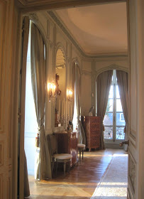
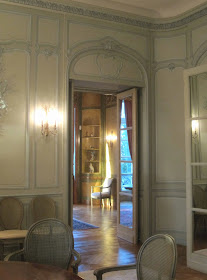
The wood paneling, parquet flooring, and crystal chandeliers were all imported from France by the interior designers, Alavoine et Cie, to evoke the style of the French Regence (1715-1723). The portrait above is of the first Belgium ambassador to inhabit the house, Baron Silvercruys, who was responsible for its purchase.
While a formal room we were assured the Ambassador and his family love to use this space and entertain here frequently, evidenced by the personal photographs on the piano.
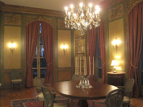
Despite the beautiful light the room receives in the evening I think I prefer it best a night when the chandeliers and lamps are lit, seen above. You can't beat that elegant ambiance.
The paneling is spectacular and in immaculate condition. It was only lightly retouched in the recent restoration.
The charming interiors look straight out of House Beautiful circa 1935. However- symmetry, as seen in the arrangement above, never goes out of style in my book!
The painted paneling allows the oak parquet floors to shine and warm the space.
From the salon one enters the Dining Room, which occupies a corner.
Again I think the room is best seen at night!
The caned chairs were recently restored and date to the 1930s.
One of the most intriguing details in the entire house are the mirrored screens in the dining room which shield the service areas, seen above flanking the chest.
If you look closer the screens are actually mirrored french doors, mimicking the other doors in the room, with false hinges, and open as a screen on one side to shield the actual leather-padded butler pantry doors. When not in use, the screens fold flat into the wall and appear to be normal French doors like the others in the room.
The current ambassador is a fan of wildlife and his stunning collection of Meissen birds decorate the primary spaces.
The Ambassador leaves his post in December to return home and I'm sure the house will miss his Meissen collection!
On the other side of the dining room is the former music room, now an informal dining room used daily by the Ambassador and his family. I suppose one would refer to it as the breakfast room.
The marbelized walls feature musical instruments while the shelves hold more of the Meissen collection.
The table and candlesticks are recent purchases while the chairs are original and belong to the dining room set.
The light fixtures in this space are simpler and more neo-classical in style. Notice again the use of mirrored french interior doors; in this case false to provide symmetry with the entry door from the dining room.
Even the hinges were beautiful! The faux marbeling on the walls is incredible and surely make this one of the most unique rooms of the house.
Join me for my next and final post where I'll feature the library and morning room aux treillage!
The wood paneling, parquet flooring, and crystal chandeliers were all imported from France by the interior designers, Alavoine et Cie, to evoke the style of the French Regence (1715-1723). The portrait above is of the first Belgium ambassador to inhabit the house, Baron Silvercruys, who was responsible for its purchase.
While a formal room we were assured the Ambassador and his family love to use this space and entertain here frequently, evidenced by the personal photographs on the piano.
Despite the beautiful light the room receives in the evening I think I prefer it best a night when the chandeliers and lamps are lit, seen above. You can't beat that elegant ambiance.
The paneling is spectacular and in immaculate condition. It was only lightly retouched in the recent restoration.
The charming interiors look straight out of House Beautiful circa 1935. However- symmetry, as seen in the arrangement above, never goes out of style in my book!
The painted paneling allows the oak parquet floors to shine and warm the space.
From the salon one enters the Dining Room, which occupies a corner.
Again I think the room is best seen at night!
The caned chairs were recently restored and date to the 1930s.
One of the most intriguing details in the entire house are the mirrored screens in the dining room which shield the service areas, seen above flanking the chest.
If you look closer the screens are actually mirrored french doors, mimicking the other doors in the room, with false hinges, and open as a screen on one side to shield the actual leather-padded butler pantry doors. When not in use, the screens fold flat into the wall and appear to be normal French doors like the others in the room.
Above is a view of the butler's pantry with original cabinetry. Also original was the dumb waiter which carries food up from the kitchen below to this day.
I loved this chinese lamp on a built-in marble console table flanking the fireplace- perfect for serving more casual meals.
The intricate crown molding features different flowers such as daffodils and old-fashioned roses.
The paneling trophies feature spoils of the hunt.
I can't get enough of this bronze hardware!The current ambassador is a fan of wildlife and his stunning collection of Meissen birds decorate the primary spaces.
The Ambassador leaves his post in December to return home and I'm sure the house will miss his Meissen collection!
On the other side of the dining room is the former music room, now an informal dining room used daily by the Ambassador and his family. I suppose one would refer to it as the breakfast room.
The marbelized walls feature musical instruments while the shelves hold more of the Meissen collection.
The table and candlesticks are recent purchases while the chairs are original and belong to the dining room set.
The light fixtures in this space are simpler and more neo-classical in style. Notice again the use of mirrored french interior doors; in this case false to provide symmetry with the entry door from the dining room.
Even the hinges were beautiful! The faux marbeling on the walls is incredible and surely make this one of the most unique rooms of the house.


